Why Do Yield Curves of Treasury Securities Forecast Business Cycles So Well?

By Jeffrey J. Peshut

August 18, 2014

In a recent post on LinkedIn, economic strategist Paul Winghart correctly points out that yield curves of Treasury securities have an unrivaled track record of out-forecasting even the best economic forecasters — present company excepted, of course!  In support of his proposition, he cites “Forecasting Recessions: The Puzzle of the Enduring Power of the Yield Curve” (Rudebusch and Williams, 2008).  Mr. Winghart veers off track, however, when he echoes Keynesians like Fed Chair Janet Yellen and argues that the yield curves’ greatest powers are their ability to capture and reflect the amount of economic slack in the economy at any given moment.

This post will show that yield curves accurately forecast business cycles because they reflect the Fed’s manipulation of both interest rates and the supply of money and credit, not economic slack in the economy.  Therefore, Mr. Winghart presented the right chart, but with the wrong reasons for why it works.

This post will then go on to forecast the 10-Year Treasury/3-Month Treasury spread over the next 12 to 24 months and suggest the likely impact the forecasted spread wil have on the economy.

Yield Curves of Treasury Securities and Forecasting Business Cycles

The yield curves of Treasury securities — specifically the spread between yields of long-term and short-term Treasury securities — have a well-documented history of accurately forecasting business cycles in general and economic recessions in particular.  A case in point is the spread between the yield on the 10-year Treasury Note and the 3-Month Treasury Bill.  (See Figure 1.)

Figure 1: 10-Year Treasury Note to 3-Month Treasury Spread  01/01/82 to 07/01/14

10-Year Treasury to 3-Month Treasury Spread 01-01-82 to 07-01-14

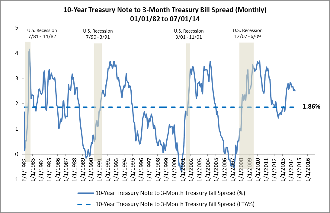
Shortly before each of the last four economic recessions, the spread between the 10-Year Treasury Note and the 3-Month Treasury Bill approached zero and in the case of the last three recessions actually fell below zero.  Put differently, in each case the yield curve flattened and even inverted.  Any investor monitoring the yield curves or this chart could have easily seen the economic downturns far enough ahead to still have time to take the appropriate protective actions.

Why Do They Work So Well?

To understand why the yield curves of Treasury securities forecast business cycles so well, it’s necessary to first look at the yields on the long-term and short-term Treasuries side-by-side to see whether one or the other is more responsible for the widening and narrowing of the spreads.  (See Figure 2.)

Figure 2: 10-Year Treasury Note and 3-Month Treasury Bill  01/01/82 to 07/01/14

10-Year Treasury and 3-Month Treasury 01-01-82 to 07-01-14

You can see right away that, except for the early 1980s, yields on the 3-Month Treasury Bill have been much more volatile than yields on the 10-Year Treasury Note and that they have been much more responsible for changes in the spread than yields on the 10-Year Treasury.

Next, we need to look for a reason for the volatility in the 3-Month Treasury Bill.  Because the Federal Reserve is responsible for establishing short-term interest rates through its control of the Fed Funds Rate, comparing yields on the 3-Month Treasury Bill to the Fed Funds Rate is a good place to start.  (See Figure 3.)

Figure 3: 3-Month Treasury Bill and Fed Funds Rate  01/01/82 to 07/01/14

3-Month Treasury and Fed Funds Rate  01-01-82 to 07-01-14

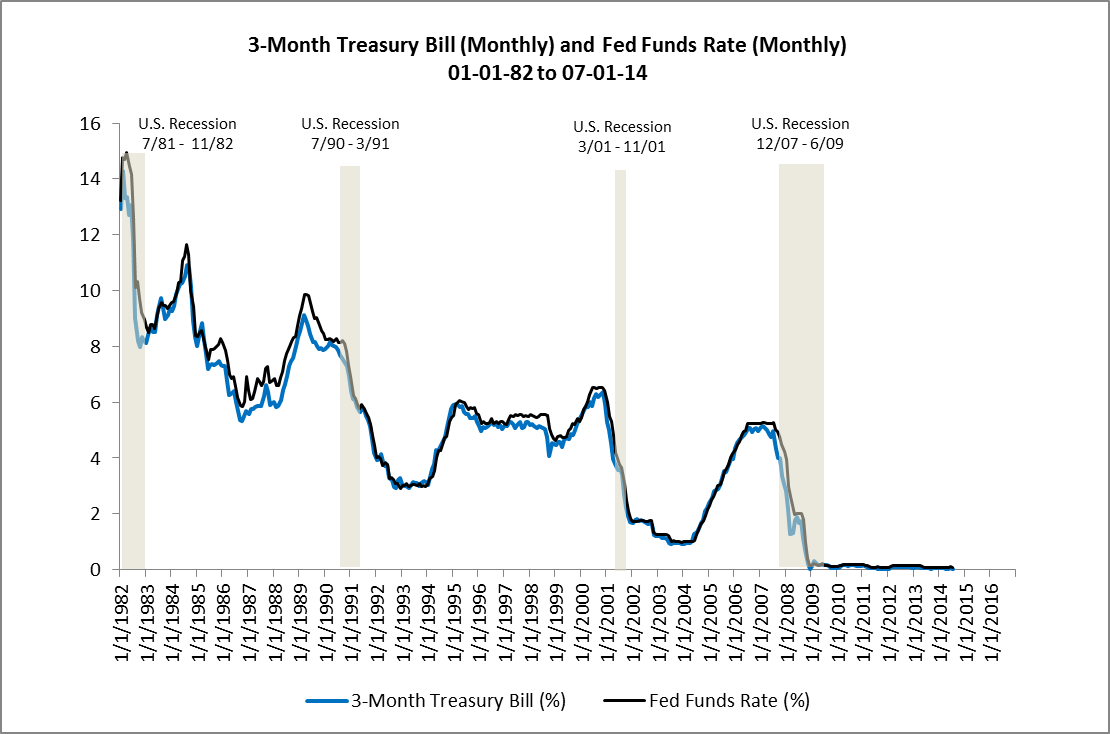
Not surprisingly, yields on the 3-Month Treasury Bill move in virtual lock step with the Fed Funds Rate.  This suggests that the Fed is responsible for the volatility in the 3-Month Treasury Bill through its control of the Fed Funds Rate and, by extension, is also largely responsible for changes in the spread between the 10-Year Treasury Note and the 3-Month Treasury Bill.

Now, if the spread between the 10-Year Treasury Note and 3-Month Treasury Bill accurately forecasts recessions, changes in the yields of the 3-Month Treasury Bill are largely responsible for changes in the 10-Year Treasury Note/3-Month Treasury Bill spread and the Fed’s control of the Fed Funds Rate is responsible for changes in the yield of the 3-Month Treasury Bill, it follows that changes in the Fed Funds Rate should also accurately forecast recessions.

Here’s where Austrian Business Cycle Theory (ABCT) comes in.  Not only do changes in the Fed Funds Rate accurately forecast recessions, but the Fed’s manipulation of the Fed Funds Rate and yields on short-term Treasury securities actually causes the business cycle. That’s why the yield curves of Treasury securities forecast business cycles so well!   For a thorough explanation of how the Federal Reserve causes the business cycle, see an earlier post on RealForecasts.com titled “Does The Federal Reserve Really Cause The Boom/Bust Cycle?”

What’s Next For The Fed Funds Rate And The 10-Year Treasury/3-Month Treasury Spread?

As of July 1, the spread between the 10-Year Treasury and 3-Month Treasury was 2.51%.  (See Figure 1.)  Because the Fed’s manipulation of the Fed Funds Rate causes the business cycle — and economic recessions occur once the spread between the 10-Year Treasury Note and 3-Month Treasury Bill approaches zero — it’s important to forecast the Fed’s actions and the 10-year Treasury/3-Month Treasury spread in the months ahead.

To begin, the Fed isn’t expected to raise the Fed Funds Rate until it ends its current round of quantitative easing, commonly referred to as QE3.  In July, the Fed tapered its monthly bond buying to $25 billion and is on track to end QE3 in October of this year.

Next, the median estimate of Fed officials, released after the FOMC’s June meeting, forecasted an increase in the Fed Funds Rate to 1.13% at the end of 2015 and 2.5% by the end of 2016.  According to the median of economists’ estimates in a Bloomberg survey, the Fed will first increase the Fed Funds Rate to 0.50% after its July, 2015 meeting.  St. Louis Fed President James Bullard, who doesn’t vote on policy this year, has said that the Fed should increase the Fed Funds Rate at the end of March, depending on economic data.

Once the Fed begins raising the Fed Funds Rate, look for the 10-Year Treasury/3-Month Treasury to begin narrowing.  Because the spread is at 2.51% today, it’s likely that the Fed will have to raise the Fed Funds Rate by only 250 to 300 basis points before the spread approaches zero and the economy enters its next recession.  If the Fed officials’ forecast mentioned above is accurate, that could occur by the end of 2016.  (See Figure 4.)

Figure 4: 10-Year Treasury Note to 3-Month Treasury Spread  08/01/14 to 12/31/16 Forecast

10-Year Treasury to 3-Month Treasury Spread 08-01-14 to 12-31-16 Forecast

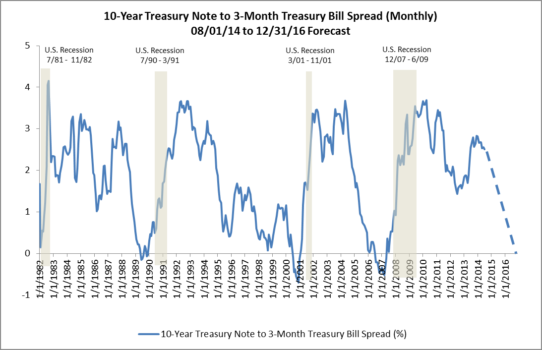
So, for now, it appears that the Fed will begin to raise the Fed Funds Rate, and thereby begin to narrow the 10-Year Treasury/3-Month Treasury spread, in mid-2015 — give or take a quarter.  It also appears that the Fed Funds Rate will reach 2.5%, the 10-Year Treasury/3-Month Treasury spread will approach zero and the economy will enter its next recession by the end of 2016.   Continue to check back with RealForecasts.com for future updates about changes in the 10-Year Treasury/3-Month Treasury spread.

image_pdfOpen As PDFimage_printPrint Post

Is True Money Supply (TMS) Growth Continuing To Decelerate?

By Jeffrey J. Peshut

July 16, 2014

In its most recent posts — What’s Next For Employment Growth?, Will GDP Growth Continue To Lose Momentum? and Where Will Commercial Real Estate Returns Go From Here? — RealForecasts.com showed that the rate of growth of TMS had been decelerating since September, 2011.  (See Figure 1.)

Figure 1: True Money Supply (YOY%) 1/1/06 – 12-01-13True Money Supply 01-01-06 to 12-01-13

Moreover, at the end of each of these posts, RealForecasts.com encouraged readers to continue to monitor the Fed’s actions during 2014 to anticipate changes in TMS.  To that point, it’s been widely publicized that the Fed has been reducing or “tapering” its bond purchases under QE3, from a high of $85 billion per month in November of 2013 down to $35 billion per month in July of 2014.   Based on a roughly $10 billion per meeting tapering schedule, the last QE3  purchases should occur in October of 2014.

As a result of the Fed’s tapering policy, I would have expected the growth rate of TMS to continue to decelerate during the first part of 2014.  I was surprised to learn instead that the TMS growth rate accelerated slightly during the first five months of the year.  (See Figure 2.)

Figure 2: True Money Supply (YOY%) 1/1/06 to 5/1/14True Money Supply 01-01-06 to 05-01-14

According to my Austrian fellow-traveler Michael Pollaro,  the recent acceleration in the growth of TMS can be explained by looking separately at the two sources of TMS — Base Money and Uncovered Money Substitutes.  Base Money is made up of Currency Outstanding and Reserve Deposits held by the Fed.  The rate of growth of Base Money is directly related to the level of the Fed’s bond-buying activity.

The Uncovered Money Substitute portion of TMS is money created by the “pyramiding” of Reserve Deposits through fractional reserve banking.  The rate of growth of Uncovered Money Substitutes is directly related to the level of lending by the commercial banks.

Data provided by Michael shows that the recent acceleration in lending activity by commercial banks has more than offset the deceleration in the Fed’s bond-buying activity.  It’s too early to tell whether this relationship will continue long enough to be characterized as the beginning of a trend.

Even if it doesn’t develop into a new trend, the interruption in the deceleration of TMS could delay by five or six months the events forecast by RealForecasts.com in recent posts.  Keep checking back with RealForecasts.com for future changes in the growth rate of TMS.

As always, thanks to J. Michael Pollaro, author of The Contrarian Take, for the TMS data used to construct the charts in this article.

image_pdfOpen As PDFimage_printPrint Post

Are We Eating Our Seed Corn?

By Jeffrey J. Peshut

March 30, 2014

The U.S. has a rich agricultural heritage. This heritage includes an expansive body of wit and wisdom in the form of aphorisms, admonitions and advice that have been accumulated by farmers over hundreds of years of plowing and tilling fields, planting and harvesting crops, milking cows, etc.

“Don’t eat your seed corn!” is one of these admonitions. In literal terms, it suggests that farmers who choose to consume the corn from this year’s harvest that they will need for planting next year — rather than saving it for planting — will reduce crop production in the next year. Figuratively speaking, it refers to living beyond our means today at the cost of reducing our standard of living tomorrow.

Austrian Business Cycle Theory

In its January 14th post titled Does The Federal Reserve Really Create The Boom/Bust Cycle?, RealForecasts.com explained how the Federal Reserve creates the boom/bust cycle by artificially expanding the supply of money and credit, lowering interest rates below their market or “natural” level and thereby creating an unsustainable economic boom which inevitably results in a bust. According To Austrian Business Cycle Theory, one of the negative consequences of the boom/bust cycle is that it depletes an economy’s pool of funding.

Dr. Frank Shostak, adjunct scholar of the Mises Institute (www.mises.org) and principal of Applied Austrian School Economics, Ltd (http://aaseconomics.com) has written extensively about the pool of funding. According to Dr. Shostak, the pool of funding is made up of all of the final products and services produced by an economy. In the case of an individual farmer, the pool of funding is made up of the farmer‘s entire corn harvest.

It is important to recognize that an economy’s pool of funding is produced to be consumed by individuals to support their standard of living, just as the individual farmer’s crop harvest is produced to be consumed by the farmer and his family to support their standard of living. Not all of the pool of funding can be consumed, however. For consumers to maintain their standard of living, they must save enough of the pool of funding to maintain the current level of production of final products and services. This is known as the economy’s pool of real savings – its “seed corn” if you will.

For consumers to improve their standard of living, an economy must increase its productive capacity and production. To increase the economy’s productive capacity, producers must invest in the production of better tools, equipment, machinery, etc. To make the resources available for investment, consumers must save more than the minimum required to simply maintain the current level of production. They must increase the size of the pool of real savings. Of course, to save more, they must consume less.

For example, to improve their standard of living, the farmer and his family must cut back on corn consumption today to save enough to invest in a better tractor, better farm implements to be used with the tractor or education to learn better farming techniques. These investments, in turn, will allow them to produce more corn in the future and raise their standard of living.

Thus we can see that the pool of funding can be used for either current consumption or saved and invested for future production.

It’s important to recognize that the use of money in an economy doesn’t change the essence of the pool of funding. Products and services are paid for with products and services – not with money. Money is simply a medium of exchange that facilitates the transactions. The farmer exchanges corn for money and then exchanges the money for boots. The boot maker exchanges his boots for money and then exchanges the money for corn. Ultimately, however, the farmer pays for the boots with the corn he produces and the boot maker pays for corn with the boots he produces.

So, how does the artificial expansion of the supply of money and credit, the lowering of the interest rate and the unsustainable boom and inevitable bust deplete the pool of funding? It depletes it in two ways.

When the Federal Reserve expands the money supply, it creates money out of “thin air”. The holder of the newly-created money can exchange it for final products and services in the pool of funding without having made a prior contribution of final products and services to the pool. They can consume without having produced. As a result, there are now less products and services left in the pool of funding than there were before the Fed expanded the money supply. The pool of funding has been partially depleted.

Also, when the Federal Reserve lowers interest rates below their market or “natural” level, it sends a misleading signal to producers about consumers’ true time preferences. As the Fed drives down interest rates, producers are led to believe that consumers are saving more today to consume more in the future and that now is the time to take advantage of the lower interest rates and invest in longer-term production projects for new products in the future. In fact, consumers haven’t said that they want to save more today and consume more in the future. Because the holders of the newly-created money used it to siphon off products and services from the pool of funding, consumers may demand more products and services today just to consume the same amount as the have been consuming.

Similarly, just because the Fed has decided to force interest rates down, it doesn’t mean that consumers want to invest more of their savings to complete future production capacity and future production. As suggested above, people may not only prefer to continue to consume the same amount of resources today, they may want to consume even more. This creates an unchanged or even shrinking pool of real savings from which to fund a growing number of new investment projects.

Something has got to give. The boom in economic growth precipitated by the artificial creation of money and credit and lower interest rates is not sustainable. The bust is inevitable.

The bust may occur because producers incorrectly forecasted future consumer demand for the future supply of their products and services. As a result, these projects will become unprofitable. It may also occur because producers incorrectly forecasted the size of the pool of real savings from which to complete their future projects and they won’t be able to complete them. It can even occur because the Fed decides to reverse its monetary policy – from a “loose” policy stance to a “tight” policy stance – based upon a concern about how the increase in the money supply will affect consumer prices, asset prices or the price of the dollar relative to other currencies. But occur it must.

Once the bust occurs, the market liquidates the unsustainable projects or “malinvestments”. All or part of the pool of real savings that was invested in these projects is lost or “consumed” by the unsustainable and unsuccessful projects. The result is a further depletion of the pool of funding.

According to Austrian Business Cycle Theory, then, the Fed’s intervention in the markets for money and credit creates the boom/bust cycle and depletes the pool of funding and the pool of real savings. To the extent the Fed’s intervention depletes the pool of real savings, we are in fact “eating our seed corn” and thereby reducing both producers’ ability to maintain and improve their productive capacity and production and consumers’ ability to maintain and improve their standard of living.

But does the data back this up?

Empirical Data

The chart in Figure 1 shows year-over-year percentage increases and decreases in the True Money Supply from 1978 through 2013. The positive slope of the trend line shows that, overall, the True Money Supply has been increasing at an increasing rate over the past 35 years.

Figure 1: True Money Supply (YOY%) With Trend Line 1978 – 2013

True Money Supply YOY With Trend Line 1978-2013

The charts in Figure 2 and Figure 3 show year-over-year percentage increases and decreases in the Real Growth Domestic Product and Total Non-Farm Employment, respectively, from 1978 through 2013.

The negative slope of the trend line in Figure 2 shows that, overall, Real Gross Domestic Product has been increasing at a decreasing rate over the past 35 years.

Figure 2: Real Gross Domestic Product (YOY%) With Trend Line 1978 – 2013

Real Gross Domestic Product YOY With Trend Line 1978 - 2013

Similarly, the negative slope of the trend line in Figure 3 shows that, overall, Total Non-Farm Employment has also been increasing at a decreasing rate over the past 35 years.

Figure 3: Total Non-Farm Employment (YOY%) With Trend Line 1978 – 2013

Total Non-Farm Employment YOY With Trend Line 1978 - 2013

The acceleration in the growth of the True Money Supply and the deceleration in the growth of the GDP and Total Non-Farm Employment supports the Austrian School’s view that the Fed’s intervention has in fact been depleting the pool of real savings in the U.S. — i.e., we have been “eating our seed corn” — and that this has reduced the ability of producers to maintain and improve their productive capacity and levels of production.

Say’s Law and the Permanent Recession

In Say’s Law and the Permanent Recession, Robert Blumen argues that the most recent recession, often called The Great Recession, actually began in 2000 and not in 2008 and that there has been little if any real economic growth in the U.S. since 2000:

John Williams, an economic statistician and the proprietor of the web site Shadowstats, has produced a version of the real GDP based on the government’s nominal GDP deflated by his own GDP deflator. (The GDP deflator is sort of like the CPI, a price index that is used to convert nominal GDP into real GDP. For some reason they don’t use the same price index for both consumer prices and for this). Like Williams’ own CPI, his GDP deflator is computed with older rules from before the time when the BLS began cooking the books to hide inflation. Williams’ measure of real GDP shows low to negative growth over the period since 2000.

Robert’s article further supports the Austrian School’s view presented by RealForecasts.com in this post.

Refilling Our Seed Corn Bins

To increase producers’ ability to maintain and improve their productive capacity and production — and consumers’ ability to maintain and improve their standard of living — the Federal Reserve must first stop creating money out of thin air and expanding the supply of money and credit, allow the market to liquidate the unsustainable projects or “malinvestments” and allow interest rates to return to their natural levels. Once this occurs, interest rates can begin to play their role of coordinating production over time — matching the production of goods and services with consumers’ true time preferences for consuming today or saving today and consuming tomorrow. The pool of funding and the pool of real savings will be replenished. Unlike a credit-fueled boom, which is unsustainable, savings-based growth is sustainable. Consequently, over time, the economy will gradually return to health.

Or, to paraphrase our metaphorical farmers with whom we began, we must “stop eating our seed corn” and begin refilling our seed corn bins.

As always, my thanks to J. Michael Pollaro of The Contrarian Take who provided the TMS data used to create the chart in Figure 1.

image_pdfOpen As PDFimage_printPrint Post

Where Will Commercial Real Estate Returns Go From Here?

By Jeffrey J. Peshut

March 20, 2014

On January 24, the National Council of Real Estate Investment Fiduciaries (NCREIF) released results for the NCREIF Property Index (NPI) for the fourth quarter of 2013. The NPI reported a Total Return for the quarter of 2.53%, comprised of a 1.34% Income Return and a 1.19% capital Appreciation Return. For the year, the NPI returned 10.98%, which included an Income Return of 5.61% and an Appreciation Return of 5.16%. A potential real estate investor may want to see how they too can make a profit this way and add to their real estate portfolio. There are many potential ways that this can be done, however, nowadays this can be achieved by looking to invest in real estate using EFT’s (in Immobilien mit ETFs investieren) which goes to show how the digital market has had an effect on the sector.

NCREIF is an association of professionals involved with private-market real estate equity investments owned by pension funds, who come together to promote research on the asset class and address important industry issues. www.NCREIF.org The NPI consists of a portfolio of 7,029 investment-grade, income-producing apartment, office, retail, industrial and hotel properties with a year-end market value of approximately $354 billion. The NPI includes property data from over 195 Metropolitan Statistical Areas (MSAs). Overall, these investments are rather significant and have a great ROI for many investors. So much so, some investors are looking into other areas of real estate investments, such as in dst 1031 property, to see if the same returns are available in that sector too.

NCREIF Property Index – Historical Perspective

Since its inception in 1978, the NCREIF Property Index has reported a Total Return of 9.15%, made up of an Income Return of 7.52% and an Appreciation Return of 1.54%.

After returning 15.85% in 2007, the NPI Total Return declined to – 6.46% in 2008 and – 16.85% in 2009. Total Return for 2008 was comprised of an Income Return of 5.13% and an Appreciation Return of -11.15%. The impact of The Great Recession was even more pronounced in 2009, with an Income Return of 6.17%, but an Appreciation Return of -21.98%.

In response to the Fed’s first and second rounds of Quantitative Easing, the NPI rebounded in 2010 with a positive return of 13.11% The NPI has been on an impressive run since, posting Total Returns of 14.26%, 10.54% and 10.98% for 2011, 2012 and 2013, respectively. See Figure 1.

Figure 1: NPI Income, Appreciation and Total Return 1978 – 2013

NPI Income Appreciation and Total Returns  1978 - 2013

Notwithstanding this impressive run, the Appreciation Index Value for the fourth quarter of 2013 of 173.47 is still 12.9% below the Appreciation Index Value of 199.16 reported for the fourth quarter of 2007. This puts into perspective just how far the Appreciation Index Value had fallen by the end of 2009.

The Income Index Value for the fourth quarter of 2013 of 1359.87, on the other hand, is 41,1% above the fourth quarter of 2007 Income Index Value of 962.3.

Based upon the positive contribution of the Income Index Value, the Total Index Value for the fourth quarter of 2013 of 2,334.57 is 23.3% above the fourth quarter of 2007 Total Index Value of 1,892.85, resulting in an average annual Total Return since the end of 2007 of approximately 3.9%. See Figure 2.

Figure 2: NPI Income, Appreciation and Total Index Values 2007 – 2013

NPI Income Appreciation and Total Index Values  2007 - 2013

NCREIF Property Index – Forecast

In its February 13th post titled What’s Next For Employment Growth?, RealForecasts.com pointed out that the rate of growth of the True Money Supply (TMS) has been slowing over the past two years and forecasted that it will continue to slow as the Federal Reserve reduces its bond purchases, euphemistically referred to by the Fed as “tapering”. By extrapolating the TMS’s current trajectory into the future, RealForecasts.com forecasted that TMS growth should approach zero in early 2015, setting the stage for the next credit crisis near the end of 2015 or the beginning of 2016.

Based upon a one-year lag between TMS growth and Employment growth since 2009, RealForecasts.com also forecasted that the growth of Employment will begin to decelerate in 2014 and expects it to approach zero in the 2015 to 2016 timeframe. See Figure 3.

Figure 3: Total Non-Farm Employment (YOY%) v. True Money Supply (YOY%) 1978 – 2013 Actual and 2014 – 2016 Forecast

Total Non-Farm Employment YOY v. True Money Supply YOY  1978 - 2013

In its March 4th post titled Will GDP Growth Continue To Lose Momentum?, RealForecasts.com identified a similar one-year lag between TMS growth and GDP growth since 2009 and forecasted that the growth rate of GDP should continue to lose momentum and approach zero in early 2016. See Figure 4.

Figure 4: Real Gross Domestic Product (YOY%) v. True Money Supply (YOY%) 1978 – 2013 Actual and 2014 – 2016 Forecast

Real Gross Domestic Product YOY v. True Money Supply YOY 1978 - 2013

It won’t be much of a surprise to real estate investment industry veterans that there is a strong correlation between Employment and GDP growth rates and the NPI Returns. After all, employees occupy apartment, office and hotel properties and products fill industrial and retail properties! Those looking to get into real estate investment may want to check out the 1031 exchange broker to get started with this specific area of investment, diversify their portfolio, and improve their income-growth potential. Of course, there are plenty of other tools to invest in if you are looking to get your real estate business off the ground. These can be tools like CRM or lead generation. You can also look in to Real Estate Back Office to help you organise your transactions, and to streamline your productivity.

The correlation between NPI Total Return and the Employment growth rate is illustrated in Figure 5. The peaks and troughs of the NPI Total Return closely follow the peaks and troughs of YOY change in Employment, with a slight lag during some time periods.

Figure 5: NPI Total Return v. Total Non-Farm Employment (YOY%) 1978 – 2013 Actual and 2014 – 2016 Forecast

NPI Total Return v. Total Non-Farm Employment YOY 1978 - 2013A and 2014 - 16F

Similarly, the correlation between NPI Total Return and the GDP growth rate is illustrated in Figure 6. The peaks and troughs of the NPI Total Return closely follow the peaks and troughs of the YOY change in Real Gross Domestic Product, but without a lag.

Figure 6: NPI Total Return v. Real Gross Domestic Product (YOY%) 1978 – 2013 Actual and 2014 – 2016 Forecast

NPI Total Return v. Real Gross Domestic Product YOY 1978 - 2013A and 2014 - 2016F

Finally, shortly after the NPI Total Return begins a cyclical decline, the NPI Income Return turns upward. Real estate values and cap rates — for which the NPI Income return can be viewed as a proxy – are inversely related. This occurred during 2008 and 2009 and would have continued in 2010 and beyond if the Fed had not forced yields back down through its quantitative easing policy. Now that the Fed is reducing its bond purchases with the aim of ending quantitative later this year, the NPI Income Return will likely resume the trajectory it was on before the Fed’s intervention. See Figure 7.

Figure 7: NPI Income Return v. NPI Total Return 1978 – 2013 Actual and 2014 – 2016 Forecast

NPI Income Return v. NPI Total Return 1978 - 2013 Actual and 2014 - 2016 Forecast

As with the forecasts contained in RealForecasts.com’s two previous posts, the current forecast is predicated on the Fed’s continuation of its current policy to gradually reduce the amount of bond purchases until it ends quantitative easing later this year. Because continuation of the Fed’s current policy is likely, this forecast represents RealForecasts.com’s base case scenario. To prepare for possible changes in the TMS, Employment and GDP growth rates — and the NCREIF Property Index returns — RealForecast.com recommends that readers continue to keep a close watch on the Fed’s actions as 2014 unfolds.

Many thanks to J. Michael Pollaro, author of The Contrarian Take, for the TMS data used to construct the charts in this article.

image_pdfOpen As PDFimage_printPrint Post

Will GDP Growth Continue To Lose Momentum?

By Jeffrey J. Peshut

March 4, 2014

On February 28th, the Commerce Department released its revised estimate of real Gross Domestic Product growth for the fourth quarter of 2013, reducing it from January’s original estimate of 3.2% to 2.4%.  Both are down from the third quarter’s GDP growth of 4.1%.  For the entire year, real GDP grew by only 1.9% after expanding by 2.8% in 2012.

What are people saying about this news?  Many are wondering whether the weak economic data represent a mere seasonal speed bump on the road to a continued economic recovery or a harbinger of a loss of momentum in economic activity.

In her appearance before the Senate banking committee last week, new Federal Reserve Chair Janet Yellen acknowledged that “we have seen quite a bit of soft data over the last month to six weeks”, referring to disappointing data about industrial production, employment, the housing market and retail sales.  “What we need to do . . . is to try to get a firmer handle on exactly how much of that set of softer data can be explained by weather and what portion if any is due to a softer outlook,” she added.

Because this writer lacks the meteorological skills ostensibly possessed by Ms. Yellen and others at the Fed, RealForecasts.com will limit its analysis to data associated with GDP and the money supply.

Gross Domestic Product and Gross Domestic Product Growth – Historical Context

In current dollars, Gross Domestic Product increased from $2.4 trillion in 1978 to $16.8 trillion in 2013, a total of $14.4 trillion and an average of approximately $411.4 billion per year    Although there have been four economic recessions in the U.S. since 1978 — traditionally defined as two consecutive quarters of negative GDP growth — 2009 was the only year during that period in which GDP was less than it was in the previous year.  See Figure 1,

Figure 1: Gross Domestic Product ($Billions) 1978 – 2013

Gross Domestic Product ($Billions) 1978 - 2013

Because nominal GPD includes increases in production due to price changes, economists prefer to remove the effects of price inflation and use real GDP to determine how much the economy has actually grown from one year to the next.  Real GDP for 1978 to 2013, calculated as index numbers with 2009 equal to 100, is shown in Figure 2.  Real GDP fell in 1980, 1982, 1991, 2008 and 2009 and didn’t surpass its 2007 level until 2011.

Figure 2: Real Gross Domestic Product (Index Numbers, 2009=100)  1978 – 2013

Real Gross Domestic Product 1978 - 2013

In percentage terms, real GDP increased at an average annual growth rate of approximately 2.8% from 1978 through 2013.  See Figure 3.  This time period included four recessions and two longer periods of above-average growth (1983 – 1989 and 1992 – 2000) followed by one shorter period (2003 – 2006) of above-average growth.

Since 2001, however, real GDP has grown at an average annual rate of only 1.8%.  From 2001 through 2009 it grew even more slowly — reporting an anemic average annual rate of 1.56%.  In the four years since the end of The Great Recession, real GDP has fared slightly better, posting an average annual rate of 2.25%.

Figure 3: Real Gross Domestic Product (YOY%)  1978 – 2013

Real Gross Domestic Product YOY 1978 - 2013

Gross Domestic Product Growth – Forecast

Two posts ago, in Does The Federal Reserve Really Create The Boom/Bust Cycle?, RealForecasts.com explained how the Federal Reserve does indeed create the boom/bust cycle through the artificial expansion and contraction of the supply of money and credit.  The definition of the money supply used to demonstrate the Fed’s creation of the boom/bust cycle was the True Money Supply (TMS).

Because a recession is defined as two consecutive quarters of negative GDP growth, GDP is the key indicator of any business cycle.  The chart in Figure 3 shows the relationship between a decrease in GDP and the declaration of a recession.  A sharp drop in real GDP accompanied each of the four economic recessions that have occurred since 1978.

The chart in Figure 4 shows that changes in the growth rate of TMS can accurately forecast changes in the growth rate of GDP.  When the growth of TMS is accelerating, GDP growth also accelerates.  When the TMS growth rate reaches its peak, the GDP growth rate also typically peaks, but with a one to two year lag.  Once the rate of growth of TMS has peaked and begins to decelerate, GDP’s rate of  growth also begins to decelerate — still with a lag.  And when the TMS growth rate reaches its trough, the GDP growth rate also troughs — again, usually within one to two years.

Exceptions to the one to two year lag between the TMS growth rate and the GDP growth rate occurred between 1984 and 1987, 2001 and 2004 and 2006 and 2009.  In the first instance, from 1984 to 1987, the deceleration of GDP growth lagged the acceleration of TMS growth by three years .  Similarly, the acceleration of GDP lagged the acceleration of TMS growth by three years from 2001 and 2004 and the deceleration of GDP lagged the deceleration of TMS by three years between 2006 and 2009.

Figure 4: Real Gross Domestic Product (YOY%) v. True Money Supply (YOY%)  1978 – 2013 Actual and 2014 – 2016 Forecast

Real Gross Domestic Product YOY v. True Money Supply YOY 1978 - 2013

Although TMS has been increasing over the past two years, it’s been increasing at a decreasing rate, which is what really matters. The Fed’s reduction of bond purchases will likely decelerate the growth of TMS even further, setting the stage for the next credit crisis.

Extrapolating the TMS’s current trajectory into the future, TMS growth should approach zero in early 2015, setting the stage for a credit crisis near the end of 2015 or the beginning of 2016.  Based upon a one-year lag between the TMS growth rate and the GDP growth rate since 2009, the growth rate of GDP is expected to approach zero in early 2016.

Of course, the trajectory of the TMS and GDP growth rates could change as a result of a change in the Fed’s current policy.  Referring to the possibility that the Fed will reconsider its current tapering policy, Ms. Yellen said, “If there is a significant change in the outlook, certainly we would be open to reconsidering, but I wouldn’t want to jump to any conclusions.”   For this reason, the forecast in the preceding paragraph is RealForecast.com’s base-case scenario.  To anticipate changes in the TMS and GDP growth rates, RealForecast.com recommends that readers continue to monitor the Fed’s actions as 2014 unfolds.

Thank you to J. Michael Pollaro, author of The Contrarian Take, for the TMS data used to construct the charts in this article.

image_pdfOpen As PDFimage_printPrint Post

What’s Next For Employment Growth?

By Jeffrey J. Peshut

February 13, 2014

On February 7th, the Labor Department announced that Total Non-Farm Employment (“Employment”) increased by 113,000 workers during January. The job gains were lower than expected, however, and reflected the second straight month of disappointing job growth. December payrolls were adjusted upward slightly, from 74,000 to 75,000. Notwithstanding these modest gains, the Unemployment Rate edged slightly downward from 6.7% to 6.6%, the lowest since October 2008.

Because the Unemployment Rate measures only the unemployed who are actively looking for work, however, the current Rate distorts the actual number of available workers in the economy. Some people would very much like to work, but have become so frustrated with the lack of suitable employment alternatives that they’ve withdrawn from the labor force for the time being. Business owners may not be aware of all the options to them when it comes to recruitment. For those looking to employ truck drivers, for example, there is software that they can look at that will help them recruit the best workforce possible. As a result of the distortion of the number of available workers, the absolute level of Employment and the Employment growth rate provide a better yardstick for measuring the state of the U.S. labor market and economy.

Employment and Employment Growth – Historical Context

In absolute terms, Employment increased by 52.3 million workers from 1978 through 2013. During this 35-year period, there were two lengthy periods with particularly strong Employment growth. From the beginning of 1983 through mid-1990, a total of seven-and-a-half years, Employment grew by 21.0 million or 2.8 million workers per year. Employment grew by 24.4 million during the nine-and-a-half year period from mid-1991 through the end of 2000 or 2.6 million workers per year.

In the new millenium, Employment growth has been much more modest. From mid-2003 through the end of 2007, Employment increased by only 8.1 million — 1.8 million per year — peaking at about 138 million at the end of 2007. Employment leasing through what is known as a professional employer organization, or PEO, is becoming increasingly popular and should be reflected in employment statistics. The benefits of employing individuals in this manner are many but you can do research on the subject here if you’re interested in learning more for yourself – https://thepeopeople.com/employeeleasing/.

As a result of massive layoffs during the Great Recession, Employment reached a trough of about 129.4 million at the end of 2009 — a loss of almost 8.6 million jobs over two years. This means that the U.S. economy lost 500,000 more jobs during 2008 and 2009 than it gained during the entire 2003 to 2007 growth period. It’s no wonder that so many economic commentators refer to the period from 2001 to 1010 as “The Lost Decade”.

Since the beginning of 2010, the U.S. economy has recovered about 7.5 million of these jobs — slightly less than 1.9 million per year — resulting in Employment of 136.9 million at the end of 2013. This is still short of the 2007 peak. See Figure 1,

Figure 1: Total Non-Farm Employment 1978 – 2013

Total Non-Farm Employment  1978 - 2013

In percentage terms, from 1978 through 2013, Employment increased at an average annual growth rate of approximately 1.4%. During the two lengthy growth periods of the 1980s and 1990s, however, the percentage growth rate was much higher. From the beginning of 1983 through mid-1990, Employment grew at an average annual growth rate of 2.8%. During the nine-and-a-half year period from mid-1991 through the end of 2000, Employment grew at an average annual growth rate of 2.4%,

From mid-2003 through the end of 2007, Employment increased at a 1.4% average annual growth rate. Employment has grown at an average annual rate of 1.45% since the current recovery began in 2010. Both are in line with the long-term average of 1.4%, but well short of the more robust growth of the 1980s and 1990s. See Figure 2.

Figure 2: Total Non-Farm Employment (YOY%) 1978 – 2013Total Non-Farm Employment YOY 1978 - 2013

If employment growth continues at the current pace, the economy should finally eclipse the 2007 peak sometime during 2014. This means the recovery period of the last business cycle will have taken almost five years.

Employment and Employment Growth – Forecast

The last post on RealForecasts.com demonstrated how the Federal Reserve creates the boom/bust cycle through the artificial expansion and contraction of the supply of money and credit. The definition of the money supply used to demonstrate the Fed’s creation of the boom/bust cycle was the True Money Supply (TMS).

Employment is one of the key components of any business cycle — it increases during the boom period and decreases during the bust. The chart in Figure 2 clearly supports this proposition. A loss of jobs accompanied each of the four economic recessions that have occurred since 1978.

The chart in Figure 3 shows that changes in the growth rate of TMS can accurately forecast changes in the Employment growth rate. When the growth of TMS is accelerating, Employment growth also accelerates, When TMS growth reaches its peak, Employment growth typically peaks one to two years later. Once the growth of TMS has peaked and begins to decelerate, Employment also begins to decelerate — still with a lag. And when TMS reaches its trough, Employment growth also troughs — again, usually within one to two years.

The exception to the one to two year lag between the TMS growth rate and the Employment growth rate occurred between 2001 and 2005. In that case, the acceleration of Employment growth lagged the acceleration of TMS growth by four years. Similarly, the deceleration of Employment lagged the deceleration of TMS by three years between 2006 and 2009.

Figure 3: Total Non-Farm Employment (YOY%) v. True Money Supply (YOY%) 1978 – 2013 Actual and 2014 – 2016 Forecast

Total Non-Farm Employment YOY v. True Money Supply YOY  1978 - 2013

Although TMS has been increasing over the past two years, its growth rate has been slowing, which is what really matters. The Fed’s reduction of bond purchases will likely decelerate growth of the TMS even further, setting the stage for the next credit crisis. If the two-year lag between the TMS growth rate and the Employment growth rate holds true going forward, look for the Employment growth rate to begin to decelerate from its present rate during 2014.

Extrapolating the TMS’s current trajectory into the future, TMS growth should approach zero in early 2015, setting the stage for a credit crisis near the end of 2015 or the beginning of 2016. In the meantime, the growth of Employment will continue to decelerate and is expected to reach zero in the 2015 to 2016 timeframe.

While that trajectory of the TMS and the Employment growth rate could change as a result of a change in the Fed’s current policy, the forecast outlined above is RealForecast.com’s base-case scenario. To anticipate changes in the TMS and Employment growth rate, it will be important to continue to monitor the Fed’s actions as 2014 unfolds.

Thank you to J. Michael Pollaro, author of The Contrarian Take, for the TMS data used to construct the charts in this article.

image_pdfOpen As PDFimage_printPrint Post

Does The Federal Reserve Really Create The Boom/Bust Cycle?

By Jeffrey J. Peshut

January 14, 2014

On Monday, January 6th, the U.S. Senate confirmed Janet Yellen as the next Chair of the Board of Governors of the Federal Reserve System.  Yellen will take over the role from current Chair Ben Bernanke, whose term ends on January 31, 2014.  Yellen will also take over Bernanke’s role as Chair of the Federal Open Market Committee (FOMC), the Fed’s primary monetary policymaking body.

Many have lauded Bernanke for his astute leadership of the Fed as it helped to avert a meltdown of the U.S. economy in 2008 and 2009 and put it back on the path to recovery — as slow and modest as it has been.  Proponents of Austrian Business Cycle Theory, on the other hand, argue that the Fed actually creates the business cycle by artificially expanding the supply of money and credit, lowering interest rates below their market or “natural” level and thereby creating an unsustainable economic boom which inevitably results in a bust.  They contend that giving Bernanke and the Fed credit for averting an economic meltdown is akin to giving an arsonist credit for putting out a fire that they set in the first place and creating favorable conditions for the next fire!

Austrian Business Cycle Theory

Thomas E. Woods, Jr., a senior fellow at the Ludwig von Mises Institute (www.mises.org) and best selling author, provides a succinct explanation of Austrian Business Cycle Theory, which I will attempt to replicate here.   Echoing Nobel Prize-winning economist Friedrich Hayek, Woods begins his explanation by asserting that interest rates play an important role in a free market economy — they coordinate production over time.  When we save more of our income, and interest rates consequently decrease, we send a signal to businesses to produce goods and invest in projects that are going to bear fruit in the future.  Because long-term projects are more interest rate sensitive, lower interest rates provide an incentive to businesses to invest in them.  Also, when we save more of our income today, we are implicitly saying that we are going to consume more in the future.  It’s that future consumption that businesses are investing for today.

Furthermore, when we save more of our income and don’t consume all of the resources that we could today, the unconsumed resources remain available in the economy and provide the material wherewithall to produce future goods and complete longer-term projects.  In the Austrian vernacular, the pool of real savings has increased.

Conversely, when we consume more of our income today and save less, and interest rates increase, we send a signal to businesses to produce goods and invest in projects that are going to bear fruit today.  Higher interest rates provide a disincentive for businesses to invest in long-term projects.  Also, when we consume more today, we will have less available for consumption in the future.  With higher interest rates and less future consumption, businesses invest in the production of fewer future goods and fewer long-term projects.  Consumers prefer to consume today versus the future and businesses prefer to produce for today versus the future.

When we save less and consume more today, we leave fewer resources available to produce future goods and complete long-term projects.  The pool of real savings hasn’t increased and could, theoretically, even decrease.

In either case, if interest rates are allowed to achieve market or “natural” levels and to coordinate production over time, the resulting economic growth is sustainable and there is no boom/bust cycle.  If, however, some exogenous force tampers with the structure of interest rates that would otherwise be set by the market, they can no longer serve their coordinating function.  “Dis-coordination” is introduced into their coordinating function.

Consequently, if a central bank like the Federal Reserve decides to force interest rates down through its open market operations, it sends a misleading signal to businesses about consumers’ true time preferences.  As the Fed drives down interest rates, businesses are led to believe that consumers are saving more today to consume more in the future and that now is the time to take advantage of the lower interest rates and invest in longer-term production projects for new products in the future.  In fact, consumers haven’t said that they want to save more today and consume more in the future.  They may want to continue to consume the same amount as the have been consuming.  They may even demand more of existing goods.

Similarly, just because the Fed has decided to force interest rates down, it doesn’t mean that consumers have released more resources into the economy to complete future production capacity and future production.  As suggested above, people may not only prefer to continue to consume the same amount of resources today, they may want to consume even more.  This creates an unchanged or even shrinking resource pool from which to fund a growing number of new investment projects.

Something has got to give.  The boom in economic growth precipitated by the artificial creation of money and credit and lower interest rates is not sustainable.  The bust is inevitable.  The bust may occur because businesses incorrectly forecasted future consumer demand for the future supply of their products.  As a result, these projects will become unprofitable.  It may also occur because businesses incorrectly forecasted the availability of resources from which to complete their future projects and they won’t be able to complete them.  It can even occur because the Fed decides to reverse its monetary policy — from a “loose” policy stance to a “tight” policy stance — based upon a concern about how the increase in the money supply will affect consumer prices, asset prices or the price of the dollar relative to other currencies.  But occur it must.

Once the bust occurs, the solution is to stop the money creation, allow the market to liquidate the unsustainable projects or “malinvestments”, allow interest rates to return to their natural levels and thereby allow the economy to return to health.

Empirical Data

One way to test the Austrian Business Cycle Theory is to determine whether the empirical data from the Fed’s policy decisions create the boom and bust conditions in the economy that the Theory suggests.  Figure 1  illustrates that the five credit crises and four recessions that have occurred in the U.S. economy since 1975 were all preceded by a period of loose monetary policy, with a corresponding sharp decrease in the Fed Funds Rate, followed by a period of tight monetary policy, with a corresponding sharp increase in the Fed Funds Rate.  A boom period followed by a bust.

Figure 1: Fed Funds Rate 1975 – 2013

Fed Funds Rate - 1975-2013

Figure 2 supports the assertion that a decrease in the Fed Funds Rate results in an increase in the growth rate of the True Money Supply, while an increase in the Fed Funds Rate results in a decrease in the growth rate — and sometimes an outright decrease — of the True Money Supply.   The concept of the True Money Supply (TMS) was first articulated by Murray Rothbard and represents the amount of money in the economy that is available for immediate use in exchange. It has been referred to in the past as the Austrian Money Supply, the Rothbard Money Supply and the True Money Supply.

The benefits of TMS over conventional measures calculated by the Federal Reserve are that it counts only immediately available money for exchange and does not double count.  Money Market Mutual Fund shares are excluded from TMS precisely because they represent equity shares in a portfolio of highly liquid, short-term investments which must be sold in exchange for money before such shares can be redeemed.  For a detailed description and explanation of the TMS aggregate, see The “True” Money Supply: A Measure of the Supply of the Medium of Exchange in the U.S. Economy by Joseph T. Salerno (Austrian Economic Newsletter (Spring 1987)) and The Mystery of the Money Supply Definition by Frank Shostak (The Quarterly Journal of Austrian Economics Vol. 3, No. 4 (Winter 2000): 69-76).  The True Money Supply data used to create the following graphs were provided courtesy of J. Michael Pollaro, author of The Contrarian Take.

Figure 2: True Money Supply (YOY%) v. Fed Funds Rate 1975 – 2013

True Money Supply v. Fed Funds Rate - 1975-2013

Given the strong inverse correlation between the Fed Funds Rate and the rate of growth of the True Money Supply, it’s not surprising that the five credit crises and four recessions that have occurred in the U.S. economy since 1975 were preceded by a period of sharp increase in the rate of growth of the True Money Supply followed by a period of sharp decrease in its growth rate.  Again, a boom period followed by a bust.  In each case, the credit crisis and recessions occurred shortly after the rate of growth of the True Money Supply became negative or began to approach zero.  See Figure 3.

Figure 3: True Money Supply (YOY%) 1975 – 2013

True Money Supply - 1975-2013

It’s important to note that until the most recent credit crisis and recession, the Fed was able to implement a loose policy stance by simply lowering the Fed Funds Rate.  In the Fall of 2008, however, the Fed Funds Rate began to approach 0%.  To continue to force down interest rates and increase the growth of the money supply, the Fed began to provide loans to key sources of credit and purchase Treasury securities, GSE debt and mortgage-backed securities through its open market operations.  This policy tool is commonly referred to as “quantitative easing” or QE for short.  See Figure 4.

Figure 4: Fed Funds Rate and Federal Reserve Balance Sheet 2007 – 2013

Fed Funds Rate and Federal Reserve Balance Sheet  2007 - 2013The Fed’s two most recent policy tools, Operation Twist and QE3, were specifically designed to force down long-term interest rates through the purchase of $45 billion of longer-term Treasury securities and $40 billion of agency mortgage-backed securities each month.  On December 18, 2013, the FOMC announced that it would reduce its bond purchases under Operation Twist and QE3 from $85 million per month to $75 million per month, beginning in January of 2014.   Going forward, the FOMC will add to its holdings of longer-term Treasury securities at a pace of $40 billion per month rather than $45 billion per month and will add to its holdings of agency mortgage-backed securities at a pace of $35 billion per month rather than $40 billion per month.  Although the True Money Supply has been increasing during Operation Twist and QE3, it has been doing so at a decreasing rate.  Again, see Figure 3.  The Fed’s reduction in bond purchases will likely cause the growth of the True Money Supply to continue to decelerate and could set the stage for the next credit crisis.

image_pdfOpen As PDFimage_printPrint Post

Whence The Housing Bubble?

Editor’s Note: RealForecasts.com is re-publishing a blog post titled “Whence The Housing Bubble?”, originally posted by Joseph Salerno on Circle Bastiat on March 5, 2013.

At the end of 2012, the ratio of the average existing home sales price of $225,400 to the average household income of $71,274 equaled 3.16, less than its long-term average of 3.21. Through the first three quarters of 2013, the average existing home sales price had increased to $243,233. Average household income for 2013 is not yet available. Even if we’re conservative and assume that average household income increased by only 1.5% through the first three quarters of 2013, the ratio has increased to only 3.36, slightly greater than the long-term average but well below the level reached at the height of the Housing Bubble.

Whence The Housing Bubble?

By Joseph Salerno

March, 2013

I have recently written that there are certain key indexes and ratios derived from Austrian business cycle theory that help us discern the development of bubbles in various sectors. As Mises wrote: “Only theory, business cycle theory, permits us to detect the wavy outline of a cycle in the tangled confusion of events.”

Jeff Peshut, an institutional real estate investment manager, has been kind enough to share with me a chart that he has developed that is useful in detecting a bubble in the housing market.  His chart below shows the ratio of the average existing home sales price to average household income. The long term average (LTA) of this ratio has been slightly above 3.0. At the beginning of 2001, however, it began to rise rapidly, reaching a peak 33 percent higher than the LTA during 2005, and then declining precipitously back to its LTA during 2008.

Peshut’s chart also shows that, as of the beginning of 2012, Fed monetary policy had been unable to restart a bubble in the housing market unlike it had done in financial asset, farmland, and commodities markets. In fact housing prices were still falling both absolutely and in relation to household income. This is apparently beginning to change as it has recently been reported that the S&P/Case-Schiller Home Price Indices “showed that all three headline composites ended the year with strong gains. The national composite posted an increase of 7.3% for 2012. The 10- and 20-City Composites reported annual returns of 5.9% and 6.8% in 2012.” In contrast, national income rose by 4 percent and disposable personal income by about 2 percent year over year in 2012.

Average-Home-Price-To-Household-Income-Ratio-02-13-1

Joseph Salerno is academic vice president of the Mises Institute, professor of economics at Pace University, and editor of the Quarterly Journal of Austrian Economics. He has been interviewed in the Austrian Economics Newsletter and on Mises.org.

image_pdfOpen As PDFimage_printPrint Post

The Impact of Federal Reserve Policy on the Multi-family Sector

Editor’s Note: For its sixth post, RealForecasts.com is re-publishing a white paper titled “The Impact of Federal Reserve Policy on the Multi-family Sector”, which was written in March of 2010 and distributed by ING Clarion Partners to institutional investors and consultants.

Although the Fed stopped purchasing agency debt and MBS coincident with the end of QE1 in March of 2010, it resumed its purchases with the commencement of QE2 in November of 2010 and continued purchases through the end of QE2 in June of 2011. These continued purchases further bolstered multi-family lending and capital values and forestalled the risk of reversal in the multi-family property market that was raised by this paper.

The Fed’s third round of quantitative easing (QE3) began in September of 2012. Unlike QE1 and QE2, QE3 does not have a defined timeframe and will reportedly continue until the employment market improves. Combined with purchases of long-term Treasuries under “Operation Twist”, which is designed to drive down long-term interest rates, since September of 2012 the Fed has been buying $85 billion of assets per month.

The Impact of Federal Reserve Policy on the Multi-family Sector

Jeffrey J. Peshut, M. Gregory Chicota, David J. Lynn, PhD, Tim Wang, PhD, Bohdy Hedgcock

March, 2010

Executive Summary

We believe that the Federal Reserve’s explicit support for housing-related government-sponsored enterprises (GSEs) — Fannie Mae, Freddie Mac, Ginnie Mae, and the Federal Home Loan Banks – has helped avert a more severe fall in housing values. It has also helped to bolster multi-family lending and capital values. This support appears to be waning, however, as the Fed has announced an end to the programs in March. This policy shift will likely impact the availability and cost of debt for multi-family properties, which may have a spillover effect on property valuations.

Overview

In November of 2008, the Federal Reserve announced a $600 billion program to purchase the direct obligations of housing-related GSEs — Fannie Mae, Freddie Mac, and the Federal Home Loan Banks — and mortgage-backed securities (MBS) guaranteed by Fannie Mae, Freddie Mac, and Ginnie Mae. According to the Fed, the action was taken to reduce the cost and increase the availability of credit for the purchase of houses, which was expected to support housing markets and foster improved conditions in financial markets more generally.

Purchases of up to $100 billion in GSE direct obligations under the program were to be conducted with the Federal Reserve’s primary dealers through a series of competitive auctions. Purchases of up to $500 billion in MBS were to be conducted by asset managers selected via a competitive process. Purchases of both direct obligations and MBS were expected to take place over several quarters.

Purchases of up to $100 billion in GSE direct obligations under the program were to be conducted with the Federal Reserve’s primary dealers through a series of competitive auctions. Purchases of up to $500 billion in MBS were to be conducted by asset managers selected via a competitive process. Purchases of both direct obligations and MBS were expected to take place over several quarters.

In December of 2009, the Treasury Department quietly announced that instead of limiting its support to the GSEs to the previously-announced $600 billion, its support would be unlimited for the next three years.

Since the original program was announced in November of 2008, the Federal Reserve has actually purchased $152.4 billion of Federal agency debt securities and $970.3 billion of mortgage-backed securities guaranteed by Fannie Mae, Freddie Mac and Ginnie Mae. The Fed said last month it will stop buying agency debt and MBS at the end of March. By then, the Fed plans to have bought about $175 billion worth of agency debt and $1.25 trillion worth of mortgage-backed securities.

GSE Share of Residential Mortgage Loans

The GSEs hold the largest share of single-family residential mortgages and home loans, including $5.1 trillion of loans that support the mortgage-backed securities they have issued and $446.4 billion of “whole” loans in their own portfolios. Combined, they account for approximately $5.5 trillion or 51% of the almost $10.9 trillion of single-family mortgage debt outstanding in the U.S. They are followed by Commercial Banks with $2.2 trillion (20%), Asset-Backed Securities issuers with $1.6 trillion (15%), Savings Institutions with $537.4 billion (4.9%), Finance Companies with $345.1 billion (3.2%) and Credit Unions with $318.4 billion (2.9%) (Figure 1).

The GSEs also hold the largest share of multi-family mortgage loans, with $197.4 billion of “whole” loans in their own portfolios and $162.2 billion of loans that support the mortgage-backed securities they have issued. Combined, they account for $359.6 billion or 39% of the $911.7 billion of multi-family residential mortgage debt outstanding. They are followed by Commercial Banks with $217 billion (24%), Asset-Backed Security issuers with $110 billion (12%), State and Local Governments with $66 billion (7%), Savings Institutions with $64 billion (7%) and Life Insurance Companies (6%) (Figure 2).

Impact of Federal Reserve Policy - Figure 1 and 2

It is worth noting that the amount of single-family residential mortgage debt outstanding greatly exceeds the amount of multi-family residential mortgage debt outstanding, with multi-family mortgages representing only 7.7% of all residential mortgage debt outstanding. More importantly for this analysis, GSE single-family residential mortgage debt outstanding dwarfs the amount of GSE multi-family residential mortgage debt outstanding, with GSE multi-family mortgages representing only 6.5% of all GSE residential mortgage debt outstanding.

Multi-Family Debt Outstanding, Interest Rates and Equity Returns

While the Fed’s program was designed to hold down home loan costs and stimulate the economy, research suggests that it has had the ancillary effect of increasing the availability and reducing the cost of credit for the purchase of multi-family residential properties. This in turn has slowed the rate of increase in the Income Return for NCREIF’s multi-family property sector — a proxy for capitalization rates (cap rates) — compared with NCREIF’s other property sectors.

From the end of the third quarter of 2008 through the end of the third quarter of 2009, a period which encompasses the Fed’s program, GSE multi-family residential mortgage debt outstanding increased by 9.5% (Figure 3).

Impact of Federal Reserve Policy - Figure 3

During the same four quarters, all multi-family residential mortgage debt outstanding increased by only 1% and commercial mortgage debt outstanding decreased by 1%.

As the outstanding GSE multi-family residential mortgage debt increased from the end of the third quarter of 2008 through the end of the fourth quarter of 2009, the cost of that debt decreased, with the interest rate on Freddie Mac’s 5-year fixed-rate loans declining by 90 bps, from 6.4% to 5.5% (Figure 4).

Impact of Federal Reserve Policy - Figure 4

From the end of the third quarter of 2008 through the end of the third quarter of 2009, the Income Return for the NCREIF Apartment Sector increased 88 bps from an historic low of 4.45% to 5.33% (Figure 5).

Impact of Federal Reserve Policy - Figure 5

This increase is less than the 116 bps increase in the combined Income Return for NCREIF’s Office, Retail and Industrial property sectors for the same period and would seem to reflect the impact of the increased availability and reduced cost of GSE debt on the Apartment sector.

Example From A Recent Transaction

A recent transaction highlights the impact of the increased availability and the lower cost of GSE debt for the multi-family sector. City Pointe is a five-story 183-unit apartment property that is well-located in downtown Fullerton, CA.

The property is subject to a $24,000,000 Freddie Mac floating rate loan that the seller recently put in place at a spread of 311 basis points over Freddie Mac’s Reference note, which is currently at 0.1%. This results in a highly-favorable current rate of 3.21%. The loan includes a 7% interest rate cap, a 5-year term, and can be paid off with a 1% penalty at anytime after November 2010.

Widely marketed by CBRE, the offering generated 50 property tours and 27 offers. About one-third of the offers exceeded $40 million. The bidders that submitted above $40 million included REITs, private buyers and exchange buyers. The property is expected to trade for approximately $42 million, which translates into an implied going-in cap rate of 5.25% on the nominal underwriting assumptions. On more realistic assumptions, we believe the expected purchase price will represent a going-in cap rate of approximately 4.9%.

Investment Implications

The analysis presented in this paper suggests that the Federal Reserve’s program to purchase the direct obligations of housing-related GSEs has increased the amount of GSE multi-family mortgage debt outstanding, lowered the interest rates on these mortgages and slowed the increase in income returns — and decrease in value — for multi-family properties. With the Fed’s recent announcement (January 2010) that it will stop buying agency debt and MBS at the end of March, it is reasonable to conclude that we may see a moderation in the positive effects on multi-family pricing. Combined with Federal Reserve Chairman Bernanke’s statement to the Financial Services Committee (February 13, 2010) about the Fed’s strategy for winding down the extraordinary lending and monetary policies that it implemented to combat the financial crisis, there is a greater risk that recent capital market trends for the multi-family property sector could reverse.

These considerations imply that current market conditions are providing a window of opportunity for multi-family residential owners to sell assets – whether to realize gains that have accrued to them over the past several years, pay down debt or increase liquidity. Surprisingly, the NCREIF Apartment Income Return is still only 88 bps above its all-time low.

Although the current economic and real estate market environment makes finding attractive multi-family investment opportunities difficult, prospective buyers should focus on properties characterized by strong and sustainable operating fundamentals – occupancy, rental rates, income and cash flow – that will offset the potential for cap rate decompression as the Fed’s support for the GSEs wanes.

image_pdfOpen As PDFimage_printPrint Post

Asset Allocations Through the Recession

Editor’s Note: For its fifth post, RealForecasts.com is re-publishing a white paper titled “Asset Allocations Through the Recession”, which was written in May of 2009 and distributed by ING Clarion Partners to institutional investors and consultants. Based upon its thoughtful approach and the accuracy of its forecast and recommended strategy, I&P Real Estate selected the article for its compilation of best articles about real estate during The Great Recession.

Asset Allocations Through The Recession

Jeffrey Peshut, David Lynn, PhD and Tim Wang, PhD

May, 2009

The precipitous decline in the public-equity markets over the past year reduced total portfolio size for many institutional investors. As a result, allocations to the real estate asset class for many investors now account for a larger share of total assets, and allocations are no longer within target ranges. For example, a year ago, many institutional portfolios were at or below real estate targets of 7% to 8%; today, real estate may represent 10% to 11% of portfolios. Investment professionals often refer to this phenomenon as the “denominator effect.” This has led many investors to consider reducing their real estate portfolios in order to bring their real estate allocations back into prescribed ranges.

However, ING Clarion believes that investors should consider maintaining real estate allocations through the downturn, even if current allocations are inconsistent with strategic targets. While uncertainty is pervasive today, history reminds us that extreme market cycles in public equities and private real estate have ultimately been temporary, and we believe that the current downturn will likely follow this pattern. ING Clarion expects that public equity and private real estate markets will revert to long-term valuations (albeit, below their market peaks), thereby reversing the denominator effect and bringing actual allocations back in line with strategic targets.

During the past 30 years, declines in the S&P 500 Index (the “Index”) have typically been followed by sharp rebounds shortly after the Index reached cyclical troughs (Figure 1). For example, after experiencing significant declines from late-2000 through 2002, the Index had recovered most of its losses by the middle of 2003.

Figure 1: Total Return Among Asset Classes

Asset Allocations Through the Recession - Figure 1

Although the magnitude of the current decline has eclipsed that of 2000-2002, history suggests that the monetary policies and fiscal stimulus programs underway today should help lead to economic stabilization and an eventual recovery of the economy and the indices. In response to the slowing economy in the second half of 2000, for example, the Federal Reserve aggressively lowered its policy rate from 6.5% in December 2000 to 1.75% in December 2001.

Since August 2007, the Federal Reserve has similarly lowered its policy rate from 5.25% to effectively zero today. In addition to lowering its policy rate, the Federal Reserve has been aggressively pushing money into the banking system by purchasing Treasury securities in the open market. Forecasting a market bottom is difficult at best. However, the historical lesson is that in the past, markets have often turned quickly once reaching their nadirs. Therefore, we believe that decisions regarding strategic Asset allocation should be made with a mid-to long-term view rather than as a reaction to short-term fluctuations of individual asset classes.

For those concerned with long-term economic returns, we believe that the case for maintaining consistent allocation to real estate may actually be stronger. Private real estate generated the highest total returns on a risk-adjusted basis among the major asset classes over the last three decades (Figure 2).

Figure 2: Total Return and Volatility

Asset Allocations Through the Recession - Figure 2

Private-market real estate has also generated the second-highest average earnings yield among the four major asset classes over the past 30 years and the highest earnings yield on a risk-adjusted basis (Figure 3).

Figure 3: Yields and Volatility

Asset Allocations Through the Recession - Figure 3

Although the current NCREIF income return is near a cyclical low, ING Clarion believes that it is likely to revert to trend in the mid-term and that yields from private-market real estate will maintain their strong relative position over the long haul, especially on a risk-adjusted basis. (Figure 4)

Figure 4: Income Yields Among Asset Classes

Asset Allocations Trough the Recession - Figure 4

Private real estate has also shown low or negative correlations with equities and bonds, which provides powerful diversification benefits in a mixed-asset portfolio (Figure 5).

Figure 5: Correlations of NCREIF Property Index with S&P 500 and Barclays Capital Aggregate Bond Index

Asset Allocations Through the Recession - Figure 5

Note that prior to the current decline, private-market real estate had reported negative returns only once during the past 30 years (Figure 1). Similar to declines in the public equities markets, real estate’s decline was followed by a significant rebound. After posting negative returns from mid-1991 to mid-1993, the NCREIF Property Index recovered most of its losses by the end of 1994.

In addition to potentially superior risk-adjusted returns and diversification, we believe that private market real estate can also be viewed as a valuable hedge against the ravages of price inflation. Many economists believe that once the credit markets, equity markets and economic activity recover, the massive monetary pumping and unprecedented fiscal stimulus programs currently underway will re-ignite the flames of inflation. If these forecasts prove correct, we believe that the case for maintaining real estate allocations through the downturn becomes even more compelling.

image_pdfOpen As PDFimage_printPrint Post