Whence The Housing Bubble?
Editor’s Note: RealForecasts.com is re-publishing a blog post titled “Whence The Housing Bubble?”, originally posted by Joseph Salerno on Circle Bastiat on March 5, 2013.
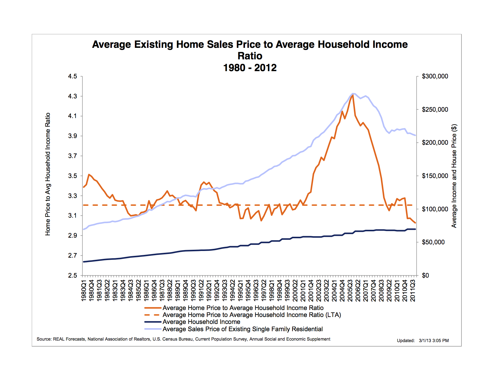
At the end of 2012, the ratio of the average existing home sales price of $225,400 to the average household income of $71,274 equaled 3.16, less than its long-term average of 3.21. Through the first three quarters of 2013, the average existing home sales price had increased to $243,233. Average household income for 2013 is not yet available. Even if we’re conservative and assume that average household income increased by only 1.5% through the first three quarters of 2013, the ratio has increased to only 3.36, slightly greater than the long-term average but well below the level reached at the height of the Housing Bubble.
Whence The Housing Bubble?
By Joseph Salerno
March, 2013
I have recently written that there are certain key indexes and ratios derived from Austrian business cycle theory that help us discern the development of bubbles in various sectors. As Mises wrote: “Only theory, business cycle theory, permits us to detect the wavy outline of a cycle in the tangled confusion of events.”
Jeff Peshut, an institutional real estate investment manager, has been kind enough to share with me a chart that he has developed that is useful in detecting a bubble in the housing market. His chart below shows the ratio of the average existing home sales price to average household income. The long term average (LTA) of this ratio has been slightly above 3.0. At the beginning of 2001, however, it began to rise rapidly, reaching a peak 33 percent higher than the LTA during 2005, and then declining precipitously back to its LTA during 2008.
Peshut’s chart also shows that, as of the beginning of 2012, Fed monetary policy had been unable to restart a bubble in the housing market unlike it had done in financial asset, farmland, and commodities markets. In fact housing prices were still falling both absolutely and in relation to household income. This is apparently beginning to change as it has recently been reported that the S&P/Case-Schiller Home Price Indices “showed that all three headline composites ended the year with strong gains. The national composite posted an increase of 7.3% for 2012. The 10- and 20-City Composites reported annual returns of 5.9% and 6.8% in 2012.” In contrast, national income rose by 4 percent and disposable personal income by about 2 percent year over year in 2012.
Joseph Salerno is academic vice president of the Mises Institute, professor of economics at Pace University, and editor of the Quarterly Journal of Austrian Economics. He has been interviewed in the Austrian Economics Newsletter and on Mises.org.