Where Are The Employment Markets In Their Cycles?
By Jeffrey J. Peshut
March 16, 2017
In a February 13, 2014 post titled What’s Next For Employment Growth?, RealForecasts.com demonstrated that changes in the growth rate of the True Money Supply (TMS) can accurately forecast changes in the growth rate of Total Employment. In a March 20, 2014 post titled Where Will Commercial Real Estate Returns Go From Here?, RealForecasts.com highlighted the strong correlation between the year-over-year growth rate of Total Employment and the annual returns from private-market real estate equity investments, as reflected in the NCREIF Property Index (NPI). Because of this strong correlation, forecasting changes in Total Employment can help us to forecast changes in the NPI Index. Before doing that, however, we need to first understand where the employment markets are in their current cycles.
Total Employment – Historical Perspective
U.S. Total Non-Farm Employment from 1978 through 2016 is shown in Figure 1.
Figure 1: Total Non-Farm Employment (000’s) 1978 – 2016
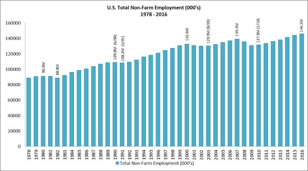
From its cyclical low of 127.8 million in January, 2010, Total Employment recovered to the previous cycle’s high of 139.3 million in mid-2014 and grew to this cycle’s high of 146.2 million at the end of 2016.
Figure 2 contains the year-over-year growth of U.S. Total Non-Farm Employment from 1978 through 2016. This chart clearly identifies the cycles in Total Employment over the past 40 years.
Figure 2: U.S. Total Non-Farm Employment (YOY%) 1978 – 2016
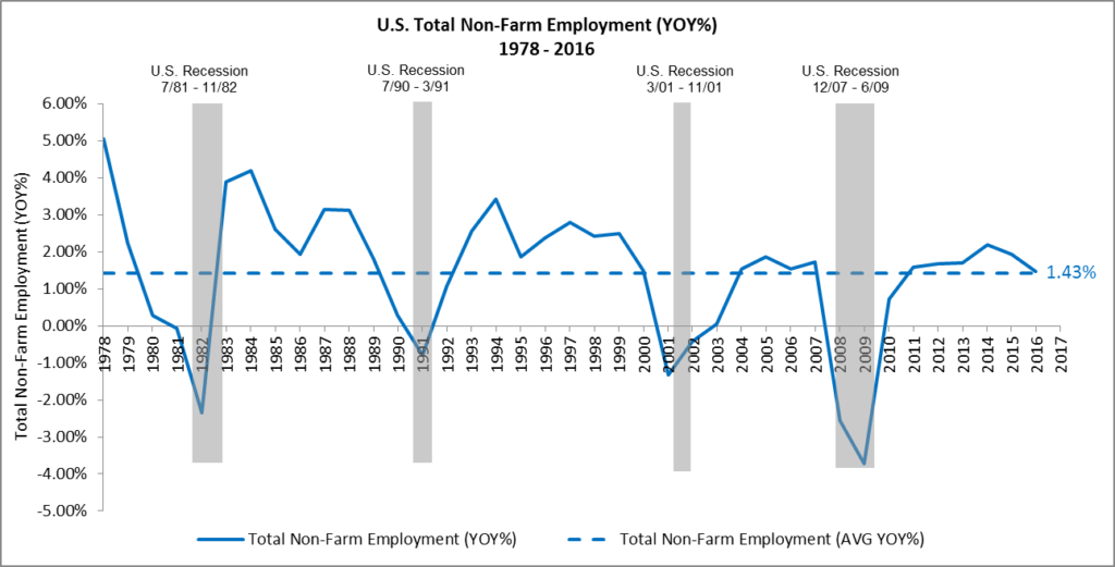
A few points worth noting. The year-over-year growth of Total Employment has averaged 1.43% since 1978. The greatest rate of growth occurred between 1982 and 1990 and 1991 and 2000. The growth rate between 2003 and 2008 and 2010 and 2017 has been modest in comparison, barely exceeding the 40-year average during those periods. For the current cycle, the Total Employment growth rate peaked at 2.19% in 2014 and has been decelerating since, finishing 2016 at 1.46%.
Because I live in Denver, Colorado and many followers of RealForecasts.com live here as well, I’ve included Total Non-Farm Employment for the Denver MSA in Figure 4.
Figure 3: Denver-Aurora-Lakewood Total Non-Farm Employment (000’s) 1990 – 2016
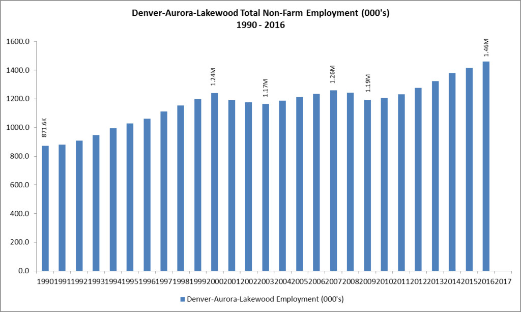
From its cyclical low of 1.19 million in 2009, Total Employment recovered to the previous cycle’s high of 1.26 million in 2012 and grew to this cycle’s high of 1.46 million at the end of 2016.
Figure 4 contains the year-over-year growth of Total Non-Farm Employment for the Denver MSA from 1990 through 2016. Once again, the cycles in Total Employment are quite evident.
Figure 4: Denver-Aurora-Lakewood Total Non-Farm Employment (YOY%) 1978-2016
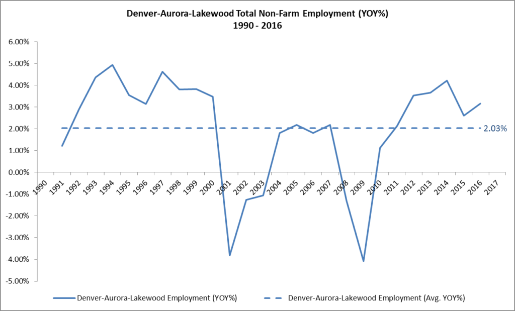
The year-over-year growth of Total Employment for the Denver MSA has averaged 2.03% since 1990. The greatest rate of growth occurred between 1991 and 2000 and between 2011 and 2016. For the current cycle, the Total Employment growth rate peaked at 4.22% in 2014 and had been decelerating before accelerating slightly in 2016.
Total Employment – Forecast
As demonstrated in previous posts, changes in the growth rate of the True Money Supply (TMS) can accurately forecast changes in the growth rate of Total Employment. Figure 5 presents the year-over-year growth of TMS from 1978 through 2016.
Figure 5: True Money Supply (YOY%) 1978 – 2016
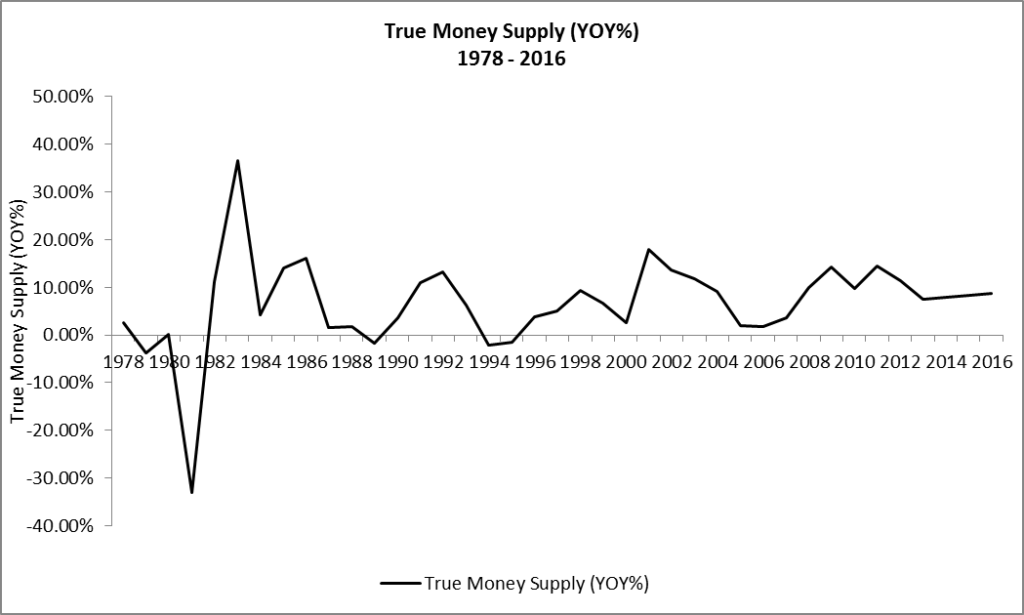
Since the end of QE3 in late 2013 and the end of the Fed’s Taper policy in late 2014, the growth rate of TMS has maintained a remarkably steady level of about 8% per year. Such a steady level of growth is unprecedented over the past 40 years.
Figure 6 compares changes in the growth rate of the True Money Supply (TMS) with changes in the growth rate of Total Employment.
Figure 6: U.S. Total Non-Farm Employment (YOY%) v. True Money Supply (YOY%) 1978 – 2016 Actual and 2017 – 2019 Forecast
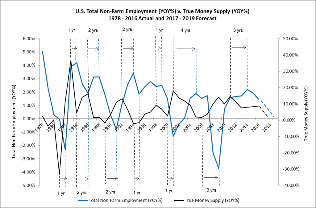
This chart demonstrates that peaks and troughs in the growth rate of Total Employment correlate strongly with peaks and troughs in the growth rate of TMS, with a lag of one to two years before the year 2000 and three to fours since then.
NCREIF Property Index – Forecast
A comparison of the growth rates in the total return for the NCREIF Property Index (NPI) is shown in Figure 7,
Figure 7: NPI Total Return v. U.S. Total Non-Farm Employment (YOY%) 1978 – 2016 Actual and 2017 – 2019 Forecast
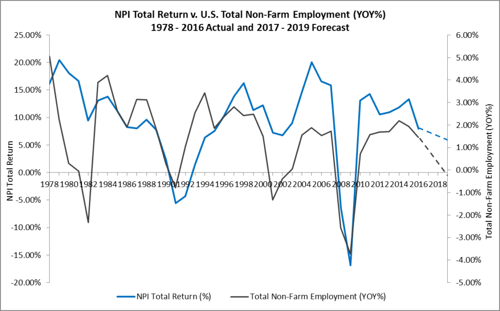
Once again, the peaks and troughs in the growth rate of the NPI correlate strongly with the peaks and troughs of Total Employment, with a slight lag. As goes Total Employment, so go private-market commercial real estate equity returns.
Conclusion
If we analogize between the employment cycles and the game of baseball, the data in the foregoing charts suggests that Total Employment is in the 8th or 9th inning of a nine-inning game. By extension, the NPI Total Return is also in the late innings of a nine-inning game. It seems likely, however, that the steady level of growth in TMS over the past few years could send both games into extra innings. To find out if we are in for extra innings, check back with RealForecasts.com for updates about the TMS growth rate.
Many thanks to Michael Pollaro at The Contrarian Take for providing the TMS data used in this post.