Category Archives: Uncategorized

Are We Eating Our Seed Corn?

By Jeffrey J. Peshut

March 30, 2014

The U.S. has a rich agricultural heritage. This heritage includes an expansive body of wit and wisdom in the form of aphorisms, admonitions and advice that have been accumulated by farmers over hundreds of years of plowing and tilling fields, planting and harvesting crops, milking cows, etc.

“Don’t eat your seed corn!” is one of these admonitions. In literal terms, it suggests that farmers who choose to consume the corn from this year’s harvest that they will need for planting next year — rather than saving it for planting — will reduce crop production in the next year. Figuratively speaking, it refers to living beyond our means today at the cost of reducing our standard of living tomorrow.

Austrian Business Cycle Theory

In its January 14th post titled Does The Federal Reserve Really Create The Boom/Bust Cycle?, RealForecasts.com explained how the Federal Reserve creates the boom/bust cycle by artificially expanding the supply of money and credit, lowering interest rates below their market or “natural” level and thereby creating an unsustainable economic boom which inevitably results in a bust. According To Austrian Business Cycle Theory, one of the negative consequences of the boom/bust cycle is that it depletes an economy’s pool of funding.

Dr. Frank Shostak, adjunct scholar of the Mises Institute (www.mises.org) and principal of Applied Austrian School Economics, Ltd (http://aaseconomics.com) has written extensively about the pool of funding. According to Dr. Shostak, the pool of funding is made up of all of the final products and services produced by an economy. In the case of an individual farmer, the pool of funding is made up of the farmer‘s entire corn harvest.

It is important to recognize that an economy’s pool of funding is produced to be consumed by individuals to support their standard of living, just as the individual farmer’s crop harvest is produced to be consumed by the farmer and his family to support their standard of living. Not all of the pool of funding can be consumed, however. For consumers to maintain their standard of living, they must save enough of the pool of funding to maintain the current level of production of final products and services. This is known as the economy’s pool of real savings – its “seed corn” if you will.

For consumers to improve their standard of living, an economy must increase its productive capacity and production. To increase the economy’s productive capacity, producers must invest in the production of better tools, equipment, machinery, etc. To make the resources available for investment, consumers must save more than the minimum required to simply maintain the current level of production. They must increase the size of the pool of real savings. Of course, to save more, they must consume less.

For example, to improve their standard of living, the farmer and his family must cut back on corn consumption today to save enough to invest in a better tractor, better farm implements to be used with the tractor or education to learn better farming techniques. These investments, in turn, will allow them to produce more corn in the future and raise their standard of living.

Thus we can see that the pool of funding can be used for either current consumption or saved and invested for future production.

It’s important to recognize that the use of money in an economy doesn’t change the essence of the pool of funding. Products and services are paid for with products and services – not with money. Money is simply a medium of exchange that facilitates the transactions. The farmer exchanges corn for money and then exchanges the money for boots. The boot maker exchanges his boots for money and then exchanges the money for corn. Ultimately, however, the farmer pays for the boots with the corn he produces and the boot maker pays for corn with the boots he produces.

So, how does the artificial expansion of the supply of money and credit, the lowering of the interest rate and the unsustainable boom and inevitable bust deplete the pool of funding? It depletes it in two ways.

When the Federal Reserve expands the money supply, it creates money out of “thin air”. The holder of the newly-created money can exchange it for final products and services in the pool of funding without having made a prior contribution of final products and services to the pool. They can consume without having produced. As a result, there are now less products and services left in the pool of funding than there were before the Fed expanded the money supply. The pool of funding has been partially depleted.

Also, when the Federal Reserve lowers interest rates below their market or “natural” level, it sends a misleading signal to producers about consumers’ true time preferences. As the Fed drives down interest rates, producers are led to believe that consumers are saving more today to consume more in the future and that now is the time to take advantage of the lower interest rates and invest in longer-term production projects for new products in the future. In fact, consumers haven’t said that they want to save more today and consume more in the future. Because the holders of the newly-created money used it to siphon off products and services from the pool of funding, consumers may demand more products and services today just to consume the same amount as the have been consuming.

Similarly, just because the Fed has decided to force interest rates down, it doesn’t mean that consumers want to invest more of their savings to complete future production capacity and future production. As suggested above, people may not only prefer to continue to consume the same amount of resources today, they may want to consume even more. This creates an unchanged or even shrinking pool of real savings from which to fund a growing number of new investment projects.

Something has got to give. The boom in economic growth precipitated by the artificial creation of money and credit and lower interest rates is not sustainable. The bust is inevitable.

The bust may occur because producers incorrectly forecasted future consumer demand for the future supply of their products and services. As a result, these projects will become unprofitable. It may also occur because producers incorrectly forecasted the size of the pool of real savings from which to complete their future projects and they won’t be able to complete them. It can even occur because the Fed decides to reverse its monetary policy – from a “loose” policy stance to a “tight” policy stance – based upon a concern about how the increase in the money supply will affect consumer prices, asset prices or the price of the dollar relative to other currencies. But occur it must.

Once the bust occurs, the market liquidates the unsustainable projects or “malinvestments”. All or part of the pool of real savings that was invested in these projects is lost or “consumed” by the unsustainable and unsuccessful projects. The result is a further depletion of the pool of funding.

According to Austrian Business Cycle Theory, then, the Fed’s intervention in the markets for money and credit creates the boom/bust cycle and depletes the pool of funding and the pool of real savings. To the extent the Fed’s intervention depletes the pool of real savings, we are in fact “eating our seed corn” and thereby reducing both producers’ ability to maintain and improve their productive capacity and production and consumers’ ability to maintain and improve their standard of living.

But does the data back this up?

Empirical Data

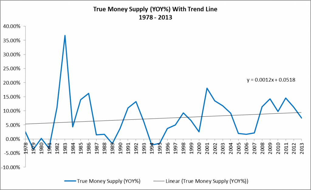
The chart in Figure 1 shows year-over-year percentage increases and decreases in the True Money Supply from 1978 through 2013. The positive slope of the trend line shows that, overall, the True Money Supply has been increasing at an increasing rate over the past 35 years.

Figure 1: True Money Supply (YOY%) With Trend Line 1978 – 2013

True Money Supply YOY With Trend Line 1978-2013

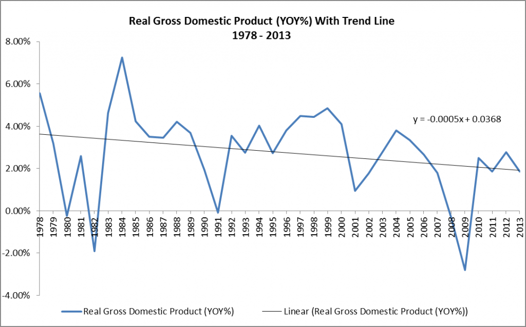
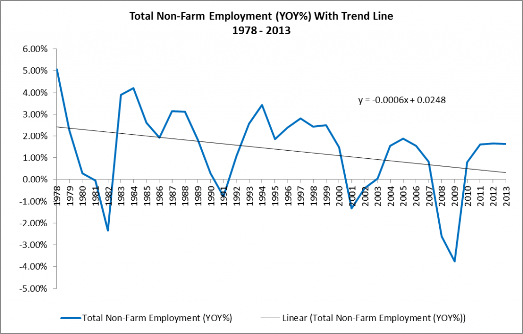
The charts in Figure 2 and Figure 3 show year-over-year percentage increases and decreases in the Real Growth Domestic Product and Total Non-Farm Employment, respectively, from 1978 through 2013.

The negative slope of the trend line in Figure 2 shows that, overall, Real Gross Domestic Product has been increasing at a decreasing rate over the past 35 years.

Figure 2: Real Gross Domestic Product (YOY%) With Trend Line 1978 – 2013

Real Gross Domestic Product YOY With Trend Line 1978 - 2013

Similarly, the negative slope of the trend line in Figure 3 shows that, overall, Total Non-Farm Employment has also been increasing at a decreasing rate over the past 35 years.

Figure 3: Total Non-Farm Employment (YOY%) With Trend Line 1978 – 2013

Total Non-Farm Employment YOY With Trend Line 1978 - 2013

The acceleration in the growth of the True Money Supply and the deceleration in the growth of the GDP and Total Non-Farm Employment supports the Austrian School’s view that the Fed’s intervention has in fact been depleting the pool of real savings in the U.S. — i.e., we have been “eating our seed corn” — and that this has reduced the ability of producers to maintain and improve their productive capacity and levels of production.

Say’s Law and the Permanent Recession

In Say’s Law and the Permanent Recession, Robert Blumen argues that the most recent recession, often called The Great Recession, actually began in 2000 and not in 2008 and that there has been little if any real economic growth in the U.S. since 2000:

John Williams, an economic statistician and the proprietor of the web site Shadowstats, has produced a version of the real GDP based on the government’s nominal GDP deflated by his own GDP deflator. (The GDP deflator is sort of like the CPI, a price index that is used to convert nominal GDP into real GDP. For some reason they don’t use the same price index for both consumer prices and for this). Like Williams’ own CPI, his GDP deflator is computed with older rules from before the time when the BLS began cooking the books to hide inflation. Williams’ measure of real GDP shows low to negative growth over the period since 2000.

Robert’s article further supports the Austrian School’s view presented by RealForecasts.com in this post.

Refilling Our Seed Corn Bins

To increase producers’ ability to maintain and improve their productive capacity and production — and consumers’ ability to maintain and improve their standard of living — the Federal Reserve must first stop creating money out of thin air and expanding the supply of money and credit, allow the market to liquidate the unsustainable projects or “malinvestments” and allow interest rates to return to their natural levels. Once this occurs, interest rates can begin to play their role of coordinating production over time — matching the production of goods and services with consumers’ true time preferences for consuming today or saving today and consuming tomorrow. The pool of funding and the pool of real savings will be replenished. Unlike a credit-fueled boom, which is unsustainable, savings-based growth is sustainable. Consequently, over time, the economy will gradually return to health.

Or, to paraphrase our metaphorical farmers with whom we began, we must “stop eating our seed corn” and begin refilling our seed corn bins.

As always, my thanks to J. Michael Pollaro of The Contrarian Take who provided the TMS data used to create the chart in Figure 1.
Where Will Commercial Real Estate Returns Go From Here?

By Jeffrey J. Peshut

March 20, 2014

On January 24, the National Council of Real Estate Investment Fiduciaries (NCREIF) released results for the NCREIF Property Index (NPI) for the fourth quarter of 2013. The NPI reported a Total Return for the quarter of 2.53%, comprised of a 1.34% Income Return and a 1.19% capital Appreciation Return. For the year, the NPI returned 10.98%, which included an Income Return of 5.61% and an Appreciation Return of 5.16%. A potential real estate investor may want to see how they too can make a profit this way and add to their real estate portfolio. There are many potential ways that this can be done, however, nowadays this can be achieved by looking to invest in real estate using EFT’s (in Immobilien mit ETFs investieren) which goes to show how the digital market has had an effect on the sector.

NCREIF is an association of professionals involved with private-market real estate equity investments owned by pension funds, who come together to promote research on the asset class and address important industry issues. www.NCREIF.org The NPI consists of a portfolio of 7,029 investment-grade, income-producing apartment, office, retail, industrial and hotel properties with a year-end market value of approximately $354 billion. The NPI includes property data from over 195 Metropolitan Statistical Areas (MSAs). Overall, these investments are rather significant and have a great ROI for many investors. So much so, some investors are looking into other areas of real estate investments, such as in dst 1031 property, to see if the same returns are available in that sector too.

NCREIF Property Index – Historical Perspective

Since its inception in 1978, the NCREIF Property Index has reported a Total Return of 9.15%, made up of an Income Return of 7.52% and an Appreciation Return of 1.54%.

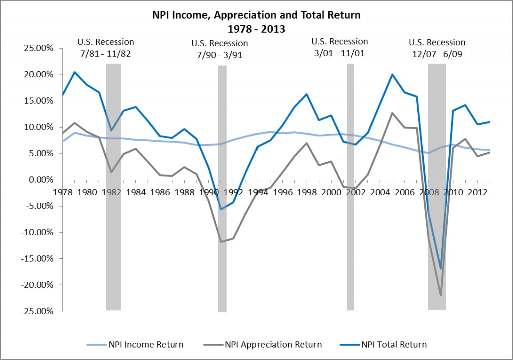
After returning 15.85% in 2007, the NPI Total Return declined to – 6.46% in 2008 and – 16.85% in 2009. Total Return for 2008 was comprised of an Income Return of 5.13% and an Appreciation Return of -11.15%. The impact of The Great Recession was even more pronounced in 2009, with an Income Return of 6.17%, but an Appreciation Return of -21.98%.

In response to the Fed’s first and second rounds of Quantitative Easing, the NPI rebounded in 2010 with a positive return of 13.11% The NPI has been on an impressive run since, posting Total Returns of 14.26%, 10.54% and 10.98% for 2011, 2012 and 2013, respectively. See Figure 1.

Figure 1: NPI Income, Appreciation and Total Return 1978 – 2013

NPI Income Appreciation and Total Returns  1978 - 2013

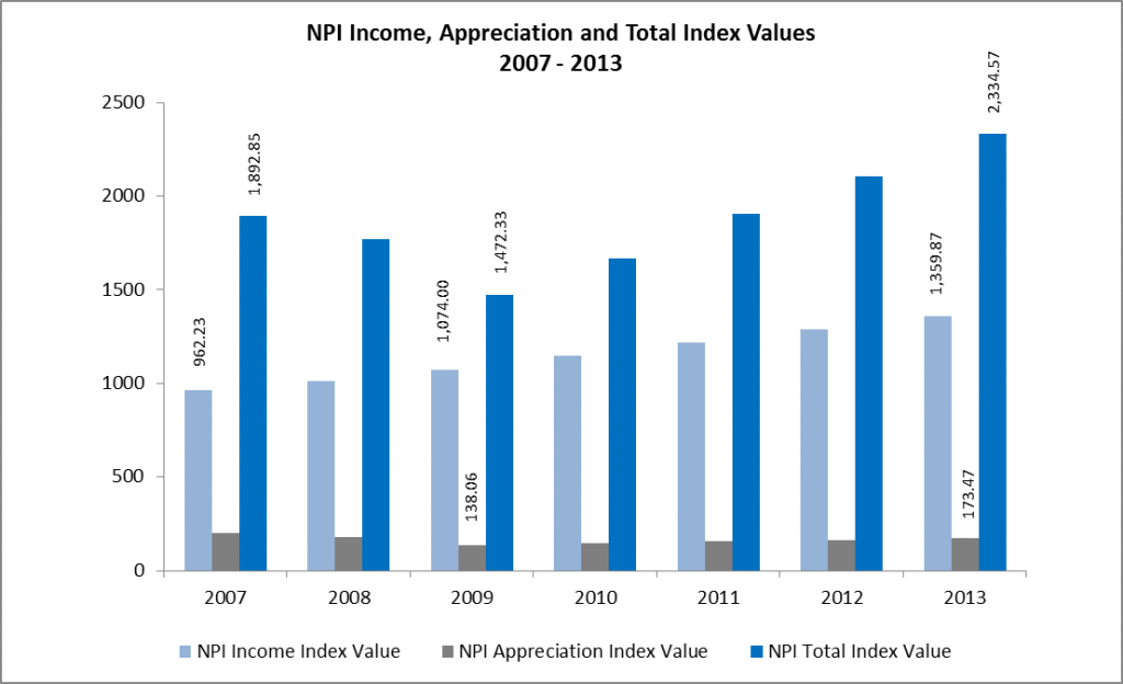
Notwithstanding this impressive run, the Appreciation Index Value for the fourth quarter of 2013 of 173.47 is still 12.9% below the Appreciation Index Value of 199.16 reported for the fourth quarter of 2007. This puts into perspective just how far the Appreciation Index Value had fallen by the end of 2009.

The Income Index Value for the fourth quarter of 2013 of 1359.87, on the other hand, is 41,1% above the fourth quarter of 2007 Income Index Value of 962.3.

Based upon the positive contribution of the Income Index Value, the Total Index Value for the fourth quarter of 2013 of 2,334.57 is 23.3% above the fourth quarter of 2007 Total Index Value of 1,892.85, resulting in an average annual Total Return since the end of 2007 of approximately 3.9%. See Figure 2.

Figure 2: NPI Income, Appreciation and Total Index Values 2007 – 2013

NPI Income Appreciation and Total Index Values  2007 - 2013

NCREIF Property Index – Forecast

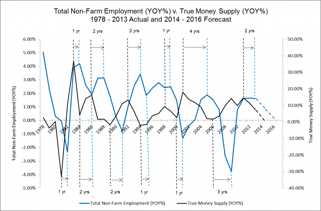
In its February 13th post titled What’s Next For Employment Growth?, RealForecasts.com pointed out that the rate of growth of the True Money Supply (TMS) has been slowing over the past two years and forecasted that it will continue to slow as the Federal Reserve reduces its bond purchases, euphemistically referred to by the Fed as “tapering”. By extrapolating the TMS’s current trajectory into the future, RealForecasts.com forecasted that TMS growth should approach zero in early 2015, setting the stage for the next credit crisis near the end of 2015 or the beginning of 2016.

Based upon a one-year lag between TMS growth and Employment growth since 2009, RealForecasts.com also forecasted that the growth of Employment will begin to decelerate in 2014 and expects it to approach zero in the 2015 to 2016 timeframe. See Figure 3.

Figure 3: Total Non-Farm Employment (YOY%) v. True Money Supply (YOY%) 1978 – 2013 Actual and 2014 – 2016 Forecast

Total Non-Farm Employment YOY v. True Money Supply YOY  1978 - 2013

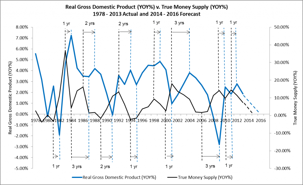
In its March 4th post titled Will GDP Growth Continue To Lose Momentum?, RealForecasts.com identified a similar one-year lag between TMS growth and GDP growth since 2009 and forecasted that the growth rate of GDP should continue to lose momentum and approach zero in early 2016. See Figure 4.

Figure 4: Real Gross Domestic Product (YOY%) v. True Money Supply (YOY%) 1978 – 2013 Actual and 2014 – 2016 Forecast

Real Gross Domestic Product YOY v. True Money Supply YOY 1978 - 2013

It won’t be much of a surprise to real estate investment industry veterans that there is a strong correlation between Employment and GDP growth rates and the NPI Returns. After all, employees occupy apartment, office and hotel properties and products fill industrial and retail properties! Those looking to get into real estate investment may want to check out the 1031 exchange broker to get started with this specific area of investment, diversify their portfolio, and improve their income-growth potential. Of course, there are plenty of other tools to invest in if you are looking to get your real estate business off the ground. These can be tools like CRM or lead generation. You can also look in to Real Estate Back Office to help you organise your transactions, and to streamline your productivity.

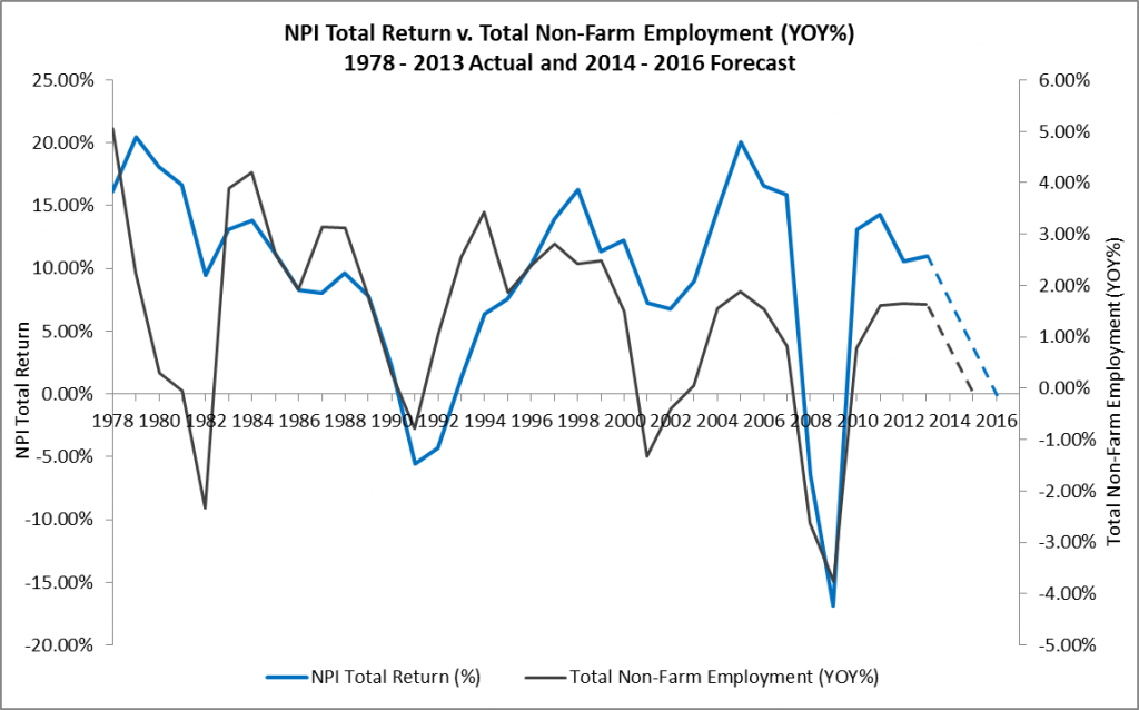
The correlation between NPI Total Return and the Employment growth rate is illustrated in Figure 5. The peaks and troughs of the NPI Total Return closely follow the peaks and troughs of YOY change in Employment, with a slight lag during some time periods.

Figure 5: NPI Total Return v. Total Non-Farm Employment (YOY%) 1978 – 2013 Actual and 2014 – 2016 Forecast

NPI Total Return v. Total Non-Farm Employment YOY 1978 - 2013A and 2014 - 16F

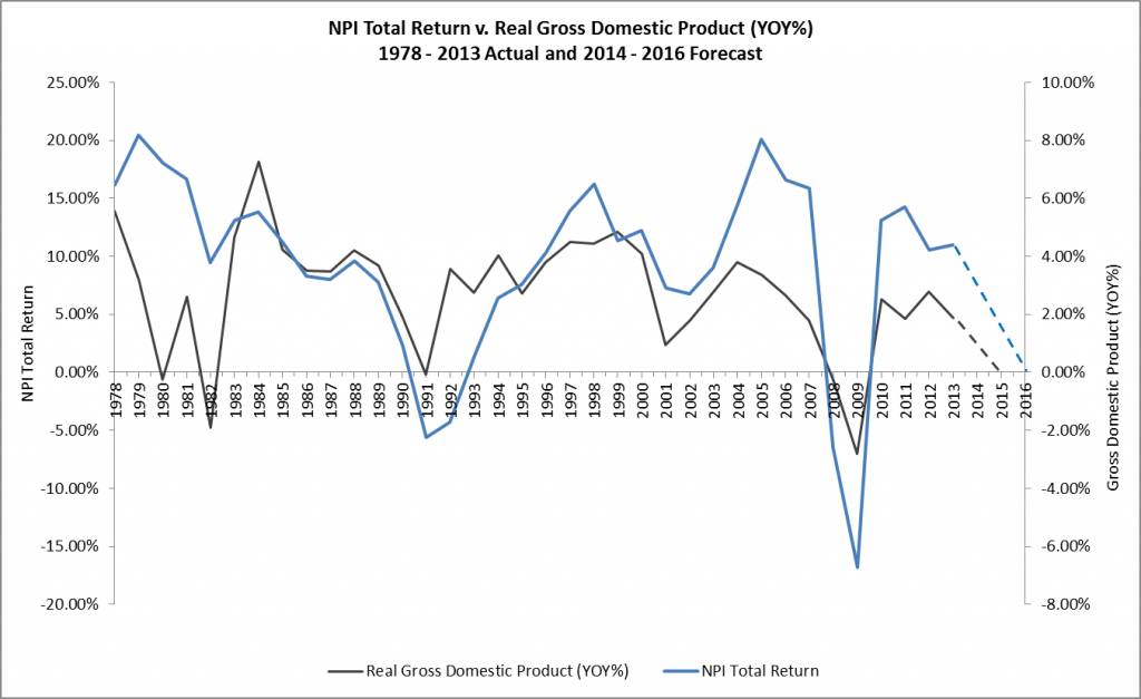
Similarly, the correlation between NPI Total Return and the GDP growth rate is illustrated in Figure 6. The peaks and troughs of the NPI Total Return closely follow the peaks and troughs of the YOY change in Real Gross Domestic Product, but without a lag.

Figure 6: NPI Total Return v. Real Gross Domestic Product (YOY%) 1978 – 2013 Actual and 2014 – 2016 Forecast

NPI Total Return v. Real Gross Domestic Product YOY 1978 - 2013A and 2014 - 2016F

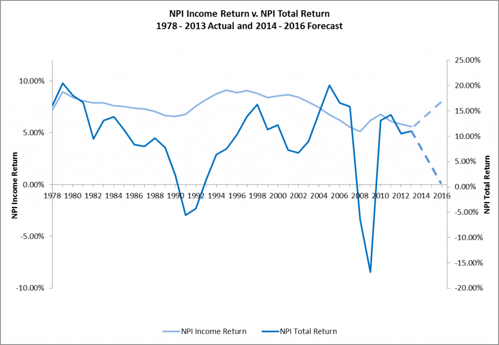
Finally, shortly after the NPI Total Return begins a cyclical decline, the NPI Income Return turns upward. Real estate values and cap rates — for which the NPI Income return can be viewed as a proxy – are inversely related. This occurred during 2008 and 2009 and would have continued in 2010 and beyond if the Fed had not forced yields back down through its quantitative easing policy. Now that the Fed is reducing its bond purchases with the aim of ending quantitative later this year, the NPI Income Return will likely resume the trajectory it was on before the Fed’s intervention. See Figure 7.

Figure 7: NPI Income Return v. NPI Total Return 1978 – 2013 Actual and 2014 – 2016 Forecast

NPI Income Return v. NPI Total Return 1978 - 2013 Actual and 2014 - 2016 Forecast

As with the forecasts contained in RealForecasts.com’s two previous posts, the current forecast is predicated on the Fed’s continuation of its current policy to gradually reduce the amount of bond purchases until it ends quantitative easing later this year. Because continuation of the Fed’s current policy is likely, this forecast represents RealForecasts.com’s base case scenario. To prepare for possible changes in the TMS, Employment and GDP growth rates — and the NCREIF Property Index returns — RealForecast.com recommends that readers continue to keep a close watch on the Fed’s actions as 2014 unfolds.

Many thanks to J. Michael Pollaro, author of The Contrarian Take, for the TMS data used to construct the charts in this article.

Whence The Housing Bubble?

Editor’s Note: RealForecasts.com is re-publishing a blog post titled “Whence The Housing Bubble?”, originally posted by Joseph Salerno on Circle Bastiat on March 5, 2013.

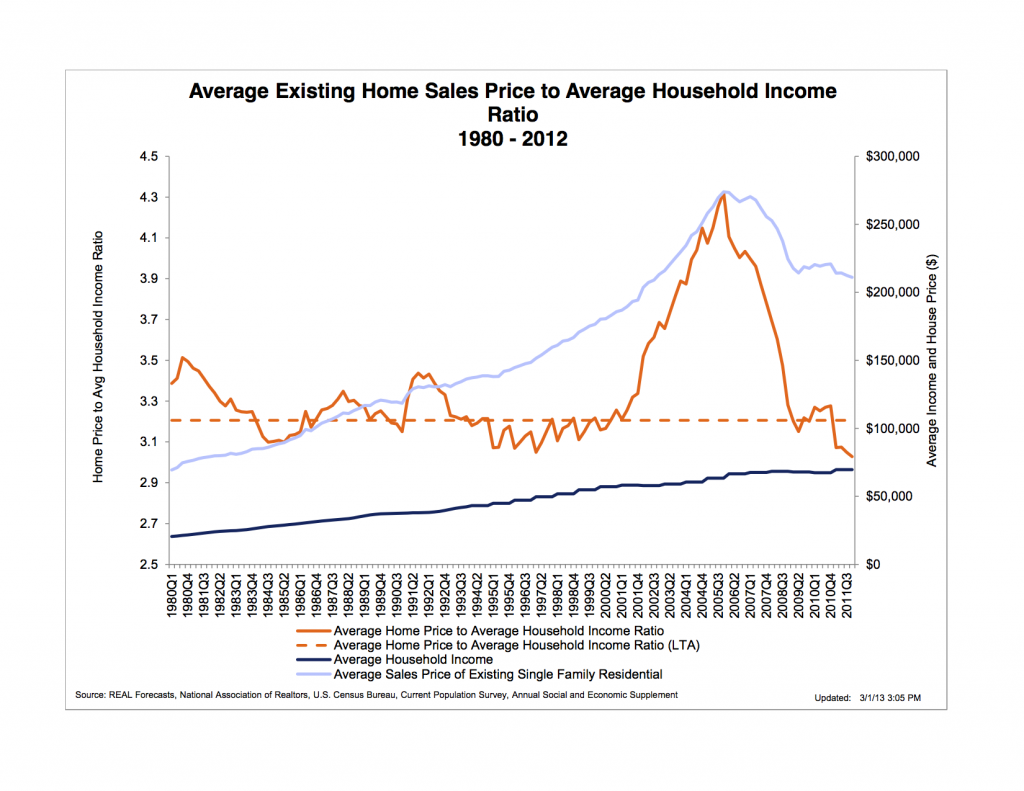
At the end of 2012, the ratio of the average existing home sales price of $225,400 to the average household income of $71,274 equaled 3.16, less than its long-term average of 3.21. Through the first three quarters of 2013, the average existing home sales price had increased to $243,233. Average household income for 2013 is not yet available. Even if we’re conservative and assume that average household income increased by only 1.5% through the first three quarters of 2013, the ratio has increased to only 3.36, slightly greater than the long-term average but well below the level reached at the height of the Housing Bubble.

Whence The Housing Bubble?

By Joseph Salerno

March, 2013

I have recently written that there are certain key indexes and ratios derived from Austrian business cycle theory that help us discern the development of bubbles in various sectors. As Mises wrote: “Only theory, business cycle theory, permits us to detect the wavy outline of a cycle in the tangled confusion of events.”

Jeff Peshut, an institutional real estate investment manager, has been kind enough to share with me a chart that he has developed that is useful in detecting a bubble in the housing market.  His chart below shows the ratio of the average existing home sales price to average household income. The long term average (LTA) of this ratio has been slightly above 3.0. At the beginning of 2001, however, it began to rise rapidly, reaching a peak 33 percent higher than the LTA during 2005, and then declining precipitously back to its LTA during 2008.

Peshut’s chart also shows that, as of the beginning of 2012, Fed monetary policy had been unable to restart a bubble in the housing market unlike it had done in financial asset, farmland, and commodities markets. In fact housing prices were still falling both absolutely and in relation to household income. This is apparently beginning to change as it has recently been reported that the S&P/Case-Schiller Home Price Indices “showed that all three headline composites ended the year with strong gains. The national composite posted an increase of 7.3% for 2012. The 10- and 20-City Composites reported annual returns of 5.9% and 6.8% in 2012.” In contrast, national income rose by 4 percent and disposable personal income by about 2 percent year over year in 2012.

Average-Home-Price-To-Household-Income-Ratio-02-13-1

Joseph Salerno is academic vice president of the Mises Institute, professor of economics at Pace University, and editor of the Quarterly Journal of Austrian Economics. He has been interviewed in the Austrian Economics Newsletter and on Mises.org.