Category Archives: Real Estate

What Does The Dramatic Deceleration In The Growth Of The True Money Supply Mean For Real Estate Investors?

By Jeffrey J. Peshut

February 21, 2018

On February 5, 2018, Jerome Powell was sworn in as the 16th Chair of the Board of Governors of the Federal Reserve System. Powell succeeded Janet Yellen, who was sworn in as Fed Chair on February 3, 2014, a little more than a month after the Federal Reserve ended its asset purchase program commonly referred to as Quantitative Easing or “QE” for short.

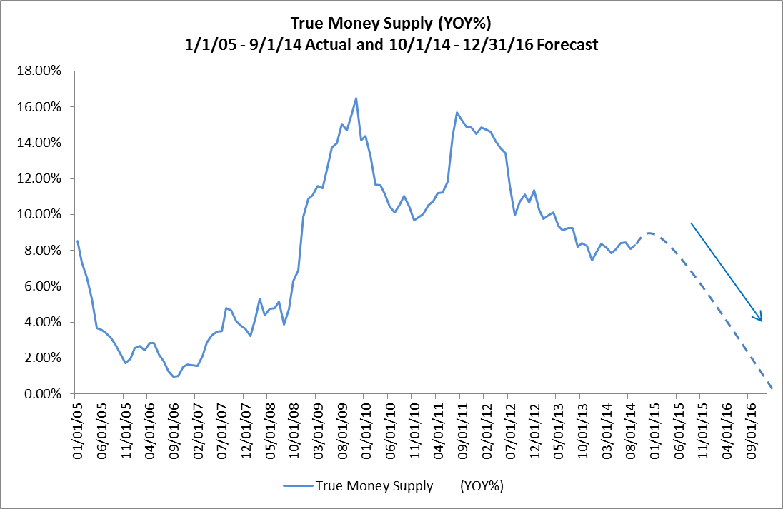
In November of 2014, in response to the end of Quantitative Easing and Janet Yellen’s appointment as Fed Chair, RealForecasts.com published a post titled How Will The End Of Quantitative Easing Impact The True Money Supply Growth Rate? In that post, RealForecasts.com forecasted a deceleration in the growth of the True Money Supply (TMS) from about 9% year-over-year (YOY) at the beginning of 2015 to 0% YOY at the end of 2016.

This post will update the actual growth rate of TMS since the end of QE and explain what it means to real estate investors like those you can find on this site. It will also provide some possible strategies that real estate investors can adopt in response to changing economic and real estate market conditions. Some real estate investors may want to build upon their financial backing to make sure they are working with the market fluctuations. They may want to look at investing in Bitcoin by gaining some advice from people who have already gone into it and have checked out helpful articles such as – Bitcoin Superstar Erfahrungen to keep them steady with their investments and to see what the risks are.

True Money Supply Growth Rate Since The End of Quantitative Easing

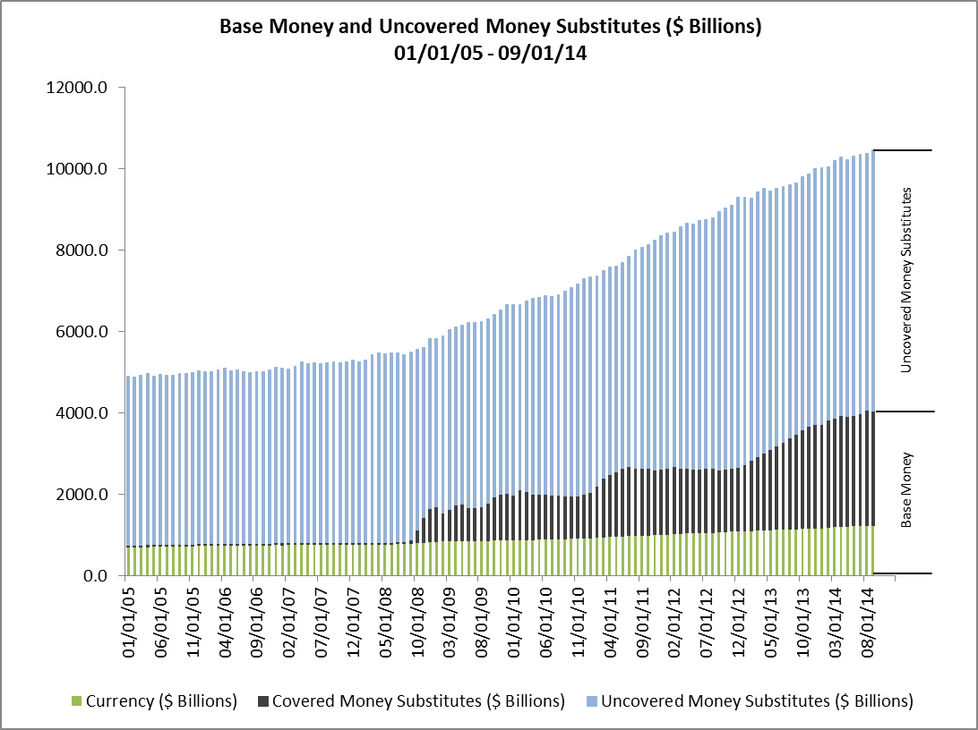
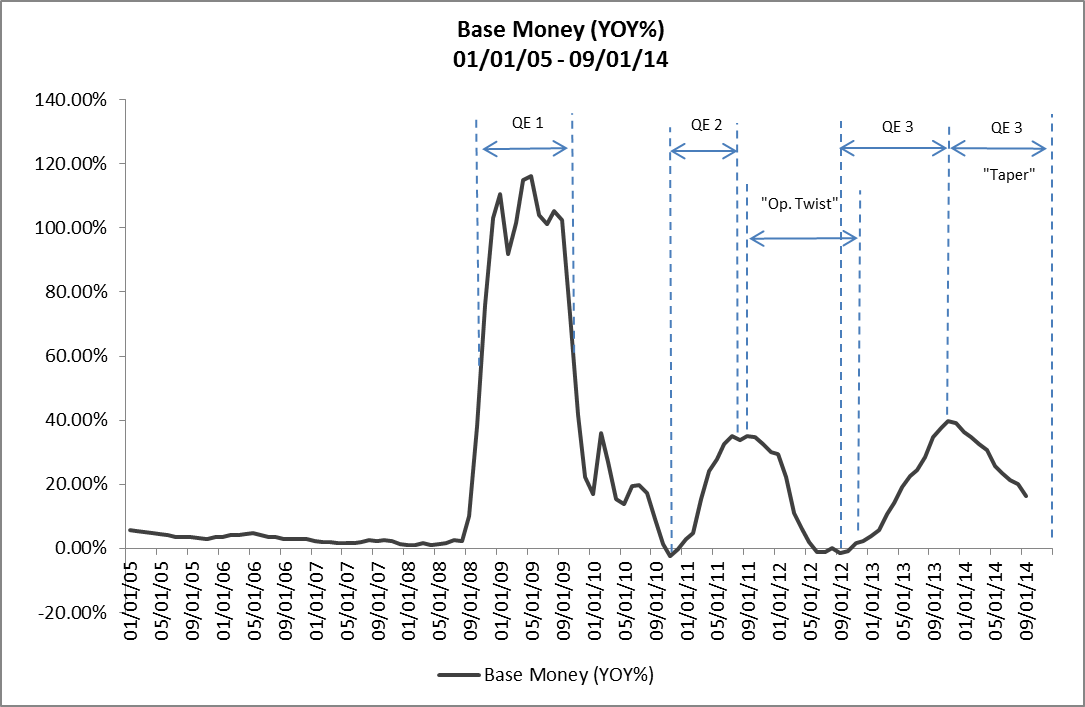
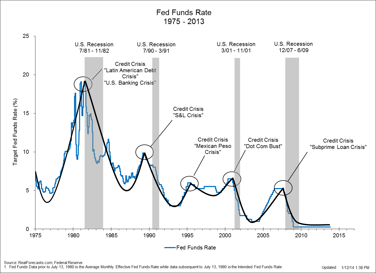
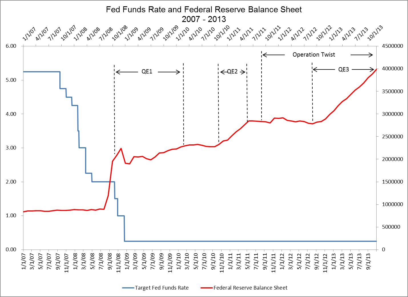
As suggested above, the Federal Reserve ended Quantitative Easing in December of 2013. Two years later, in December of 2015, the Fed began raising the Fed Funds Target Rate — with an initial increase from .25% to .50%. This was the first time that the Fed had raised the Fed Funds Rate since June of 2006.

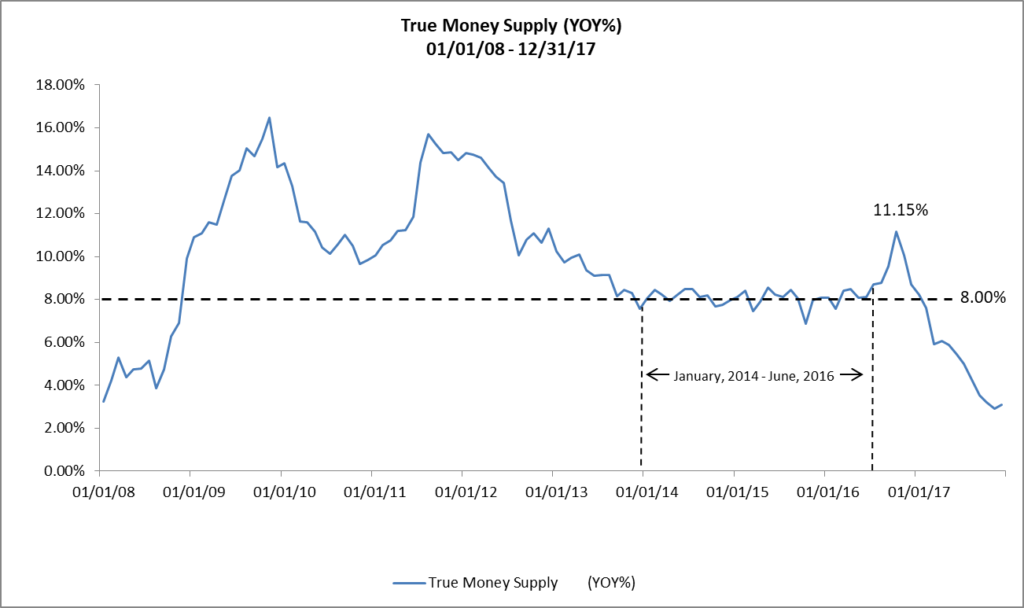
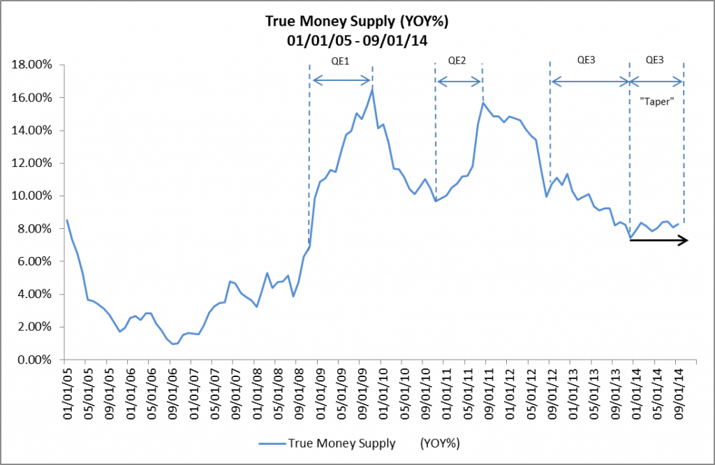
During this two-year period, TMS grew at a remarkably consistent rate of about 8% YOY. The steady growth of TMS continued during the first half of 2016 and even accelerated briefly to 11.15% YOY in October of 2016. (See Figure 1.)

Figure 1: True Money Supply (YOY%) 01/01/08 – 12/31/17

In December of 2016, and in March, June and December 2017, the Fed continued to increase the Fed Funds Rate in 25 bps increments to its current rate of 1.50%.

Moreover, on September 20, 2017, the Fed announced that it would begin to reduce the $4.5 trillion balance sheet that it had amassed during QE by selling $10 billion of assets each month from October through December of 2017, $20 billion per month from January through March of 2018, $30 billion per month from April through June of 2018, $40 billion per month from July through October 2018 and $50 billion per month from October through December of 2018 for total sales of $450 billion by the end of 2018. The Fed also announced plans to raise the Fed Funds Rate three more times during 2018 to end the year above 2 %.

In response to the Fed’s increasingly tighter monetary stance, the growth rate of TMS has decelerated dramatically, from 11.15% YOY in October of 2016 to 3.10% YOY in December of 2017.

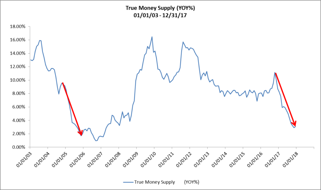
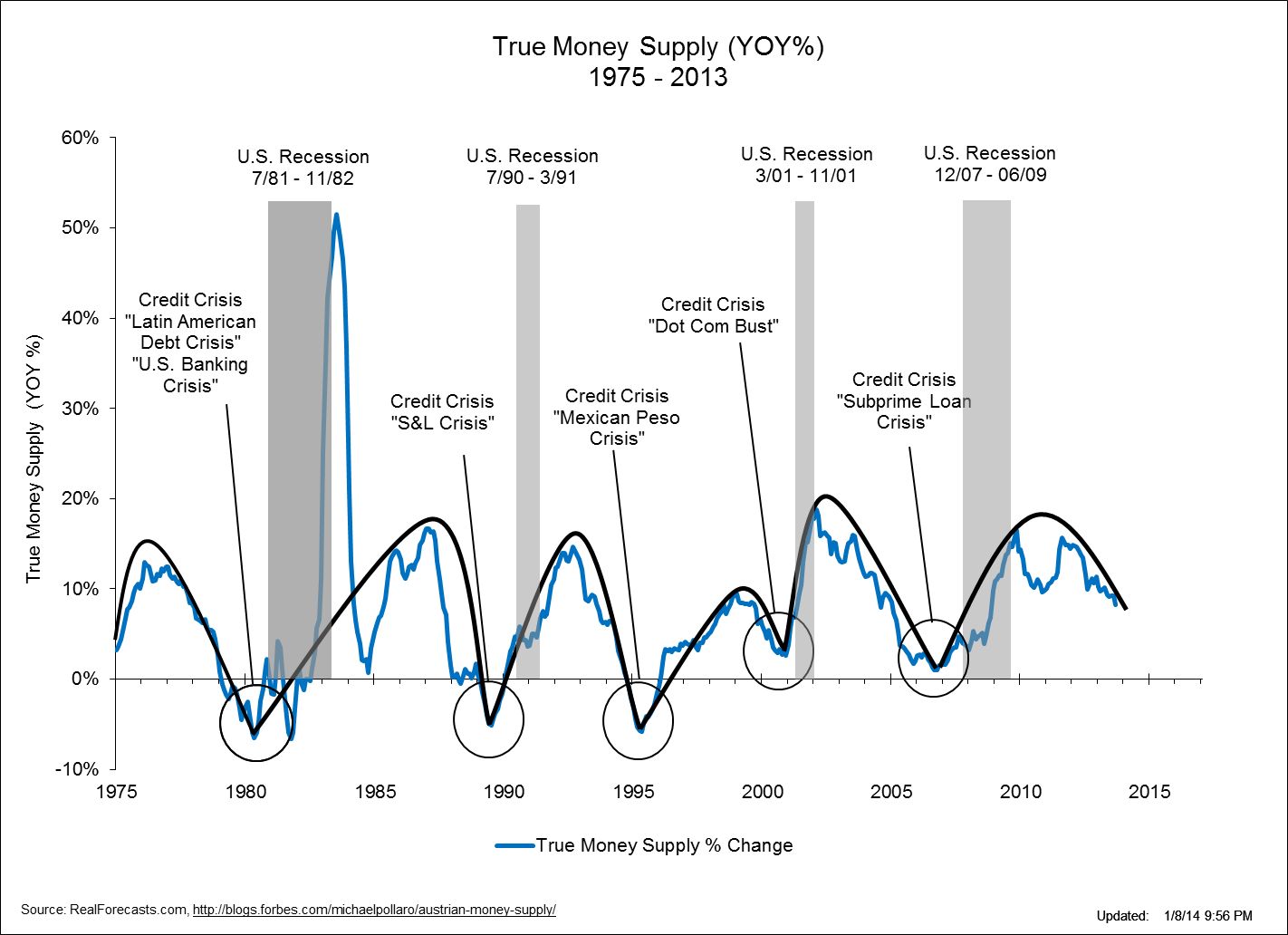
This is the same magnitude of deceleration that RealForecasts.com had forecasted in November of 2014, but because the Fed unexpectedly delayed its decision to begin raising the Fed Funds Rate and reduce its balance sheet, it occurred about a year later than expected. Note that this is the most dramatic deceleration during a period of monetary tightening since TMS decelerated from 9.54% YOY in October of 2004 to 1.71% YOY in November of 2005. (See Figure 2.) In that case, after accelerating slightly from December of 2005 to April of 2006, the TMS growth rate decelerated to its cyclical low of ,98% YOY in September of 2006.

Figure 2: True Money Supply (YOY%) 01/01/03 – 12/31/17

If the Fed sticks with its plans to continue to both raise the Fed Funds Rate and reduce its balance sheet during 2018, it’s easy to see that the growth of TMS could grind to a halt and even begin to contract later this year.

What Does This Mean For Real Estate Investors?

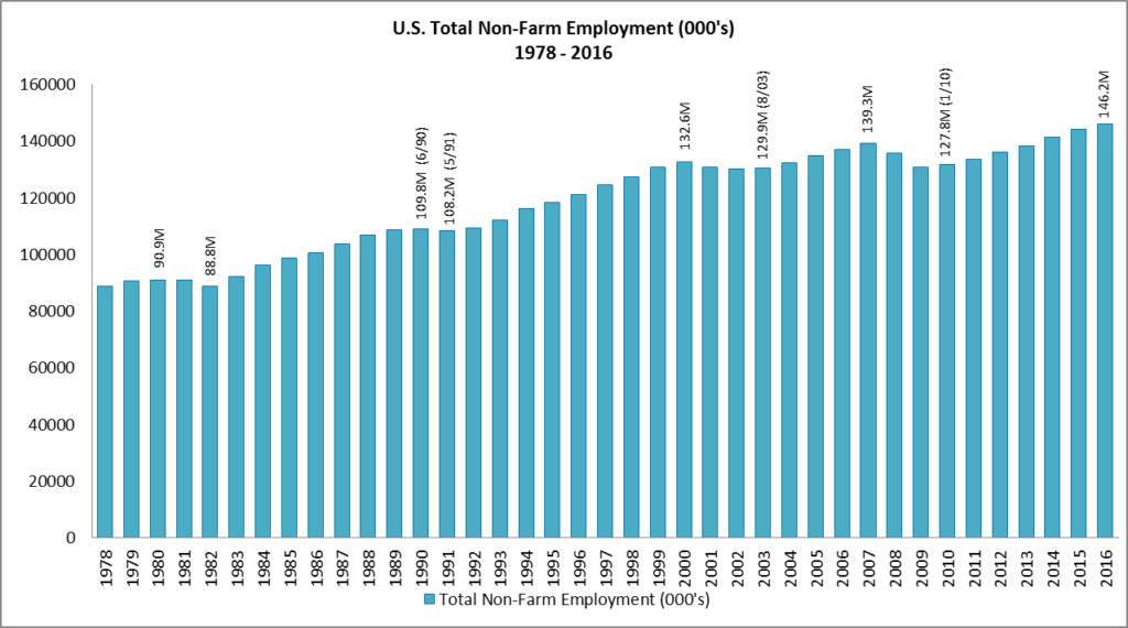
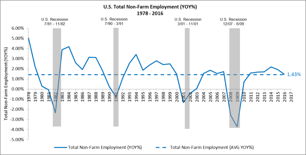
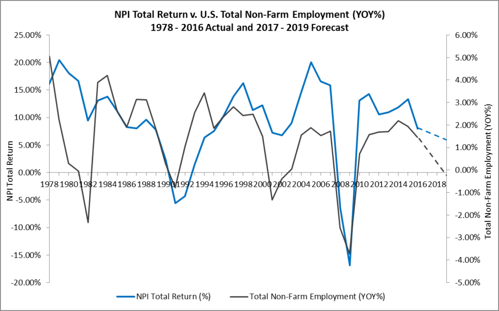
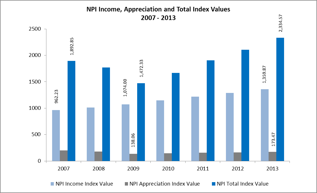
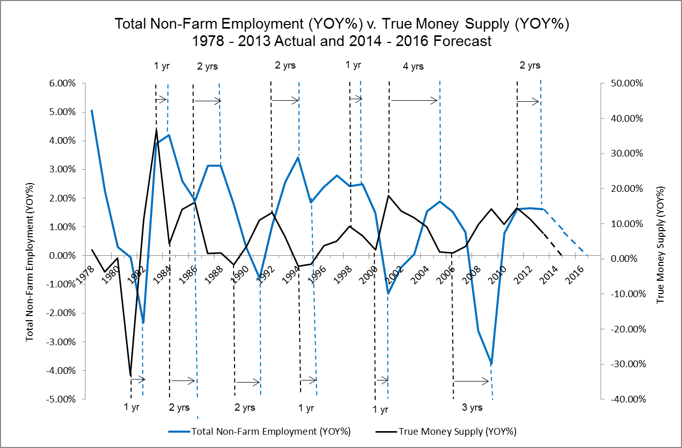
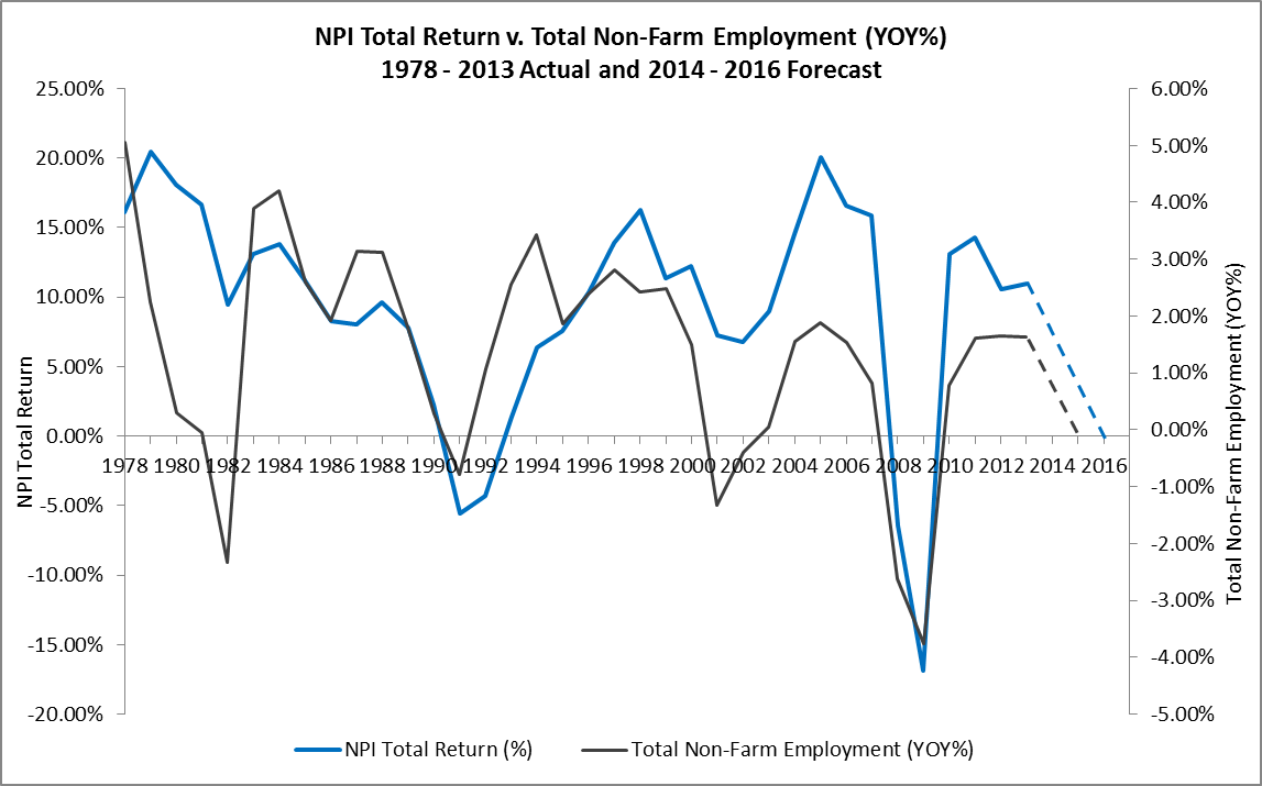
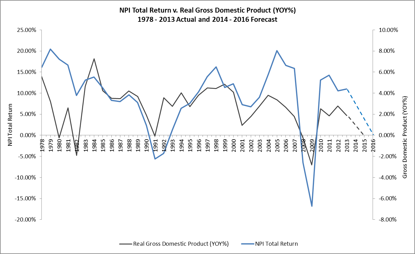
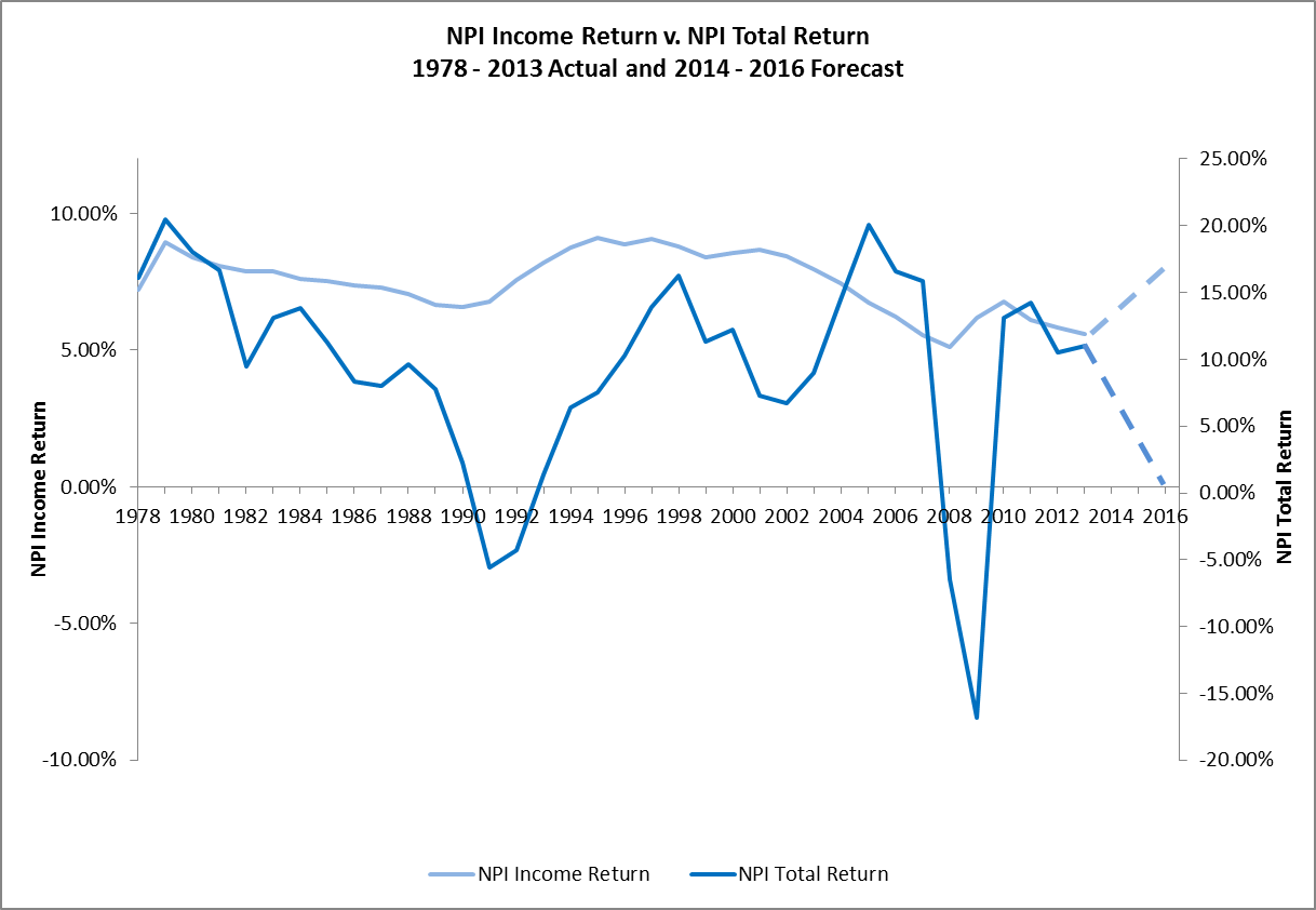
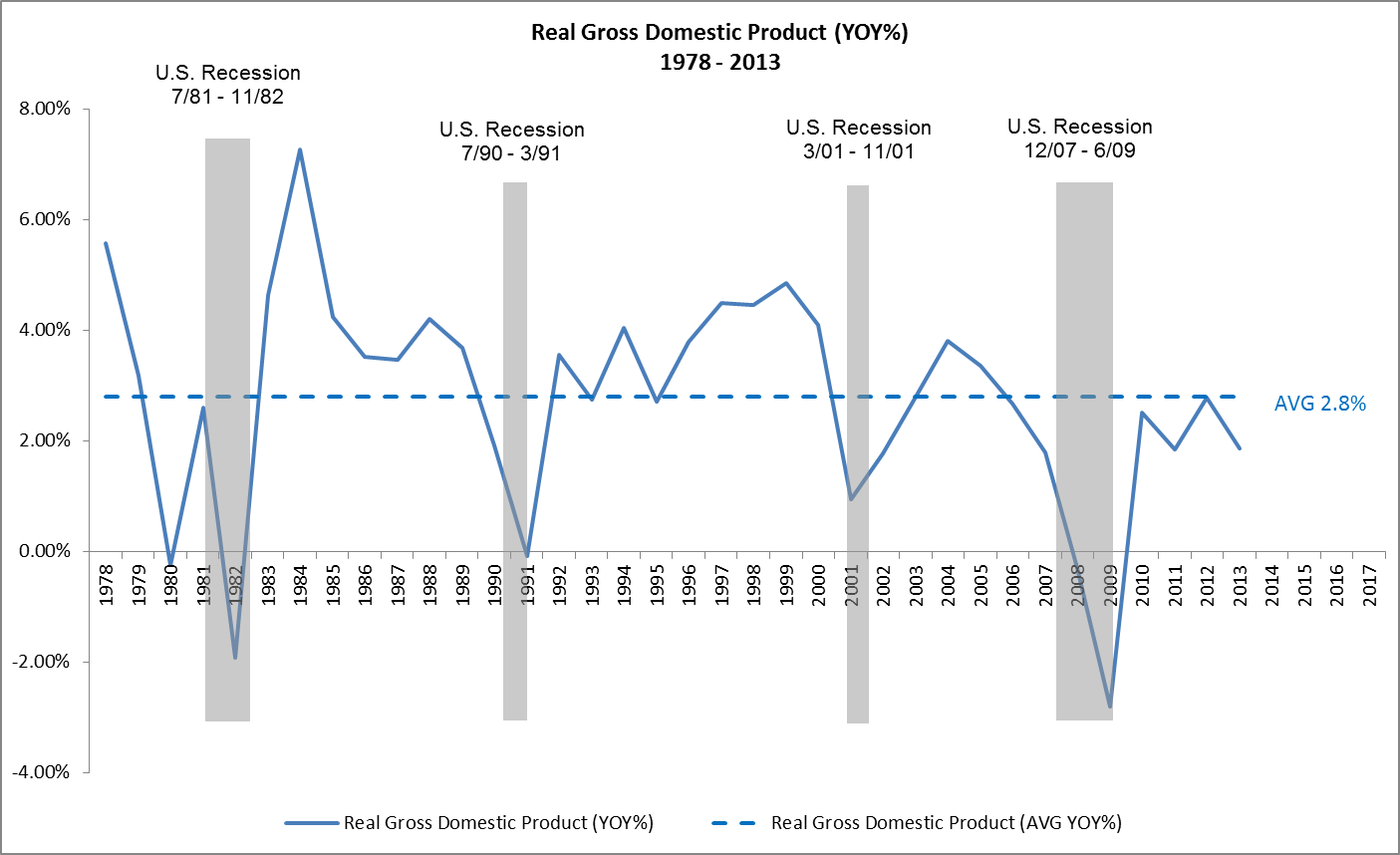
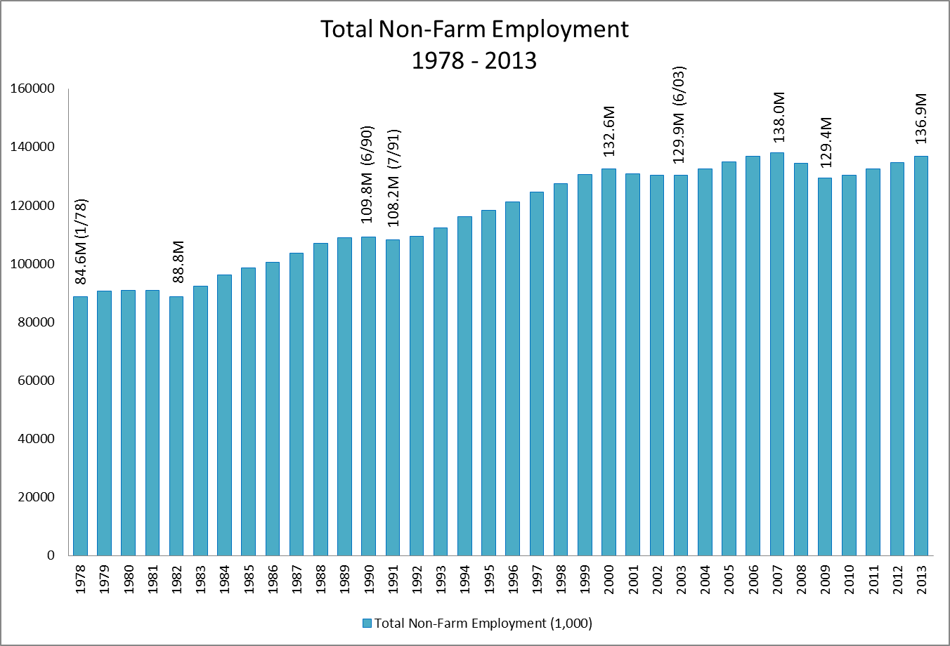
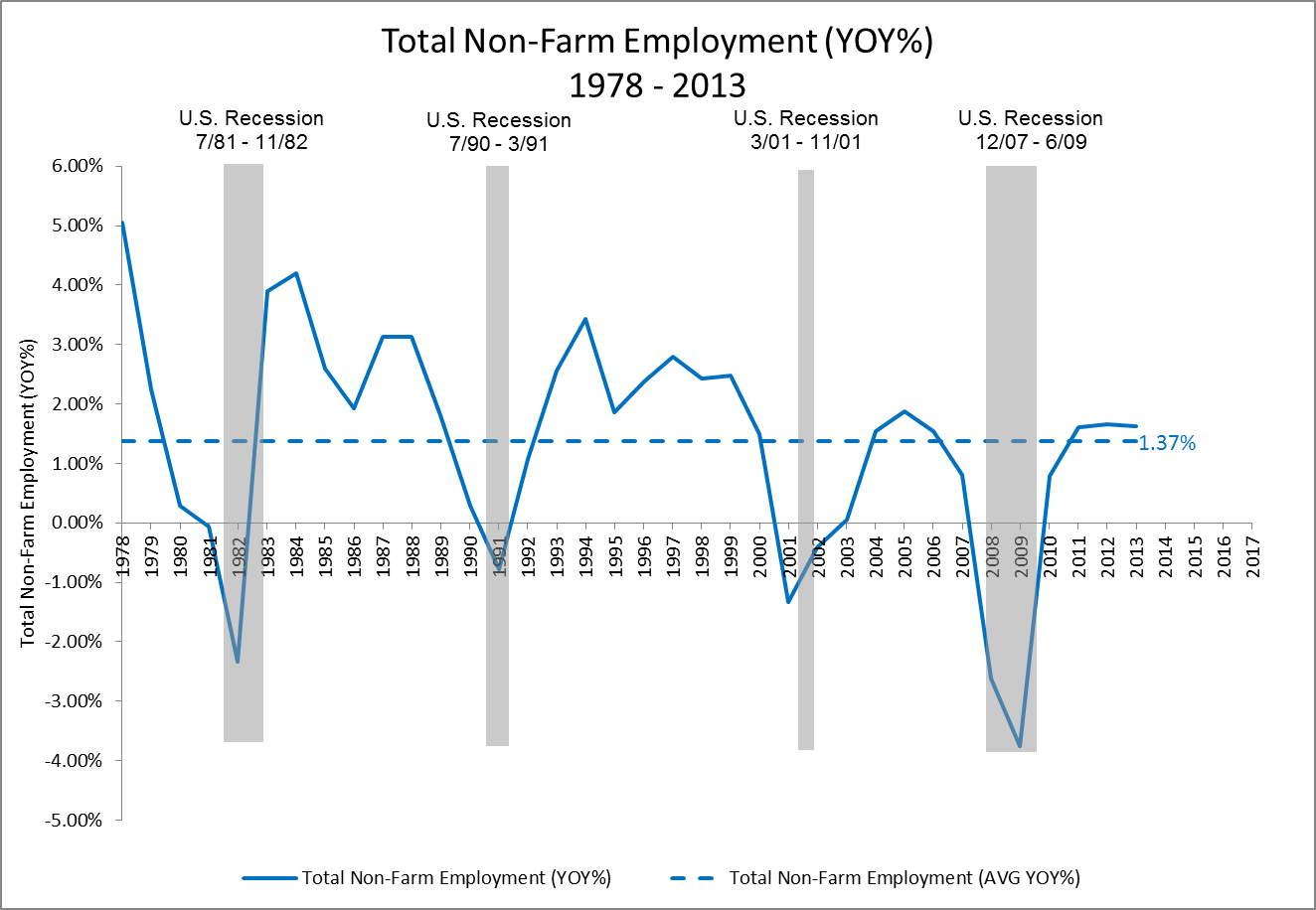
In previous posts such as Where Are The Employment Markets In Their Cycles? and Where Will Commercial Real Estate Returns Go From Here?, RealForecasts.com demonstrated that changes in the TMS growth rate can accurately forecast changes in the growth rate of Total Employment. Further, because of the the strong correlation between the YOY growth rate of Total Employment and the annual returns from private-market real estate equity investments, as reflected in the NCREIF Property Index (NPI), changes in Total Employment can help us to forecast changes in the NPI.

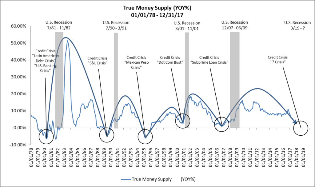
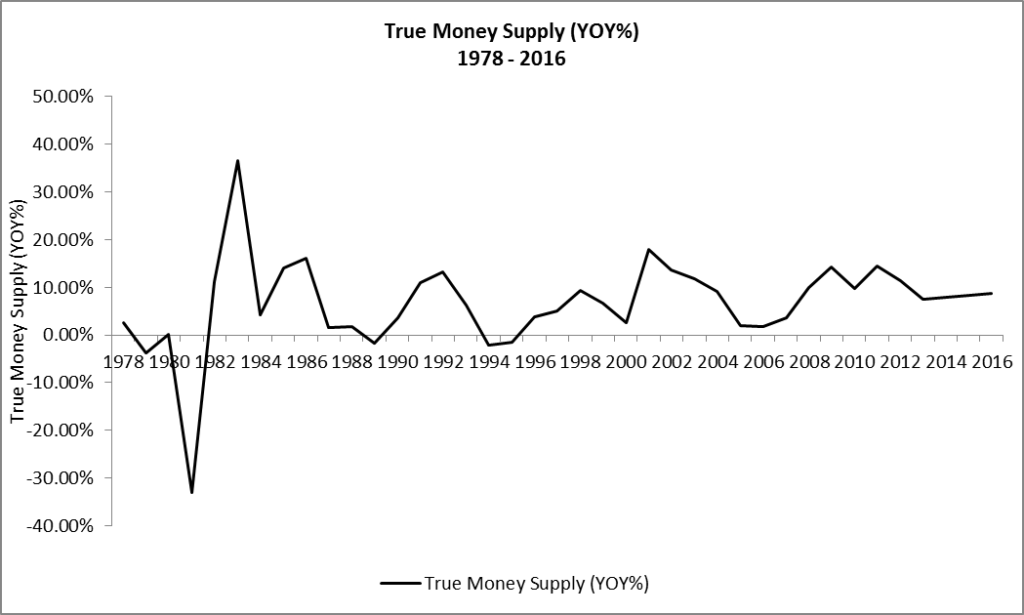
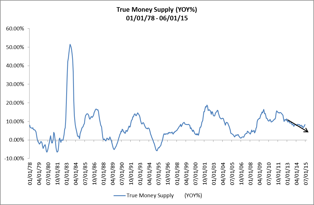
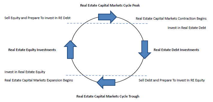
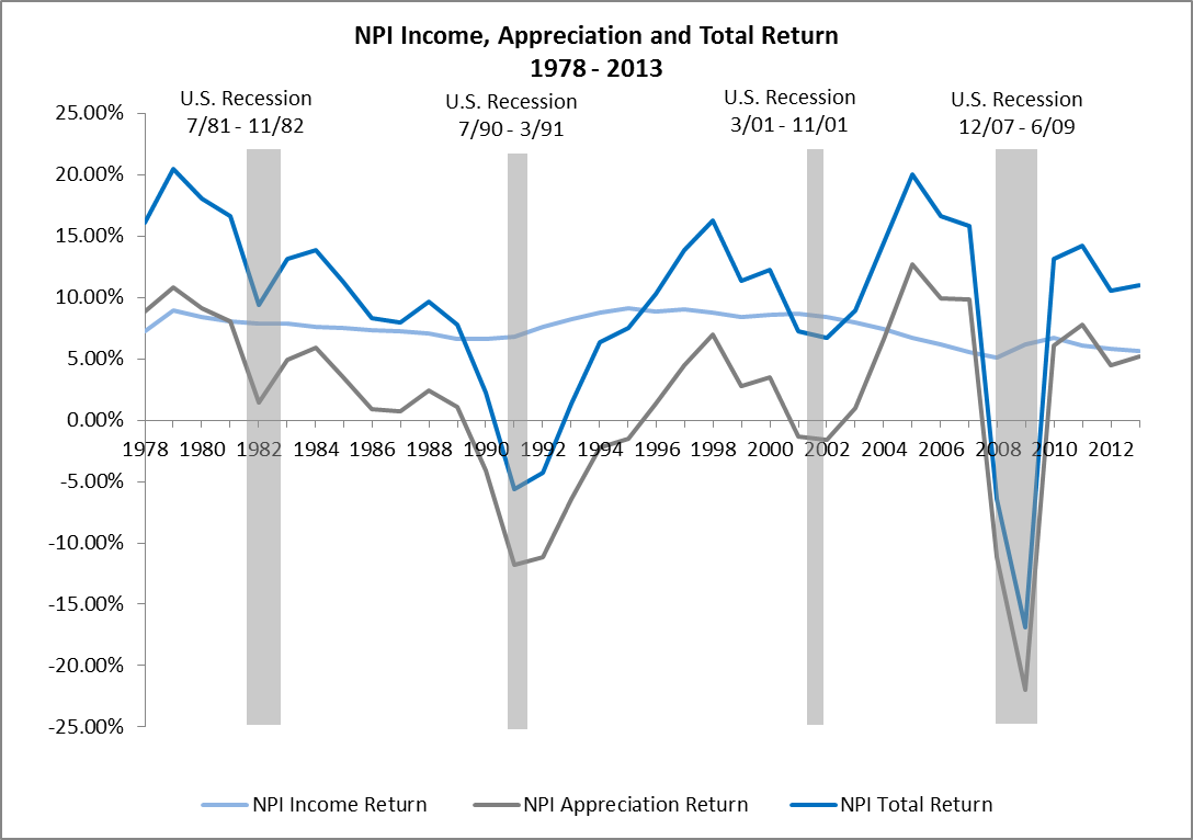
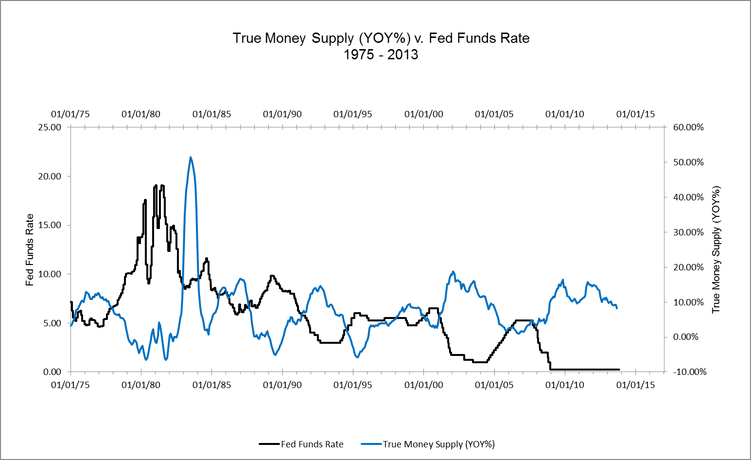
Figure 3 shows the acceleration and deceleration of the expansion — and sometimes contraction — of TMS dating back to 1978. Note that in each TMS expansion and contraction cycle, the Fed maintained a tight policy stance until a credit and liquidity crisis occurred. Also, an economic recession typically occurred shortly after the credit and liquidity crisis. Finally, of particular note is the length of the loose policy stance in the current cycle and, until recently, the slow pace of tightening since the end of QE.

Figure 3: True Money Supply (YOY%) 01/01/78 – 12/31/17

RealForecasts.com expects that the growth of TMS will continue its downward trend in the months ahead, as the Federal Open Market Committee continues to raise the Fed Funds Target Rate and reduce its balance sheet. Based upon the current trajectory of this trend, and the Fed’s current policy stance, it looks like the next credit and liquidity crisis could occur during the second half of 2018, with an economic recession and real estate market downturn to follow. Of course, this forecast could change if the Fed changes its policy stance or if the commercial banks change their pace of lending activity.

In the meantime, real estate investors would be wise to take advantage of the still robust capital markets environment to begin selling some of their under-performing and less-strategic assets and using the proceeds to reduce the leverage on their remaining properties and portfolios. Whether the current climate makes any attempt to buy luxury homes MacDonald highlands unpalatable remains to be seen. By “dealing from the bottom of the deck” and reducing leverage, they will be improving the risk profile of their portfolios in anticipation of – and not in reaction to – the next credit and liquidity crisis, economic recession and real estate market downturn.

Many thanks to Michael Pollaro at The Contrarian Take for providing the TMS data used in this post.

Where Are The Employment Markets In Their Cycles?

By Jeffrey J. Peshut

March 16, 2017

In a February 13, 2014 post titled What’s Next For Employment Growth?, RealForecasts.com demonstrated that changes in the growth rate of the True Money Supply (TMS) can accurately forecast changes in the growth rate of Total Employment.  In a March 20, 2014 post titled Where Will Commercial Real Estate Returns Go From Here?, RealForecasts.com highlighted the strong correlation between the year-over-year growth rate of Total Employment and the annual returns from private-market real estate equity investments, as reflected in the NCREIF Property Index (NPI).  Because of this strong correlation, forecasting changes in Total Employment can help us to forecast changes in the NPI Index.  Before doing that, however, we need to first understand where the employment markets are in their current cycles.

Total Employment – Historical Perspective

U.S. Total Non-Farm Employment from 1978 through 2016 is shown in Figure 1.

Figure 1: Total Non-Farm Employment (000’s)  1978 – 2016

From its cyclical low of 127.8 million in January, 2010, Total Employment recovered to the previous cycle’s high of 139.3 million in mid-2014 and grew to this cycle’s high of 146.2 million at the end of 2016.

Figure 2 contains the year-over-year growth of U.S. Total Non-Farm Employment from 1978 through 2016.  This chart clearly identifies the cycles in Total Employment over the past 40 years.

Figure 2: U.S. Total Non-Farm Employment (YOY%)  1978 – 2016 

A few points worth noting.  The year-over-year growth of  Total Employment has averaged 1.43% since 1978.  The greatest rate of growth occurred between 1982 and 1990 and 1991 and 2000.  The growth rate between 2003 and 2008 and 2010 and 2017 has been modest in comparison, barely exceeding the 40-year average during those periods.  For the current cycle, the Total Employment growth rate peaked at 2.19% in 2014 and has been decelerating since, finishing 2016 at 1.46%.

Because I live in Denver, Colorado and many followers of RealForecasts.com live here as well, I’ve included Total Non-Farm Employment for the Denver MSA in Figure 4.

Figure 3: Denver-Aurora-Lakewood Total Non-Farm Employment (000’s)  1990 – 2016

From its cyclical low of 1.19 million in 2009, Total Employment recovered to the previous cycle’s high of 1.26 million in 2012 and grew to this cycle’s high of 1.46 million at the end of 2016.

Figure 4 contains the year-over-year growth of Total Non-Farm Employment for the Denver MSA from 1990 through 2016.  Once again, the cycles in Total Employment are quite evident.

Figure 4: Denver-Aurora-Lakewood Total Non-Farm Employment (YOY%) 1978-2016

The year-over-year growth of  Total Employment for the Denver MSA has averaged 2.03% since 1990.  The greatest rate of growth occurred between 1991 and 2000 and between 2011 and 2016.  For the current cycle, the Total Employment growth rate peaked at 4.22% in 2014 and had been decelerating before accelerating slightly in 2016.

Total Employment – Forecast

As demonstrated in previous posts, changes in the growth rate of the True Money Supply (TMS) can accurately forecast changes in the growth rate of Total Employment.  Figure 5 presents the year-over-year growth of TMS from 1978 through 2016.

Figure 5: True Money Supply (YOY%)  1978 – 2016

Since the end of QE3 in late 2013 and the end of the Fed’s Taper policy in late 2014, the growth rate of TMS has maintained a remarkably steady level of about 8% per year.  Such a steady level of growth is unprecedented over the past 40 years.

Figure 6 compares changes in the growth rate of the True Money Supply (TMS) with changes in the growth rate of Total Employment.

Figure 6: U.S. Total Non-Farm Employment (YOY%) v. True Money Supply (YOY%) 1978 – 2016 Actual and 2017 – 2019 Forecast

This chart demonstrates that peaks and troughs in the growth rate of Total Employment correlate strongly with peaks and troughs in the growth rate of TMS, with a lag of one to two years before the year 2000 and three to fours since then.

NCREIF Property Index – Forecast

A comparison of the growth rates in the total return for the NCREIF Property Index (NPI) is shown in Figure 7,

Figure 7: NPI Total Return v. U.S. Total Non-Farm Employment (YOY%)  1978 – 2016 Actual and 2017 – 2019 Forecast

Once again, the peaks and troughs in the growth rate of the NPI correlate strongly with the peaks and troughs of Total Employment, with a slight lag.  As goes Total Employment, so go private-market commercial real estate equity returns.

Conclusion

If we analogize between the employment cycles and the game of baseball, the data in the foregoing charts suggests that Total Employment is in the 8th or 9th inning of a nine-inning game.  By extension, the NPI Total Return is also in the late innings of a nine-inning game.  It seems likely, however, that the steady level of growth in TMS over the past few years could send both games into extra innings.  To find out if we are in for extra innings, check back with RealForecasts.com for updates about the TMS growth rate.

Many thanks to Michael Pollaro at The Contrarian Take for providing the TMS data used in this post.

Where Are The Real Estate Credit Markets In Their Cycles?

By Jeffrey J. Peshut

September 14, 2015

In its last post, Can Real Estate Investors Manage Through The Boom/Bust Cycle?, RealForecasts.com presented alternative strategies that real estate investors can employ to manage through the boom/bust cycle, depending upon where the real estate capital markets and real estate property markets are in their cycles.  That of course begs the question, “Where are the real estate capital markets and real estate property markets in their cycles today?” This post will address the question of where one sector of the real estate capital markets — the real estate credit markets — are in their cycles.

Real Estate Credit Market Cycles

The real estate credit markets can be divided into three separate categories — commercial mortgage debt, multi-family residential mortgage debt and and single-family residential mortgage debt. RealForecasts.com uses changes in the level of mortgage debt outstanding to track the cycle for each category.

For example, Figure 1 shows commercial mortgage debt outstanding from 1978 to 2014. The last cycle for commercial mortgage debt began in 1995 at a level of $733.8 billion before peaking in 2008 at a level of $2.58 trillion. As the supply of credit contracted after the Great Financial Crisis, commercial mortgage debt outstanding also contracted, reaching a trough of $2.23 trillion — and the end of the cycle — in 2012. Since the start of the current cycle in 2013, commercial mortgage debt outstanding has increased to $2.39 trillion, but has yet to recover to its 2008 peak.

Figure 1: Commercial Mortgage Debt Outstanding ($ Billions) 1978 – 2014

Commercial Mortgage Debt Outstanding - $B- 1978 to 2014

The year-over-year growth rate of commercial mortgage debt outstanding since 1978 is shown in Figure 2. The rate of growth averaged 7.26% from 1978 to 2014. but accelerated to almost 15% in both 1999 and 2005.

Figure 2: Commercial Mortgage Debt Outstanding (YOY%) 1978 – 2014

Commercial Mortgage Debt Outstanding - YOY - 1978 to 2014

Figure 3 presents multifamily mortgage debt outstanding between 1978 and 2014. The last cycle for multifamily mortgage debt began in 1994 at a level of $268.2 billion and increased to a peak of $855.2 billion in 2009. After the Great Financial Crisis, however, multifamily mortgage debt outstanding decreased only slightly to $852.2 billion in 2010. Multifamily mortgage debt began increasing again — and the new cycle began — in 2011 and had reached $998.6 billion as of the end of 2014.

Figure 3: Multifamily Mortgage Debt Outstanding ($ Billions) 1978 – 2014

Multi-Family Mortgage Debt Outstanding - $B - 1978 - 2014

Figure 4 presents the year-over-year growth rate of multifamily mortgage debt since 1978. Although the rate of growth averaged only 6.1% from 1978 to 2014. growth accelerated to 12.2% in 1999 and 2007 and 15% in 2003.

Figure 4: Multifamily Mortgage Debt Outstanding (YOY%) 1978 – 2014

Multi-Family Mortgage Debt Outstanding - YOY - 1978 - 2014

Finally, Figure 5 shows single family mortgage debt outstanding from 1978 to 2014. The most recent cycle for single family mortgage debt began in 1995 at a level of $3.45 trillion before peaking in 2007 at a level of $11.24 trillion — an increase of 226%. Single family mortgage debt outstanding contracted significantly after the Great Financial Crisis, decreasing to $9.89 trillion at the end of 2014. At this point, it’s not clear whether the last cycle has ended and the new cycle has begun. Regardless, it will still be a number of years before single family mortgage debt outstanding returns to its 2007 peak.

Figure 5: Single Family Mortgage Debt Outstanding ($ Billions) 1978 – 2014

Single Family Mortgage Debt Outstanding - $B - 1978 - 2014

Figure 6 presents the year-over-year growth rate of single family mortgage debt outstanding since 1978. Not only did the rate of growth average almost 8% from 1978 to 2014. growth accelerated to as high as 15.5% in 1985 and 14.3% in 2004. Perhaps even more importantly, in the last year of the cycle that ended in 1995, single family mortgage debt outstanding never contracted and in fact grew at a rate of 5.1%.

Figure 6: Single Family Mortgage Debt Outstanding (YOY%) 1978 – 2014

Single Family Mortgage Debt Outstanding - YOY - 1978 - 2014

Comparing Figure 6 to Figure 4 and Figure 2 shows that the multifamily mortgage market is much farther along in its current cycle than either the commercial mortgage market or the single family mortgage market. The marked difference in size between the single family mortgage debt market and the multifamily mortgage debt market — the single family mortgage debt market is approximately 10 times the size of the multifamily mortgage debt market — may help to explain the accelerated growth in multifamily mortgage debt outstanding since 2010.

Government Sponsored Enterprises (GSE’s) like Fannie Mae and Freddie Mac are not only the largest source of lending capital for single-family homes, but they are also the largest source of lending capital for apartment homes. The Fed’s attempt to re-inflate the single-family residential market by acquiring residential mortgage-backed securities from Fannie Mae and Freddie Mac has arguably had the unintended consequence of flooding the multifamily residential market with an over-abundance of inexpensive mortgage debt. This in turn could result in the over-building and over-supply of apartment homes.

Real Estate Credit Market Cycles and Cap Rate Cycles

Recently, real estate pundits have been speculating about the impact of the Fed’s expected increase in the Fed Funds Target Rate on real estate mortgage rates and real estate cap rates. Mostly overlooked in this discussion is the impact of an increase in the level of mortgage debt outstanding on cap rates.

To that point, Figure 7 compares the NCREIF Property Index (NPI) Income Return — as a proxy for cap rates on commercial and multifamily properties — to commercial and multifamily mortgage debt outstanding from 1978 to 2014. Note the strong inverse correlation between the NPI Income Return and the level of commercial and multifamily residential mortgage debt outstanding.

For example, as commercial and multifamily mortgage debt outstanding increased from $374.4 billion in 1979 to $1.11 trillion in 1990, the NPI Income Return decreased from 8.95% to 6.59%. Then, as commercial and multifamily mortgage debt outstanding contracted from $1.11 trillion in 1990 to $990.9 billion in 1994, the NPI Income Return increased from 6.59% in 1990 to 9.13% in 1995. The credit cycle during the 17-year period from 1979 to 1995 has been referred to as the “S&L Era” to reflect the new sources of commercial and multifamily mortgage debt outstanding during that time frame.

As commercial and multifamily mortgage debt outstanding increased from $1.08 trillion in 1995 to $3.4 trillion in 2008, the NPI Income Return decreased from 9.13% to 5.13%. Then, as commercial and multifamily mortgage debt outstanding contracted from $3.4 trillion in 2008 to $3.1 trillion in 2011, the NPI Income Return increased from 5.13% in 2008 to 6.76% in 2010. The credit cycle during the 16-year period from 1995 to 2010 has been referred to as the “CMBS Era”, again to reflect the new sources of commercial and multifamily mortgage debt outstanding during that period.

Since the beginning of the current real estate credit cycle, commercial and multifamily mortgage debt outstanding has increased from $3.12 trillion in 2011 to $3.38 trillion in 2014. In turn, the NPI Income Return has decreased from 6.76% in 2010 to 5.36% in 2014.

Figure 7: NPI Income Return (%) v. Commercial and Multi-Family Mortgage Debt Outstanding 1978 – 2014

NPI Income Return v. Comm and MF Mortgage Debt Outstanding 1978 - 2014

Although it is hard to believe that it can go much lower, this analysis suggests that the NPI Income Return will in fact continue to trend downward as commercial and multifamily mortgage debt outstanding continues to increase during the current real estate credit cycle. It’s less clear at this point, however, what will be the new sources of commercial and multifamily mortgage debt outstanding during the current cycle. Those that are suggesting that this will become know as the “Shadow Banking Era” — referring to non-chartered lending institutions — could be on the right track.

Can Real Estate Investors Manage Through The Boom/Bust Cycle?

By Jeffrey J. Peshut

August 2, 2015

With the growth rate of the True Money Supply (TMS) expected to continue its inexorable decline towards the next financial crisis, what steps can real estate investors take to manage through the bust phase of the cycle? This post will address that question. But first, let’s take a look at what’s been happening with the TMS growth rate over the past several months.

TMS Growth Rate

For June, 2015, the year-over-year growth rate of TMS was 8.26%. (See Figure 1) This was up from 7.72% in the previous month and the highest level reported since the end of the QE3 “Taper” in October of 2014. The lowest level reported since October was 6.53% in March of this year.

Figure 1: True Money Supply (YOY%) 01/01/78 – 06/01/15

True Money Supply - YOY - 01-01-78 - 06-01-15

Despite this recent uptick, RealForecasts.com expects the growth rate of TMS to continue the downward trend shown by the arrow in Figure 1, especially once the FOMC raises the Fed Funds Target Rate above its current ceiling of 25 bps later this year. For a more in-depth discussion see, How Will The End Of Quantitative Easing Impact The True Money Supply Growth Rate?

What Steps Can Real Estate Investors Take To Manage Through The Next Bust?

The two most important steps that real estate investors can take to manage through the next bust is to first shift the way they look at the economy and financial markets from “linear” to “cyclical” and then shift their investment mindset from “relative” to “absolute”. It’s human nature to forecast in a linear fashion. If the economy and financial markets are going up, it’s natural for investors to forecast that they will stay up and even continue to go up in the future. If the economy and financial markets are going down, it’s also natural for investors to forecast that they will stay down and even continue to go down in the future.

Yet the economy and financial markets don’t behave that way. They are nothing if not cyclical.

Also, most investors — especially institutional investors — have adopted a relative return mindset for their portfolios and measure their performance and the performance of their investment managers against market benchmarks or indices. A relative return strategy performs well, however, only when the overall market performs well. That said, if the overall market doesn’t perform well, but the investor or manager outperforms the market benchmark or index, they are still deemed to have performed well. That sounds good in theory, but as the saying goes, “you can’t eat relative performance”. Practically speaking, even if an investor’s negative returns weren’t as great as the negative returns posted by the market as a whole, they still lost money.

A portfolio based upon an absolute return strategy, on the other hand, is designed to provide positive returns regardless of the direction of the overall market. Investors following an absolute return strategy will generate these positive returns by investing up and down the real estate capital structure (common equity to senior debt) and back and forth along the real estate risk/return continuum (core to opportunistic), depending upon where the real estate capital markets and real estate property markets are in their cycles. Figure 2 shows the universe of investment alternatives available to real estate investors by the risk profile of the investment and the investor’s position in the capital structure for the investment.

Figure 2: Real Estate Capital Structure and Real Estate Risk/Return Continuum

Real Estate Capital Structure and Real Estate Risk-Return Continuum

The following section indicates where investors should position themselves in the capital structure based upon where the Real Estate Capital Markets are in their cycle.

Real Estate Capital Markets Cycle

If the Real Estate Capital Markets are either currently in or forecasted to move into the Expansion phase of the cycle, invest in real estate equity investments to take advantage of cap rate compression and appreciating capital values. If the Real Estate Capital Markets are in or forecasted to move into the Contraction phase of the cycle, rotate out of equity investments and into real estate debt investments to avoid cap rate decompression and depreciating capital values. (See Figure 3) Depending upon the investor’s risk tolerance and return objectives, equity investments can take the form of either preferred equity or common equity. Debt investments can take the form of senior debt or mezzanine debt.

Figure 3: Real Estate Capital Markets Cycle – Indicated Investment Types

Real Estate Capital Markets - Indicated Investments

The following section indicates where investors should position themselves on the real estate risk/return continuum based upon where the Real Estate Leasing Markets are in their cycle.

Real Estate Leasing Markets Cycle

When the Real Estate Leasing Markets are in the Recovery phase of the cycle, invest in existing core, core plus and value–added investments to take advantage of rising occupancy rates, lease rates and capital values. During the Expansion phase of the Leasing Markets’ cycle, add opportunistic investments in new developments. If the Real Estate Leasing Markets are forecasted to move into the Recession and Contraction phases of the cycle, sell properties, pay down debt and rotate into core risk/return investments. (See Figure 4)

Figure 4: Real Estate Leasing Markets Cycle – Indicated Investment Types

Real Estate Leasing Markets - Indicated Investments

Takeaways

RealForecasts.com expects that the growth of TMS will continue its downward trend in the months ahead, especially once the FOMC raises the Fed Funds Target Rate above its current ceiling of 25 bps later this year. Based upon the current trajectory of this trend, and the Fed’s current policy stance, it looks like the next credit crisis could occur during the second half of 2016. Of course, this forecast could change if the Fed changes its policy stance or if the commercial banks change the pace of lending activity.

In the meantime, it’s not too early for real estate investors to take advantage of the robust capital markets environment to begin selling some of their under-performing and less-strategic assets and using the proceeds to reduce the leverage on their portfolios. By “dealing from the bottom of the deck” and reducing leverage, they will be improving the risk profile of their portfolios in anticipation of — and not in reaction to — the next downturn.

Many thanks to Michael Pollaro at The Contrarian Take for the TMS data used in this post.

How Will The End Of Quantitative Easing Impact The True Money Supply Growth Rate?

By Jeffrey J. Peshut

November 11, 2014

On Wednesday October 29th, the Federal Open Market Committee (FOMC) directed the Open Market Trading Desk at the Federal Reserve Bank of New York to conclude its asset purchase program — commonly referred to as Quantitative Easing or QE for short — by the end of October.  The FOMC also directed the Open Market Trading Desk to maintain the existing policy of reinvesting principal payments from the Federal Reserve’s holdings of both agency debt and agency MBS into agency MBS and of rolling over maturing Treasury securities at auction. Now that QE has ended, RealForecasts.com will look back to see the impact it has had on the growth and growth rate of the True Money Supply (TMS) and then provide a forecast of the TMS growth rate between now and the end of 2016.

The Impact of Quantitative Easing on the Growth Rate of the True Money Supply

Since it began in November of 2008, the Fed’s QE policy has had a dramatic impact on the growth of the TMS.  TMS grew from approximately $5.6 trillion in November of 2008 to almost $10.5 trillion at the end of September of this year — an increase of over $800 billion per year.  (See Figure 1.)

Figure 1: True Money Supply ($ Billions) 1/1/05 – 9/1/14 True Money Supply ($Billions) 01-01-05 - 09-01-14This represents an increase in TMS of 87.5% over 70 months or an average increase of 15% per year.

The growth of TMS accelerated sharply from November of 2008 to November of 2009 and from November of 2010 to August of 2011. These two periods correspond to the periods of QE1 and QE2, respectively.  Between September of 2011 and December of 2013 — the period of QE3 — TMS growth decelerated, but then grew at a relatively constant rate of approximately 8% YOY during the Fed’s QE3 “Taper” policy that began in January of this year and just ended in October.  (See Figure 2.)

Figure 2: True Money Supply (YOY%) 01/01/05 – 09/01/14 True Money Supply - YOY - 01-01-05 - 09-01-14

True Money Supply Forecast

To forecast the growth rate of TMS in a post-QE economy, we need to first separate TMS into its two component parts — Base Money and Uncovered Money Substitutes.  As explained in Is True Money Supply (TMS) Growth Continuing To Decelerate?, Base Money is made up of Currency Outstanding and Reserve Deposits held by the Fed — also known as Covered Money Substitutes.  The rate of growth of Base Money is directly related to the level of bond-buying activity by the Fed. The Uncovered Money Substitute portion of TMS is money created by the “pyramiding” of Reserve Deposits through fractional reserve banking.  The rate of growth of Uncovered Money Substitutes is directly related to the level of lending by the commercial banks.

Base Money (Currency and Covered Money Substitutes) and Uncovered Money Substitutes from January of 2005 through September of 2014 are shown in Figure 3.  The impact of the Fed’s bond-buying activity on the growth of Base Money is clearly visible in the growth of Covered Money Substitutes beginning in November of 2008.

Figure 3: Base Money and Uncovered Money Substitutes ($ Billions) 01/01/05 – 09-01-14

Base Money and Uncovered Money Substitutes 01-01-05 - 09-01-14

During the almost six-years of Quantitative Easing, three periods of accelerating growth of Base Money stand out — from November of 2008 to September of 2009, from November of 2010 to August of 2011 and from September 2012 to November of 2013.   (See Figure 4.)  The first period corresponds to most of QE1, while the second and third periods correspond directly to the periods of QE2 and QE3, respectively.

Figure 4: Base Money (YOY%) 01/01/05 – 09-01-14 Base Money YOY 01-01-05 - 09-01-14

Under a fractional reserve banking system, we’d expect that an increase in Base Money caused by an increase in Covered Money Substitutes — or Reserve Deposits — under QE would generate an increase in lending activity by commercial banks — which in turn would generate an increase in Uncovered Money Substitutes.  That is exactly what happened under QE1 and QE2, and has begun to happen under QE3. (See Figure 5.)

Figure 5: Base Money and Uncovered Money Substitutes (YOY%) 01/01/10 – 09-01-14 Base Money and Uncovered Money Substitutes 01-01-05 - 09-01-14

Notice that the peak in the growth rate of Uncovered Money Substitutes lagged the peak in the growth rate of Base Money by 18 months after QE1 and by 9 months after QE2. The last peak in the rate of growth of Base Money occurred 12 months ago, in November of 2013.  If we assume that the growth rate of Uncovered Money Substitutes lags the peak in the growth rate of Base Money by 18 months — the longer and more conservative of the periods after QE1 and QE2 — then the growth rate of Uncovered Money Substitutes should peak in mid-2015.  (See Figure 6.)

Figure 6: Base Money and Uncovered Money Substitutes (YOY%) 01/01/10 – 09-01-14 Actual and 10/1/14 – 12/31/16 Forecast Base Money and UMS Forecast 10-01-14 - 12-31-16

During the first nine months of 2014, the acceleration of lending activity by commercial banks has more than offset the deceleration of the Fed’s bond-buying activity under the QE3 Taper, which explains why the growth rate of TMS during 2014 has held constant at about 8% in the face of the Base Money’s decelerating growth.  Once the rate of growth of Uncovered Money Substitutes peaks, however, the TMS growth rate will once again decelerate, approaching 0% by the end of 2016.  (See Figure 7.)

Figure 7: True Money Supply (YOY%) 01/01/10 – 09-01-14 Actual and 10/01/14 – 12/31/16 Forecast True Money Supply - YOY - Forecast 10-01-14 - 12-31-16

So, for now, it looks like the TMS growth rate will remain constant or may even accelerate slightly through mid-year 2015, at which point it will turn downward and continue downward through the end of 2016.  Of course, this forecast is predicated on the Fed continuing its current policy stance.  In the event the Fed changes its stance, all bets are off and it will be necessary to adjust this forecast in light of the changed policy.  Continue to check back with RealForecasts.com for future updates about changes in the TMS growth rate.

As always, thanks to J. Michael Pollaro, author of The Contrarian Take, for the TMS data used to construct the charts in this article.  To see more of Michael’s TMS data, go to http://blogs.forbes.com/michaelpollaro/austrian-money-supply/.

Is True Money Supply (TMS) Growth Continuing To Decelerate?

By Jeffrey J. Peshut

July 16, 2014

In its most recent posts — What’s Next For Employment Growth?, Will GDP Growth Continue To Lose Momentum? and Where Will Commercial Real Estate Returns Go From Here? — RealForecasts.com showed that the rate of growth of TMS had been decelerating since September, 2011.  (See Figure 1.)

Figure 1: True Money Supply (YOY%) 1/1/06 – 12-01-13True Money Supply 01-01-06 to 12-01-13

Moreover, at the end of each of these posts, RealForecasts.com encouraged readers to continue to monitor the Fed’s actions during 2014 to anticipate changes in TMS.  To that point, it’s been widely publicized that the Fed has been reducing or “tapering” its bond purchases under QE3, from a high of $85 billion per month in November of 2013 down to $35 billion per month in July of 2014.   Based on a roughly $10 billion per meeting tapering schedule, the last QE3  purchases should occur in October of 2014.

As a result of the Fed’s tapering policy, I would have expected the growth rate of TMS to continue to decelerate during the first part of 2014.  I was surprised to learn instead that the TMS growth rate accelerated slightly during the first five months of the year.  (See Figure 2.)

Figure 2: True Money Supply (YOY%) 1/1/06 to 5/1/14True Money Supply 01-01-06 to 05-01-14

According to my Austrian fellow-traveler Michael Pollaro,  the recent acceleration in the growth of TMS can be explained by looking separately at the two sources of TMS — Base Money and Uncovered Money Substitutes.  Base Money is made up of Currency Outstanding and Reserve Deposits held by the Fed.  The rate of growth of Base Money is directly related to the level of the Fed’s bond-buying activity.

The Uncovered Money Substitute portion of TMS is money created by the “pyramiding” of Reserve Deposits through fractional reserve banking.  The rate of growth of Uncovered Money Substitutes is directly related to the level of lending by the commercial banks.

Data provided by Michael shows that the recent acceleration in lending activity by commercial banks has more than offset the deceleration in the Fed’s bond-buying activity.  It’s too early to tell whether this relationship will continue long enough to be characterized as the beginning of a trend.

Even if it doesn’t develop into a new trend, the interruption in the deceleration of TMS could delay by five or six months the events forecast by RealForecasts.com in recent posts.  Keep checking back with RealForecasts.com for future changes in the growth rate of TMS.

As always, thanks to J. Michael Pollaro, author of The Contrarian Take, for the TMS data used to construct the charts in this article.

Where Will Commercial Real Estate Returns Go From Here?

By Jeffrey J. Peshut

March 20, 2014

On January 24, the National Council of Real Estate Investment Fiduciaries (NCREIF) released results for the NCREIF Property Index (NPI) for the fourth quarter of 2013. The NPI reported a Total Return for the quarter of 2.53%, comprised of a 1.34% Income Return and a 1.19% capital Appreciation Return. For the year, the NPI returned 10.98%, which included an Income Return of 5.61% and an Appreciation Return of 5.16%. A potential real estate investor may want to see how they too can make a profit this way and add to their real estate portfolio. There are many potential ways that this can be done, however, nowadays this can be achieved by looking to invest in real estate using EFT’s (in Immobilien mit ETFs investieren) which goes to show how the digital market has had an effect on the sector.

NCREIF is an association of professionals involved with private-market real estate equity investments owned by pension funds, who come together to promote research on the asset class and address important industry issues. www.NCREIF.org The NPI consists of a portfolio of 7,029 investment-grade, income-producing apartment, office, retail, industrial and hotel properties with a year-end market value of approximately $354 billion. The NPI includes property data from over 195 Metropolitan Statistical Areas (MSAs). Overall, these investments are rather significant and have a great ROI for many investors. So much so, some investors are looking into other areas of real estate investments, such as in dst 1031 property, to see if the same returns are available in that sector too.

NCREIF Property Index – Historical Perspective

Since its inception in 1978, the NCREIF Property Index has reported a Total Return of 9.15%, made up of an Income Return of 7.52% and an Appreciation Return of 1.54%.

After returning 15.85% in 2007, the NPI Total Return declined to – 6.46% in 2008 and – 16.85% in 2009. Total Return for 2008 was comprised of an Income Return of 5.13% and an Appreciation Return of -11.15%. The impact of The Great Recession was even more pronounced in 2009, with an Income Return of 6.17%, but an Appreciation Return of -21.98%.

In response to the Fed’s first and second rounds of Quantitative Easing, the NPI rebounded in 2010 with a positive return of 13.11% The NPI has been on an impressive run since, posting Total Returns of 14.26%, 10.54% and 10.98% for 2011, 2012 and 2013, respectively. See Figure 1.

Figure 1: NPI Income, Appreciation and Total Return 1978 – 2013

NPI Income Appreciation and Total Returns  1978 - 2013

Notwithstanding this impressive run, the Appreciation Index Value for the fourth quarter of 2013 of 173.47 is still 12.9% below the Appreciation Index Value of 199.16 reported for the fourth quarter of 2007. This puts into perspective just how far the Appreciation Index Value had fallen by the end of 2009.

The Income Index Value for the fourth quarter of 2013 of 1359.87, on the other hand, is 41,1% above the fourth quarter of 2007 Income Index Value of 962.3.

Based upon the positive contribution of the Income Index Value, the Total Index Value for the fourth quarter of 2013 of 2,334.57 is 23.3% above the fourth quarter of 2007 Total Index Value of 1,892.85, resulting in an average annual Total Return since the end of 2007 of approximately 3.9%. See Figure 2.

Figure 2: NPI Income, Appreciation and Total Index Values 2007 – 2013

NPI Income Appreciation and Total Index Values  2007 - 2013

NCREIF Property Index – Forecast

In its February 13th post titled What’s Next For Employment Growth?, RealForecasts.com pointed out that the rate of growth of the True Money Supply (TMS) has been slowing over the past two years and forecasted that it will continue to slow as the Federal Reserve reduces its bond purchases, euphemistically referred to by the Fed as “tapering”. By extrapolating the TMS’s current trajectory into the future, RealForecasts.com forecasted that TMS growth should approach zero in early 2015, setting the stage for the next credit crisis near the end of 2015 or the beginning of 2016.

Based upon a one-year lag between TMS growth and Employment growth since 2009, RealForecasts.com also forecasted that the growth of Employment will begin to decelerate in 2014 and expects it to approach zero in the 2015 to 2016 timeframe. See Figure 3.

Figure 3: Total Non-Farm Employment (YOY%) v. True Money Supply (YOY%) 1978 – 2013 Actual and 2014 – 2016 Forecast

Total Non-Farm Employment YOY v. True Money Supply YOY  1978 - 2013

In its March 4th post titled Will GDP Growth Continue To Lose Momentum?, RealForecasts.com identified a similar one-year lag between TMS growth and GDP growth since 2009 and forecasted that the growth rate of GDP should continue to lose momentum and approach zero in early 2016. See Figure 4.

Figure 4: Real Gross Domestic Product (YOY%) v. True Money Supply (YOY%) 1978 – 2013 Actual and 2014 – 2016 Forecast

Real Gross Domestic Product YOY v. True Money Supply YOY 1978 - 2013

It won’t be much of a surprise to real estate investment industry veterans that there is a strong correlation between Employment and GDP growth rates and the NPI Returns. After all, employees occupy apartment, office and hotel properties and products fill industrial and retail properties! Those looking to get into real estate investment may want to check out the 1031 exchange broker to get started with this specific area of investment, diversify their portfolio, and improve their income-growth potential. Of course, there are plenty of other tools to invest in if you are looking to get your real estate business off the ground. These can be tools like CRM or lead generation. You can also look in to Real Estate Back Office to help you organise your transactions, and to streamline your productivity.

The correlation between NPI Total Return and the Employment growth rate is illustrated in Figure 5. The peaks and troughs of the NPI Total Return closely follow the peaks and troughs of YOY change in Employment, with a slight lag during some time periods.

Figure 5: NPI Total Return v. Total Non-Farm Employment (YOY%) 1978 – 2013 Actual and 2014 – 2016 Forecast

NPI Total Return v. Total Non-Farm Employment YOY 1978 - 2013A and 2014 - 16F

Similarly, the correlation between NPI Total Return and the GDP growth rate is illustrated in Figure 6. The peaks and troughs of the NPI Total Return closely follow the peaks and troughs of the YOY change in Real Gross Domestic Product, but without a lag.

Figure 6: NPI Total Return v. Real Gross Domestic Product (YOY%) 1978 – 2013 Actual and 2014 – 2016 Forecast

NPI Total Return v. Real Gross Domestic Product YOY 1978 - 2013A and 2014 - 2016F

Finally, shortly after the NPI Total Return begins a cyclical decline, the NPI Income Return turns upward. Real estate values and cap rates — for which the NPI Income return can be viewed as a proxy – are inversely related. This occurred during 2008 and 2009 and would have continued in 2010 and beyond if the Fed had not forced yields back down through its quantitative easing policy. Now that the Fed is reducing its bond purchases with the aim of ending quantitative later this year, the NPI Income Return will likely resume the trajectory it was on before the Fed’s intervention. See Figure 7.

Figure 7: NPI Income Return v. NPI Total Return 1978 – 2013 Actual and 2014 – 2016 Forecast

NPI Income Return v. NPI Total Return 1978 - 2013 Actual and 2014 - 2016 Forecast

As with the forecasts contained in RealForecasts.com’s two previous posts, the current forecast is predicated on the Fed’s continuation of its current policy to gradually reduce the amount of bond purchases until it ends quantitative easing later this year. Because continuation of the Fed’s current policy is likely, this forecast represents RealForecasts.com’s base case scenario. To prepare for possible changes in the TMS, Employment and GDP growth rates — and the NCREIF Property Index returns — RealForecast.com recommends that readers continue to keep a close watch on the Fed’s actions as 2014 unfolds.

Many thanks to J. Michael Pollaro, author of The Contrarian Take, for the TMS data used to construct the charts in this article.

Will GDP Growth Continue To Lose Momentum?

By Jeffrey J. Peshut

March 4, 2014

On February 28th, the Commerce Department released its revised estimate of real Gross Domestic Product growth for the fourth quarter of 2013, reducing it from January’s original estimate of 3.2% to 2.4%.  Both are down from the third quarter’s GDP growth of 4.1%.  For the entire year, real GDP grew by only 1.9% after expanding by 2.8% in 2012.

What are people saying about this news?  Many are wondering whether the weak economic data represent a mere seasonal speed bump on the road to a continued economic recovery or a harbinger of a loss of momentum in economic activity.

In her appearance before the Senate banking committee last week, new Federal Reserve Chair Janet Yellen acknowledged that “we have seen quite a bit of soft data over the last month to six weeks”, referring to disappointing data about industrial production, employment, the housing market and retail sales.  “What we need to do . . . is to try to get a firmer handle on exactly how much of that set of softer data can be explained by weather and what portion if any is due to a softer outlook,” she added.

Because this writer lacks the meteorological skills ostensibly possessed by Ms. Yellen and others at the Fed, RealForecasts.com will limit its analysis to data associated with GDP and the money supply.

Gross Domestic Product and Gross Domestic Product Growth – Historical Context

In current dollars, Gross Domestic Product increased from $2.4 trillion in 1978 to $16.8 trillion in 2013, a total of $14.4 trillion and an average of approximately $411.4 billion per year    Although there have been four economic recessions in the U.S. since 1978 — traditionally defined as two consecutive quarters of negative GDP growth — 2009 was the only year during that period in which GDP was less than it was in the previous year.  See Figure 1,

Figure 1: Gross Domestic Product ($Billions) 1978 – 2013

Gross Domestic Product ($Billions) 1978 - 2013

Because nominal GPD includes increases in production due to price changes, economists prefer to remove the effects of price inflation and use real GDP to determine how much the economy has actually grown from one year to the next.  Real GDP for 1978 to 2013, calculated as index numbers with 2009 equal to 100, is shown in Figure 2.  Real GDP fell in 1980, 1982, 1991, 2008 and 2009 and didn’t surpass its 2007 level until 2011.

Figure 2: Real Gross Domestic Product (Index Numbers, 2009=100)  1978 – 2013

Real Gross Domestic Product 1978 - 2013

In percentage terms, real GDP increased at an average annual growth rate of approximately 2.8% from 1978 through 2013.  See Figure 3.  This time period included four recessions and two longer periods of above-average growth (1983 – 1989 and 1992 – 2000) followed by one shorter period (2003 – 2006) of above-average growth.

Since 2001, however, real GDP has grown at an average annual rate of only 1.8%.  From 2001 through 2009 it grew even more slowly — reporting an anemic average annual rate of 1.56%.  In the four years since the end of The Great Recession, real GDP has fared slightly better, posting an average annual rate of 2.25%.

Figure 3: Real Gross Domestic Product (YOY%)  1978 – 2013

Real Gross Domestic Product YOY 1978 - 2013

Gross Domestic Product Growth – Forecast

Two posts ago, in Does The Federal Reserve Really Create The Boom/Bust Cycle?, RealForecasts.com explained how the Federal Reserve does indeed create the boom/bust cycle through the artificial expansion and contraction of the supply of money and credit.  The definition of the money supply used to demonstrate the Fed’s creation of the boom/bust cycle was the True Money Supply (TMS).

Because a recession is defined as two consecutive quarters of negative GDP growth, GDP is the key indicator of any business cycle.  The chart in Figure 3 shows the relationship between a decrease in GDP and the declaration of a recession.  A sharp drop in real GDP accompanied each of the four economic recessions that have occurred since 1978.

The chart in Figure 4 shows that changes in the growth rate of TMS can accurately forecast changes in the growth rate of GDP.  When the growth of TMS is accelerating, GDP growth also accelerates.  When the TMS growth rate reaches its peak, the GDP growth rate also typically peaks, but with a one to two year lag.  Once the rate of growth of TMS has peaked and begins to decelerate, GDP’s rate of  growth also begins to decelerate — still with a lag.  And when the TMS growth rate reaches its trough, the GDP growth rate also troughs — again, usually within one to two years.

Exceptions to the one to two year lag between the TMS growth rate and the GDP growth rate occurred between 1984 and 1987, 2001 and 2004 and 2006 and 2009.  In the first instance, from 1984 to 1987, the deceleration of GDP growth lagged the acceleration of TMS growth by three years .  Similarly, the acceleration of GDP lagged the acceleration of TMS growth by three years from 2001 and 2004 and the deceleration of GDP lagged the deceleration of TMS by three years between 2006 and 2009.

Figure 4: Real Gross Domestic Product (YOY%) v. True Money Supply (YOY%)  1978 – 2013 Actual and 2014 – 2016 Forecast

Real Gross Domestic Product YOY v. True Money Supply YOY 1978 - 2013

Although TMS has been increasing over the past two years, it’s been increasing at a decreasing rate, which is what really matters. The Fed’s reduction of bond purchases will likely decelerate the growth of TMS even further, setting the stage for the next credit crisis.

Extrapolating the TMS’s current trajectory into the future, TMS growth should approach zero in early 2015, setting the stage for a credit crisis near the end of 2015 or the beginning of 2016.  Based upon a one-year lag between the TMS growth rate and the GDP growth rate since 2009, the growth rate of GDP is expected to approach zero in early 2016.

Of course, the trajectory of the TMS and GDP growth rates could change as a result of a change in the Fed’s current policy.  Referring to the possibility that the Fed will reconsider its current tapering policy, Ms. Yellen said, “If there is a significant change in the outlook, certainly we would be open to reconsidering, but I wouldn’t want to jump to any conclusions.”   For this reason, the forecast in the preceding paragraph is RealForecast.com’s base-case scenario.  To anticipate changes in the TMS and GDP growth rates, RealForecast.com recommends that readers continue to monitor the Fed’s actions as 2014 unfolds.

Thank you to J. Michael Pollaro, author of The Contrarian Take, for the TMS data used to construct the charts in this article.

What’s Next For Employment Growth?

By Jeffrey J. Peshut

February 13, 2014

On February 7th, the Labor Department announced that Total Non-Farm Employment (“Employment”) increased by 113,000 workers during January. The job gains were lower than expected, however, and reflected the second straight month of disappointing job growth. December payrolls were adjusted upward slightly, from 74,000 to 75,000. Notwithstanding these modest gains, the Unemployment Rate edged slightly downward from 6.7% to 6.6%, the lowest since October 2008.

Because the Unemployment Rate measures only the unemployed who are actively looking for work, however, the current Rate distorts the actual number of available workers in the economy. Some people would very much like to work, but have become so frustrated with the lack of suitable employment alternatives that they’ve withdrawn from the labor force for the time being. Business owners may not be aware of all the options to them when it comes to recruitment. For those looking to employ truck drivers, for example, there is software that they can look at that will help them recruit the best workforce possible. As a result of the distortion of the number of available workers, the absolute level of Employment and the Employment growth rate provide a better yardstick for measuring the state of the U.S. labor market and economy.

Employment and Employment Growth – Historical Context

In absolute terms, Employment increased by 52.3 million workers from 1978 through 2013. During this 35-year period, there were two lengthy periods with particularly strong Employment growth. From the beginning of 1983 through mid-1990, a total of seven-and-a-half years, Employment grew by 21.0 million or 2.8 million workers per year. Employment grew by 24.4 million during the nine-and-a-half year period from mid-1991 through the end of 2000 or 2.6 million workers per year.

In the new millenium, Employment growth has been much more modest. From mid-2003 through the end of 2007, Employment increased by only 8.1 million — 1.8 million per year — peaking at about 138 million at the end of 2007. Employment leasing through what is known as a professional employer organization, or PEO, is becoming increasingly popular and should be reflected in employment statistics. The benefits of employing individuals in this manner are many but you can do research on the subject here if you’re interested in learning more for yourself – https://thepeopeople.com/employeeleasing/.

As a result of massive layoffs during the Great Recession, Employment reached a trough of about 129.4 million at the end of 2009 — a loss of almost 8.6 million jobs over two years. This means that the U.S. economy lost 500,000 more jobs during 2008 and 2009 than it gained during the entire 2003 to 2007 growth period. It’s no wonder that so many economic commentators refer to the period from 2001 to 1010 as “The Lost Decade”.

Since the beginning of 2010, the U.S. economy has recovered about 7.5 million of these jobs — slightly less than 1.9 million per year — resulting in Employment of 136.9 million at the end of 2013. This is still short of the 2007 peak. See Figure 1,

Figure 1: Total Non-Farm Employment 1978 – 2013

Total Non-Farm Employment  1978 - 2013

In percentage terms, from 1978 through 2013, Employment increased at an average annual growth rate of approximately 1.4%. During the two lengthy growth periods of the 1980s and 1990s, however, the percentage growth rate was much higher. From the beginning of 1983 through mid-1990, Employment grew at an average annual growth rate of 2.8%. During the nine-and-a-half year period from mid-1991 through the end of 2000, Employment grew at an average annual growth rate of 2.4%,

From mid-2003 through the end of 2007, Employment increased at a 1.4% average annual growth rate. Employment has grown at an average annual rate of 1.45% since the current recovery began in 2010. Both are in line with the long-term average of 1.4%, but well short of the more robust growth of the 1980s and 1990s. See Figure 2.

Figure 2: Total Non-Farm Employment (YOY%) 1978 – 2013Total Non-Farm Employment YOY 1978 - 2013

If employment growth continues at the current pace, the economy should finally eclipse the 2007 peak sometime during 2014. This means the recovery period of the last business cycle will have taken almost five years.

Employment and Employment Growth – Forecast

The last post on RealForecasts.com demonstrated how the Federal Reserve creates the boom/bust cycle through the artificial expansion and contraction of the supply of money and credit. The definition of the money supply used to demonstrate the Fed’s creation of the boom/bust cycle was the True Money Supply (TMS).

Employment is one of the key components of any business cycle — it increases during the boom period and decreases during the bust. The chart in Figure 2 clearly supports this proposition. A loss of jobs accompanied each of the four economic recessions that have occurred since 1978.

The chart in Figure 3 shows that changes in the growth rate of TMS can accurately forecast changes in the Employment growth rate. When the growth of TMS is accelerating, Employment growth also accelerates, When TMS growth reaches its peak, Employment growth typically peaks one to two years later. Once the growth of TMS has peaked and begins to decelerate, Employment also begins to decelerate — still with a lag. And when TMS reaches its trough, Employment growth also troughs — again, usually within one to two years.

The exception to the one to two year lag between the TMS growth rate and the Employment growth rate occurred between 2001 and 2005. In that case, the acceleration of Employment growth lagged the acceleration of TMS growth by four years. Similarly, the deceleration of Employment lagged the deceleration of TMS by three years between 2006 and 2009.

Figure 3: Total Non-Farm Employment (YOY%) v. True Money Supply (YOY%) 1978 – 2013 Actual and 2014 – 2016 Forecast

Total Non-Farm Employment YOY v. True Money Supply YOY  1978 - 2013

Although TMS has been increasing over the past two years, its growth rate has been slowing, which is what really matters. The Fed’s reduction of bond purchases will likely decelerate growth of the TMS even further, setting the stage for the next credit crisis. If the two-year lag between the TMS growth rate and the Employment growth rate holds true going forward, look for the Employment growth rate to begin to decelerate from its present rate during 2014.

Extrapolating the TMS’s current trajectory into the future, TMS growth should approach zero in early 2015, setting the stage for a credit crisis near the end of 2015 or the beginning of 2016. In the meantime, the growth of Employment will continue to decelerate and is expected to reach zero in the 2015 to 2016 timeframe.

While that trajectory of the TMS and the Employment growth rate could change as a result of a change in the Fed’s current policy, the forecast outlined above is RealForecast.com’s base-case scenario. To anticipate changes in the TMS and Employment growth rate, it will be important to continue to monitor the Fed’s actions as 2014 unfolds.

Thank you to J. Michael Pollaro, author of The Contrarian Take, for the TMS data used to construct the charts in this article.

Does The Federal Reserve Really Create The Boom/Bust Cycle?

By Jeffrey J. Peshut

January 14, 2014

On Monday, January 6th, the U.S. Senate confirmed Janet Yellen as the next Chair of the Board of Governors of the Federal Reserve System.  Yellen will take over the role from current Chair Ben Bernanke, whose term ends on January 31, 2014.  Yellen will also take over Bernanke’s role as Chair of the Federal Open Market Committee (FOMC), the Fed’s primary monetary policymaking body.

Many have lauded Bernanke for his astute leadership of the Fed as it helped to avert a meltdown of the U.S. economy in 2008 and 2009 and put it back on the path to recovery — as slow and modest as it has been.  Proponents of Austrian Business Cycle Theory, on the other hand, argue that the Fed actually creates the business cycle by artificially expanding the supply of money and credit, lowering interest rates below their market or “natural” level and thereby creating an unsustainable economic boom which inevitably results in a bust.  They contend that giving Bernanke and the Fed credit for averting an economic meltdown is akin to giving an arsonist credit for putting out a fire that they set in the first place and creating favorable conditions for the next fire!

Austrian Business Cycle Theory

Thomas E. Woods, Jr., a senior fellow at the Ludwig von Mises Institute (www.mises.org) and best selling author, provides a succinct explanation of Austrian Business Cycle Theory, which I will attempt to replicate here.   Echoing Nobel Prize-winning economist Friedrich Hayek, Woods begins his explanation by asserting that interest rates play an important role in a free market economy — they coordinate production over time.  When we save more of our income, and interest rates consequently decrease, we send a signal to businesses to produce goods and invest in projects that are going to bear fruit in the future.  Because long-term projects are more interest rate sensitive, lower interest rates provide an incentive to businesses to invest in them.  Also, when we save more of our income today, we are implicitly saying that we are going to consume more in the future.  It’s that future consumption that businesses are investing for today.

Furthermore, when we save more of our income and don’t consume all of the resources that we could today, the unconsumed resources remain available in the economy and provide the material wherewithall to produce future goods and complete longer-term projects.  In the Austrian vernacular, the pool of real savings has increased.

Conversely, when we consume more of our income today and save less, and interest rates increase, we send a signal to businesses to produce goods and invest in projects that are going to bear fruit today.  Higher interest rates provide a disincentive for businesses to invest in long-term projects.  Also, when we consume more today, we will have less available for consumption in the future.  With higher interest rates and less future consumption, businesses invest in the production of fewer future goods and fewer long-term projects.  Consumers prefer to consume today versus the future and businesses prefer to produce for today versus the future.

When we save less and consume more today, we leave fewer resources available to produce future goods and complete long-term projects.  The pool of real savings hasn’t increased and could, theoretically, even decrease.

In either case, if interest rates are allowed to achieve market or “natural” levels and to coordinate production over time, the resulting economic growth is sustainable and there is no boom/bust cycle.  If, however, some exogenous force tampers with the structure of interest rates that would otherwise be set by the market, they can no longer serve their coordinating function.  “Dis-coordination” is introduced into their coordinating function.

Consequently, if a central bank like the Federal Reserve decides to force interest rates down through its open market operations, it sends a misleading signal to businesses about consumers’ true time preferences.  As the Fed drives down interest rates, businesses are led to believe that consumers are saving more today to consume more in the future and that now is the time to take advantage of the lower interest rates and invest in longer-term production projects for new products in the future.  In fact, consumers haven’t said that they want to save more today and consume more in the future.  They may want to continue to consume the same amount as the have been consuming.  They may even demand more of existing goods.

Similarly, just because the Fed has decided to force interest rates down, it doesn’t mean that consumers have released more resources into the economy to complete future production capacity and future production.  As suggested above, people may not only prefer to continue to consume the same amount of resources today, they may want to consume even more.  This creates an unchanged or even shrinking resource pool from which to fund a growing number of new investment projects.

Something has got to give.  The boom in economic growth precipitated by the artificial creation of money and credit and lower interest rates is not sustainable.  The bust is inevitable.  The bust may occur because businesses incorrectly forecasted future consumer demand for the future supply of their products.  As a result, these projects will become unprofitable.  It may also occur because businesses incorrectly forecasted the availability of resources from which to complete their future projects and they won’t be able to complete them.  It can even occur because the Fed decides to reverse its monetary policy — from a “loose” policy stance to a “tight” policy stance — based upon a concern about how the increase in the money supply will affect consumer prices, asset prices or the price of the dollar relative to other currencies.  But occur it must.

Once the bust occurs, the solution is to stop the money creation, allow the market to liquidate the unsustainable projects or “malinvestments”, allow interest rates to return to their natural levels and thereby allow the economy to return to health.

Empirical Data

One way to test the Austrian Business Cycle Theory is to determine whether the empirical data from the Fed’s policy decisions create the boom and bust conditions in the economy that the Theory suggests.  Figure 1  illustrates that the five credit crises and four recessions that have occurred in the U.S. economy since 1975 were all preceded by a period of loose monetary policy, with a corresponding sharp decrease in the Fed Funds Rate, followed by a period of tight monetary policy, with a corresponding sharp increase in the Fed Funds Rate.  A boom period followed by a bust.

Figure 1: Fed Funds Rate 1975 – 2013

Fed Funds Rate - 1975-2013

Figure 2 supports the assertion that a decrease in the Fed Funds Rate results in an increase in the growth rate of the True Money Supply, while an increase in the Fed Funds Rate results in a decrease in the growth rate — and sometimes an outright decrease — of the True Money Supply.   The concept of the True Money Supply (TMS) was first articulated by Murray Rothbard and represents the amount of money in the economy that is available for immediate use in exchange. It has been referred to in the past as the Austrian Money Supply, the Rothbard Money Supply and the True Money Supply.

The benefits of TMS over conventional measures calculated by the Federal Reserve are that it counts only immediately available money for exchange and does not double count.  Money Market Mutual Fund shares are excluded from TMS precisely because they represent equity shares in a portfolio of highly liquid, short-term investments which must be sold in exchange for money before such shares can be redeemed.  For a detailed description and explanation of the TMS aggregate, see The “True” Money Supply: A Measure of the Supply of the Medium of Exchange in the U.S. Economy by Joseph T. Salerno (Austrian Economic Newsletter (Spring 1987)) and The Mystery of the Money Supply Definition by Frank Shostak (The Quarterly Journal of Austrian Economics Vol. 3, No. 4 (Winter 2000): 69-76).  The True Money Supply data used to create the following graphs were provided courtesy of J. Michael Pollaro, author of The Contrarian Take.

Figure 2: True Money Supply (YOY%) v. Fed Funds Rate 1975 – 2013

True Money Supply v. Fed Funds Rate - 1975-2013

Given the strong inverse correlation between the Fed Funds Rate and the rate of growth of the True Money Supply, it’s not surprising that the five credit crises and four recessions that have occurred in the U.S. economy since 1975 were preceded by a period of sharp increase in the rate of growth of the True Money Supply followed by a period of sharp decrease in its growth rate.  Again, a boom period followed by a bust.  In each case, the credit crisis and recessions occurred shortly after the rate of growth of the True Money Supply became negative or began to approach zero.  See Figure 3.

Figure 3: True Money Supply (YOY%) 1975 – 2013

True Money Supply - 1975-2013

It’s important to note that until the most recent credit crisis and recession, the Fed was able to implement a loose policy stance by simply lowering the Fed Funds Rate.  In the Fall of 2008, however, the Fed Funds Rate began to approach 0%.  To continue to force down interest rates and increase the growth of the money supply, the Fed began to provide loans to key sources of credit and purchase Treasury securities, GSE debt and mortgage-backed securities through its open market operations.  This policy tool is commonly referred to as “quantitative easing” or QE for short.  See Figure 4.

Figure 4: Fed Funds Rate and Federal Reserve Balance Sheet 2007 – 2013

Fed Funds Rate and Federal Reserve Balance Sheet  2007 - 2013The Fed’s two most recent policy tools, Operation Twist and QE3, were specifically designed to force down long-term interest rates through the purchase of $45 billion of longer-term Treasury securities and $40 billion of agency mortgage-backed securities each month.  On December 18, 2013, the FOMC announced that it would reduce its bond purchases under Operation Twist and QE3 from $85 million per month to $75 million per month, beginning in January of 2014.   Going forward, the FOMC will add to its holdings of longer-term Treasury securities at a pace of $40 billion per month rather than $45 billion per month and will add to its holdings of agency mortgage-backed securities at a pace of $35 billion per month rather than $40 billion per month.  Although the True Money Supply has been increasing during Operation Twist and QE3, it has been doing so at a decreasing rate.  Again, see Figure 3.  The Fed’s reduction in bond purchases will likely cause the growth of the True Money Supply to continue to decelerate and could set the stage for the next credit crisis.