Has The Growth Rate Of The True Money Supply Reached Its Nadir For This Cycle?

By Jeffrey J. Peshut

September 3, 2019

Since March of this year, the year-over-year growth rate of the True Money Supply (“TMS”) has hovered around 2%, the lowest growth rate since March of 2007. Further, at its July 30-31, 2019 meeting, the Federal Open Market Committee agreed to lower the target range for the Federal Funds Rate (“FFR”) by 25 basis points from 2.25% to 2.50% to 2.0% to 2.25%. Because the TMS moves inversely with the FFR, this raises the question of whether the FOMC’s recent action forecasts the acceleration of the growth of TMS, thereby indicating that the growth rate of TMS reached its nadir for this cycle during 2019’s March through August time-frame. This post will attempt to answer this question and explore the implications of the answer to real estate investors.

True Money Supply Update

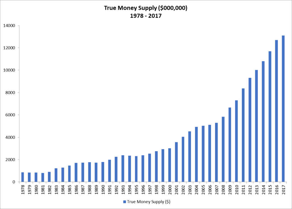
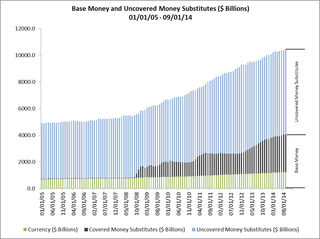
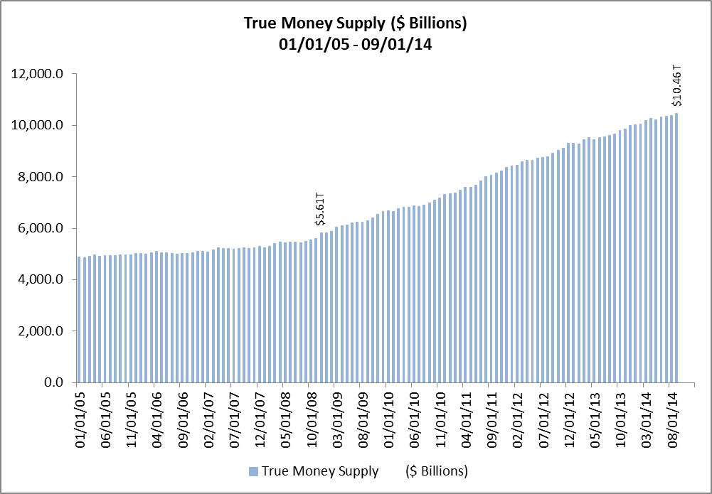
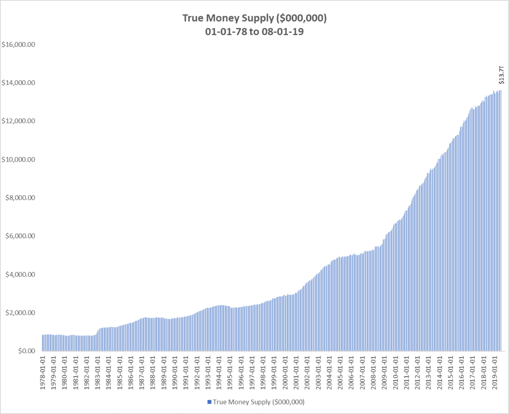
The total amount of the True Money Supply from January 1, 1978 through August 1, 2019 is shown in Figure 1. In August of 2019, TMS totaled $13.7 trillion, an increase of $8.7 trillion from the cyclical low of $5.0 trillion in August of 2006. This represents an exponential increase of 174% over the 13 year period.

Figure 1: True Money Supply ($000,000) 01-01-78 – 08-01-19

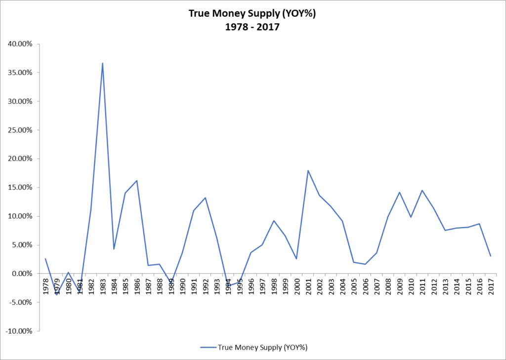
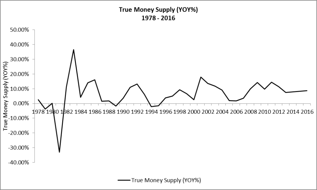
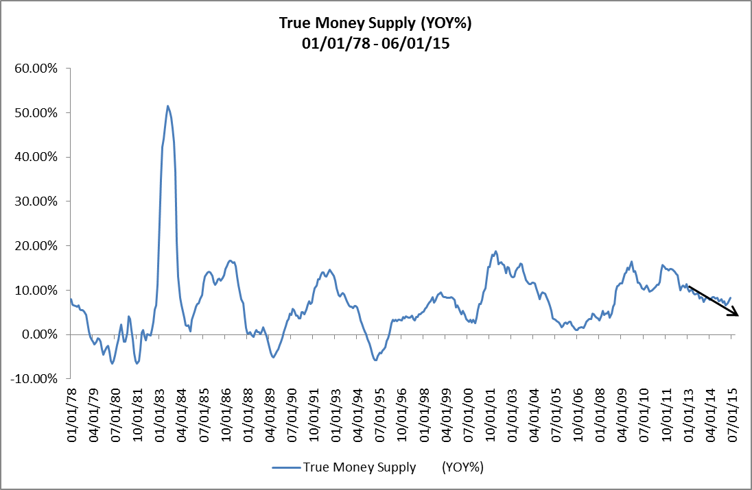
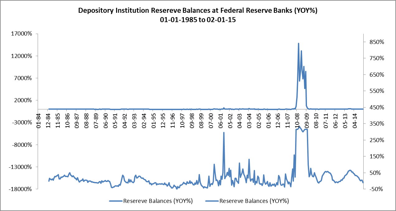
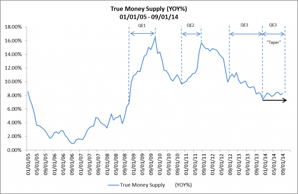
The year-over-over year percentage growth of TMS from January 1, 1978 through August 1, 2019 is shown in Figure 2. The average year-over-year growth rate of TMS over the past 40 years has been 7.24%.

Figure 2: True Money Supply (YOY%) 01-01-78 – 08-01-19

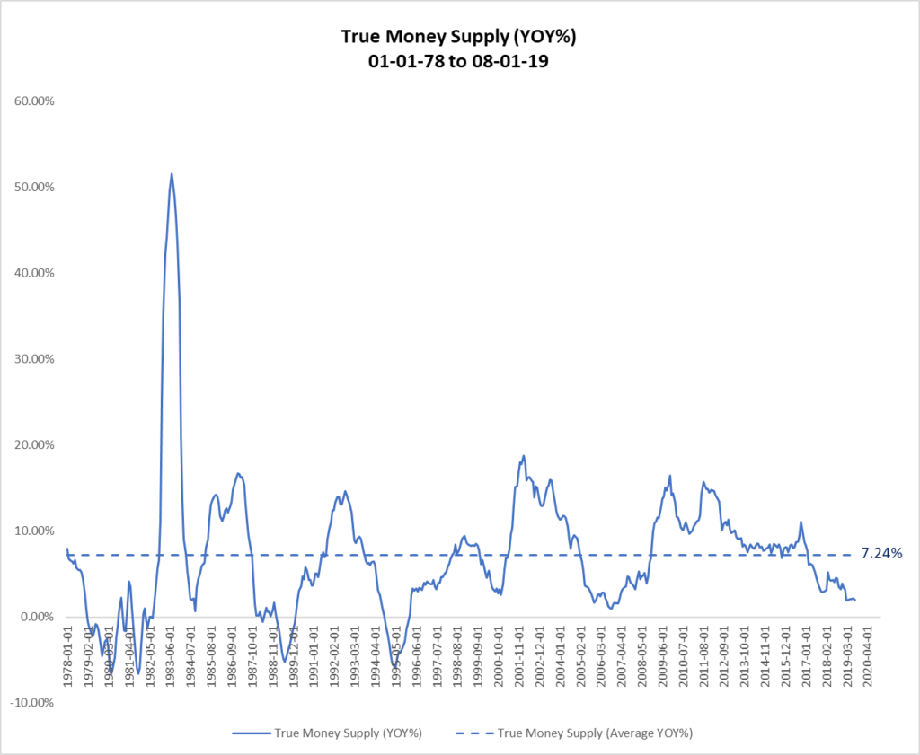
Note the cyclical peaks in the year-over-year growth of TMS of 51.53% in 1983, 14.23% in 1992, 18.02% in 2001 and what will likely be the peak for the current cycle of 15.26% in 2011.  Also note the cyclical troughs in the TMS growth rate of -4.87% in 1989, -5.79% in 1995, 2.61% in 2000 and .98% in 2006. Based upon the precipitous drop in the TMS growth rate between October of 2016 and February of 2019 and the flat growth rate of approximately 2% since March, it appears that the deceleration in the growth of TMS has leveled off and the TMS growth rate may have reached its cyclical low.

Relationship Between Federal Funds Rate and True Money Supply

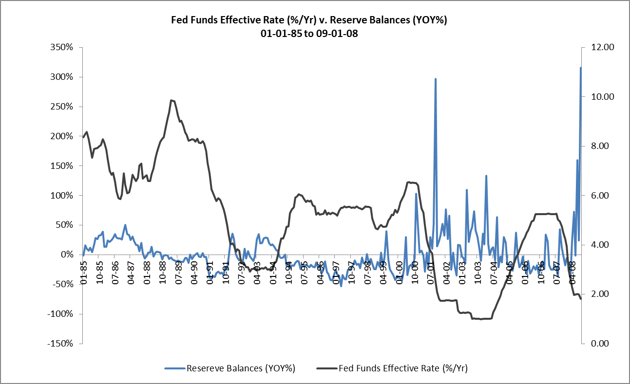
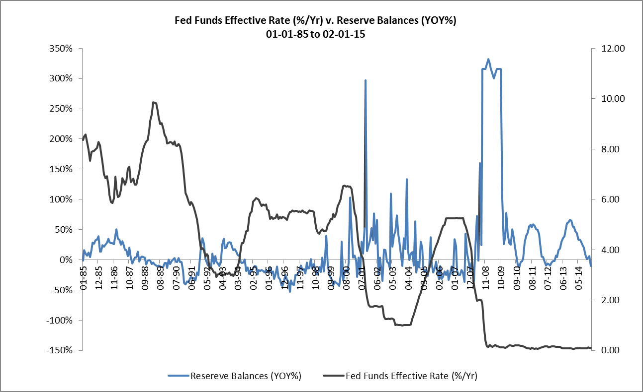
The FOMC’s recent decision to lower the target range for the Federal Funds Rate by 25 basis points is another sign that the TMS growth rate may have reached its cyclical low. Figure 3 clearly shows the inverse relationship between changes in the FFR and changes in the growth rate of TMS.

Figure 3: True Money Supply (YOY%) vs. Federal Funds Rate (Effective) 01-01-78 – 08-01-19

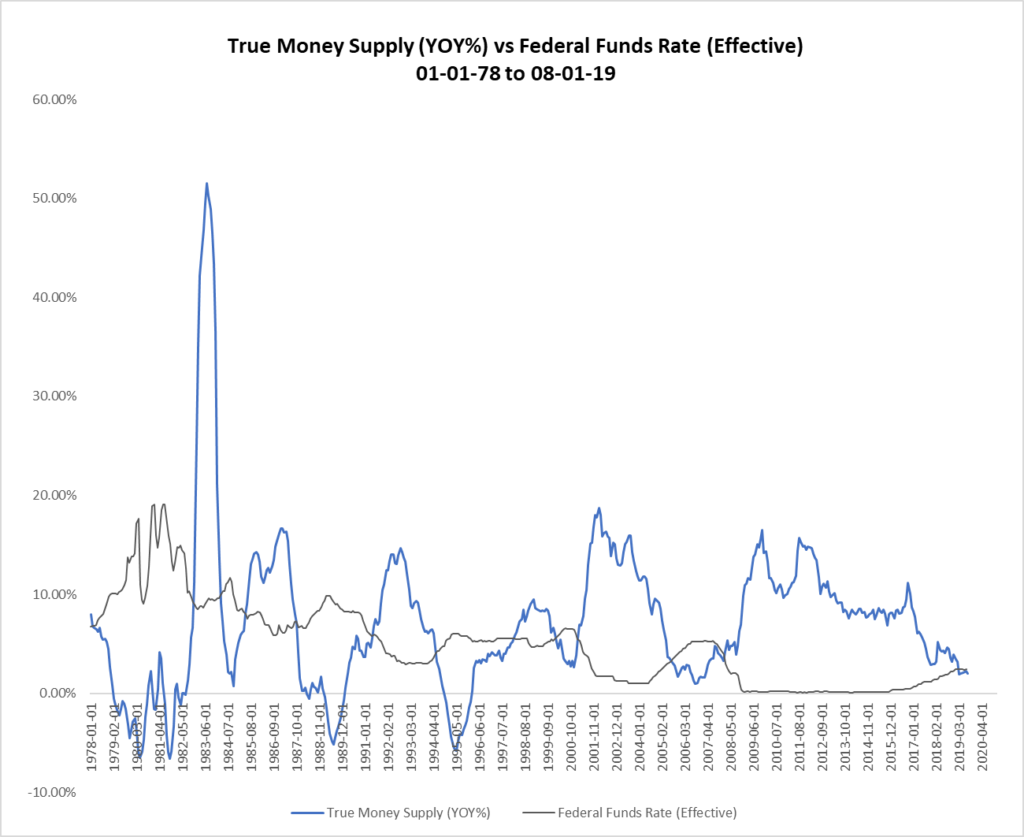
Note that the peaks in the Federal Funds Rate correspond to troughs in the growth rate of TMS and vice versa. Thus, when the FOMC adopts an accommodative monetary policy stance and begins lowering the FFR, growth in TMS accelerates. Conversely, when the FOMC adopts a tight policy stance and begins raising the FFR, growth in TMS decelerates.

In the current cycle, the FOMC began raising the FFR at the beginning of 2016. On cue, in late-2016, the growth in TMS began to decelerate. The FOMC continued to raise the FFR — and the growth in TMS continued to decelerate — until just recently when the TMS growth rate flattened.

Implications To Real Estate Investors

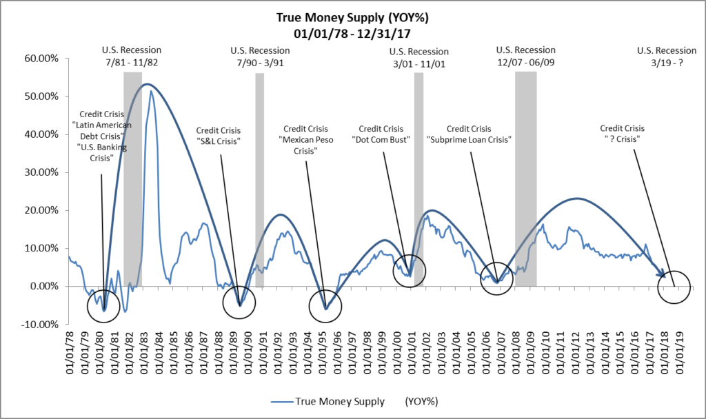
So, why is all of this so important to real estate investors? Because a deceleration in the year-over-year growth rate of TMS to a point at which the FOMC begins to lower the FFR has preceded the last four economic recessions in the U.S. For example, a deceleration in the year-over-year growth rate of TMS to 2.6% in early-2000 and the FOMC’s decision to lower the FFR in response preceded the Dot Com Bust and the economic recession that began in March of 2001. Similarly, the deceleration in the year-over-year growth rate of TMS to just under 1% in late-2006 and the FOMC’s decision to lower the FFR in response preceded the Subprime Loan Crisis and the Great Recession that began in December of 2007. (See Figure 4.)

Figure 4: Federal Funds Rate (Effective), True Money Supply (YOY%) and U.S. Recessions 01-01-78 – 08-01-19

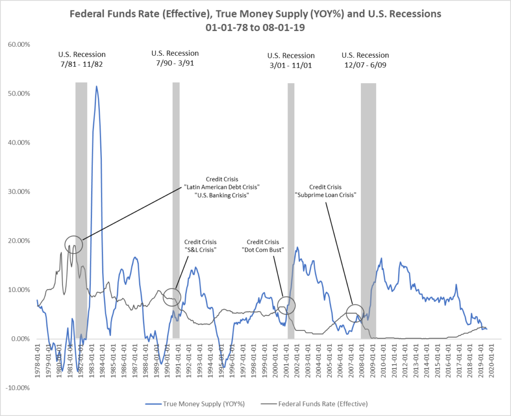
Of course, regular readers of RealForecasts.com know that Austrian Business Cycle Theory provides the only accurate explanation for this relationship among changes in the FFR, changes in TMS and economic recessions. (See, Does the Federal Reserve Really Create The Boom/Bust Cycle?)

Federal Funds Rate and True Money Supply Forecast

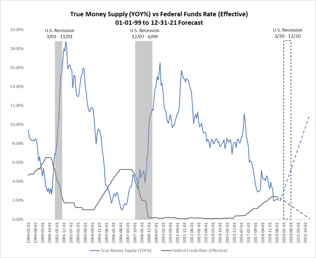
Once the FOMC shifts its monetary policy stance from accommodative to tight or tight to accommodative, it will continue with that stance until it believes that its policy objectives have been achieved. It may vary the speed of implementation, but the direction remains consistent. The FOMC doesn’t jump back and forth between policies.

Therefore, the FOMC’s recent decision to lower the FFR by 25 basis points signals a shift in policy stance that will likely continue for the next few years. Shortly after the FOMC begins lowering the FFR, watch for the growth of TMS begin to accelerate. Then, as TMS begins to accelerate, expect the U.S. economy to fall into an economic recession. (See Figure 5.)

Figure 5: True Money Supply (YOY%) vs. Federal Funds Rate (Effective) 01-01-99 – 12-31-21 Forecast

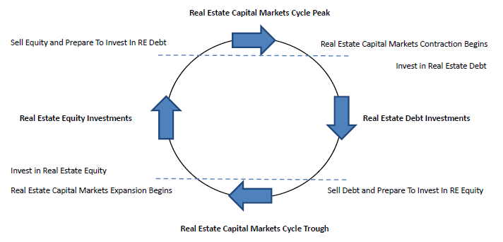
Recommended Investment Strategy

Because the next economic recession is still several months away, it’s not too late for real estate investors to take advantage of the still robust real estate capital markets to begin selling some of their under-performing and less-strategic assets and using the proceeds to reduce the leverage on their portfolios. By “dealing from the bottom of the deck” and reducing leverage, they will be improving the risk profile of their portfolios in anticipation of – and not in reaction to – the next recession.

Also, for the stronger performing and more-strategic assets, now is a good time to trade rate for occupancy, credit and term. Selectively approach existing credit tenants with a proposal to reduce their rent in exchange for an extended term. Similarly, reduce asking rates and increase concession packages for prospective credit tenants. By stabilizing occupancy with credit tenants and extending the weighted-average lease terms of the properties in their portfolios, investors will position their more-strategic assets to continue to perform well during the recession.

Conclusion

The TMS growth rate has leveled off at approximately 2% for the past six months and the FOMC recently lowered the FFR by 25 basis points. This suggests that the TMS growth rate has reached its low point for this cycle and that the next economic recession is not far off. In the meantime, real estate investors can make their portfolios more recession resistant by both selling under-performing and non-strategic assets before the recession and improving the risk profile of the rent rolls for the strategic assets that they will hold through the recession.

Thanks to Michael Pollaro for the TMS data used in this post.

image_pdfOpen As PDFimage_printPrint Post

Is There Really A Corporate Debt Bubble That’s Ready To Burst?

By Jeffrey J. Peshut

December 3, 2018

Over the past several months, media headlines have been awash with dire warnings of a looming corporate debt bubble that is about to burst. Some of the more provocative headlines include:

From the perspective of Austrian Business Cycle Theory. this post will explore the questions of whether there really is a corporate debt bubble — and, if there is, when we can expect it to burst. But first, let’s define corporate debt.

Corporate Debt

According to Federal Reserve Statistical Release Z.1, Financial Accounts of the United States, the non-financial “corporate business debt” sector consists of all private for-profit domestic non-financial corporations. S Corporations, which have 35 or fewer stockholders and are taxed as if they were partnerships, are included in this sector. Corporate farms are also included. Holding companies and equity real estate investment trusts (REITs), which are considered financial businesses, are excluded from this sector.

Corporate Business Debt outstanding totaled $20.2 trillion at the end of 2017, an increase of $7.3 trillion from the cyclical low of $12.9 trillion at the end of 2009. (See Figure 1.) This reflects a 56.6% increase over that eight-year period.

Figure 1: Corporate Business Debt ($000,000) 1978 – 2017

The $20.2 trillion of outstanding Corporate Business Debt includes debt securities that include Corporate Bonds ($5.4 trillion), Municipal Securities ($568 billion) and Commercial Paper ($207 billion), Foreign Direct Investment in U.S. ($3.9 trillion), loans that include Depository Institution Loans ($1.0 trillion), Other Loans and Advances ($1.3 trillion) and Total Mortgages ($522 trillion), Trade Payables ($2.5 trillion) and Miscellaneous Liabilities ($4.6 trillion). (See Figure 2.)

Figure 2: Corporate Business Debt By Sector 2017

The year-over-year percentage growth of Corporate Business Debt from 1978 through 2017 is presented in Figure 3. This chart vividly illustrates the cycles in Corporate Business Debt over the past 40 years. Note the cyclical peaks in its growth rate of 12.8% in 1984, 14.3% in 2000, 9.26% in 2007 and what will likely be the peak for the current cycle of 7.95% in 2015 and the cyclical troughs in its growth rate of 6.33% in 1982, 2.12% in 1991, -.56% in 2003 and -2.43% in 2009. The cyclical trough for the current cycle has yet to be revealed.

Figure 3: Corporate Business Debt (YOY%) 1978 – 2017

Non-Corporate Debt

The non-financial “non-corporate business debt” sector consists of partnerships and limited liability companies (businesses that file IRS Form 1065), sole proprietorships (businesses that file IRS Schedule C) and individuals who receive rental income (income debt reported on IRS Schedule E). Non-corporate farms are included in this sector. Investment properties owned by individuals and the corresponding mortgages are also included in this sector.

Companies in this sector are not necessarily small, but they generally do not have access to the debt securities markets like companies in the corporate business debt sector and thus rely on loans from commercial banks, trade credit and other credit providers for funding.

Non-Corporate Business Debt outstanding totaled $7.5 trillion at the end of 2017, an increase of $1.9 trillion from the cyclical low of $5.6 trillion at the end of 2011. (See Figure 4.) This reflects a 33.5% increase over that six-year period.

Figure 4: Non-Corporate Business Debt ($000,000) 1978 – 2017

The $7.5 trillion of outstanding Non-Corporate Business Debt includes Total Mortgages ($3.8 trillion), loans that include Depository Institution Loans ($1.3 trillion), Other Loans and Advances ($206 billion), Trade Payables ($672 billion) and Unidentified Miscellaneous Liabilities ($1.4 trillion). (See Figure 5.)

Figure 5: Non-Corporate Business Debt By Sector 2017

Figure 6 presents the year-over-year percentage growth of Non-Corporate Business Debt from 1978 through 2017. Similar to Figure 3, Figure 6 clearly shows the cycles in Non-Corporate Business Debt over the past 40 years. Note the cyclical peaks in its growth rate of 14.12% in 1984, 16.50% in 1998, 14.93% in 2005 and what will likely be the peak for the current cycle of 6.22% in 2014 and the cyclical troughs in its growth rate of 4.30% in 1987, -1.58% in 1991, 2.18% in 2003 and -1.11% in 2009. Again, the cyclical trough for the current cycle has yet to be revealed.

Figure 6: Non-Corporate Business Debt (YOY%) 1978 – 2017

Combined, the $20.2 trillion of “corporate business debt” and the $7.5 trillion of “non-corporate business debt” make up the total business debt of $27.7 trillion.

True Money Supply

Followers of the Austrian School of economic thought and regular readers of RealForecasts.com understand that changes in monetary policy by the Federal Reserve System’s Federal Open Market Committee (FOMC) and the resulting rate of change of U.S. Base Money, Commercial and Consumer Lending and the Money Supply can be used as leading indicators to accurately forecast changes in the economy, financial markets and real estate markets. (See, Does The Federal Reserve Really Create The Boom/Bust Cycle?) Therefore, to determine whether there is a corporate debt bubble that’s ready to burst, it’s helpful to look to changes in the rate of growth of the Austrian measure of the money supply, also known as the True Money Supply or TMS.

At the end of 2017, the True Money Supply totaled $13.1 trillion, an increase of $8.0 trillion from the cyclical low of $5.1 trillion at the end of 2006. (See Figure 7.) This reflects an astounding 156.9% increase over that 11-year period. To put that into perspective, TMS increased from the cyclical low of $3.0 trillion in 2000 to $5.1 trillion in 2006, an increase of “only” $2.1 trillion or 70% during the height of the most recent housing bubble. Is it any wonder that we’ve seen such exponential increases in asset values since the institution of Quantitative Easing?

Figure 7: True Money Supply ($000,000) 1978 – 2017

The year-over-year percentage growth of TMS is shown in Figure 8. Note the cyclical peaks in the TMS growth rate of 36.66% in 1983, 13.27% in 1992, 18.00% in 2001, and what will likely be the peak for the current cycle of 14.49% in 2011. Also note the cyclical troughs in the TMS growth rate of -1.63% in 1989, -2.11 in 1994, 2.61% in 2000 and 1.66% in 2006. Based upon the precipitous drop in the TMS growth rate over the past year and the Fed’s current monetary stance, the next cyclical trough in the TMS growth rate is likely not too far off.

Figure 8: True Money Supply (YOY%) 1978 – 2017

Corporate Debt vs. True Money Supply

The relationship between changes in the growth rate of Corporate Business Debt and the True Money Supply is set forth in Figure 9. Generally, the trough in the growth rate of Corporate Business Debt lags the trough in TMS by about three years. If this relationship holds true for the current cycle, the growth rate for Corporate Business Debt should reach its next trough in the 2021 to 2022 time-frame.

Figure 9: Corporate Business Debt (YOY%) vs. True Money Supply (YOY%) 1978 – 2017

Conclusion

Although the analysis presented in this post indicates that the growth rate of Corporate Business Debt reached its cyclical peak in 2015 and that the growth rate of TMS is nearing its cyclical trough, the three-year lag between the growth rate of Corporate Business Debt and the growth rate of TMS suggest that the growth rate of Corporate Business Debt won’t reach its next cyclical trough until the 2021 to 2022 time-frame. Therefore, warnings that a corporate debt bubble is ready to burst seem premature.

image_pdfOpen As PDFimage_printPrint Post

What Does The Dramatic Deceleration In The Growth Of The True Money Supply Mean For Real Estate Investors?

By Jeffrey J. Peshut

February 21, 2018

On February 5, 2018, Jerome Powell was sworn in as the 16th Chair of the Board of Governors of the Federal Reserve System. Powell succeeded Janet Yellen, who was sworn in as Fed Chair on February 3, 2014, a little more than a month after the Federal Reserve ended its asset purchase program commonly referred to as Quantitative Easing or “QE” for short.

In November of 2014, in response to the end of Quantitative Easing and Janet Yellen’s appointment as Fed Chair, RealForecasts.com published a post titled How Will The End Of Quantitative Easing Impact The True Money Supply Growth Rate? In that post, RealForecasts.com forecasted a deceleration in the growth of the True Money Supply (TMS) from about 9% year-over-year (YOY) at the beginning of 2015 to 0% YOY at the end of 2016.

This post will update the actual growth rate of TMS since the end of QE and explain what it means to real estate investors like those you can find on this site. It will also provide some possible strategies that real estate investors can adopt in response to changing economic and real estate market conditions. Some real estate investors may want to build upon their financial backing to make sure they are working with the market fluctuations. They may want to look at investing in Bitcoin by gaining some advice from people who have already gone into it and have checked out helpful articles such as – Bitcoin Superstar Erfahrungen to keep them steady with their investments and to see what the risks are.

True Money Supply Growth Rate Since The End of Quantitative Easing

As suggested above, the Federal Reserve ended Quantitative Easing in December of 2013. Two years later, in December of 2015, the Fed began raising the Fed Funds Target Rate — with an initial increase from .25% to .50%. This was the first time that the Fed had raised the Fed Funds Rate since June of 2006.

During this two-year period, TMS grew at a remarkably consistent rate of about 8% YOY. The steady growth of TMS continued during the first half of 2016 and even accelerated briefly to 11.15% YOY in October of 2016. (See Figure 1.)

Figure 1: True Money Supply (YOY%) 01/01/08 – 12/31/17

In December of 2016, and in March, June and December 2017, the Fed continued to increase the Fed Funds Rate in 25 bps increments to its current rate of 1.50%.

Moreover, on September 20, 2017, the Fed announced that it would begin to reduce the $4.5 trillion balance sheet that it had amassed during QE by selling $10 billion of assets each month from October through December of 2017, $20 billion per month from January through March of 2018, $30 billion per month from April through June of 2018, $40 billion per month from July through October 2018 and $50 billion per month from October through December of 2018 for total sales of $450 billion by the end of 2018. The Fed also announced plans to raise the Fed Funds Rate three more times during 2018 to end the year above 2 %.

In response to the Fed’s increasingly tighter monetary stance, the growth rate of TMS has decelerated dramatically, from 11.15% YOY in October of 2016 to 3.10% YOY in December of 2017.

This is the same magnitude of deceleration that RealForecasts.com had forecasted in November of 2014, but because the Fed unexpectedly delayed its decision to begin raising the Fed Funds Rate and reduce its balance sheet, it occurred about a year later than expected. Note that this is the most dramatic deceleration during a period of monetary tightening since TMS decelerated from 9.54% YOY in October of 2004 to 1.71% YOY in November of 2005. (See Figure 2.) In that case, after accelerating slightly from December of 2005 to April of 2006, the TMS growth rate decelerated to its cyclical low of ,98% YOY in September of 2006.

Figure 2: True Money Supply (YOY%) 01/01/03 – 12/31/17

If the Fed sticks with its plans to continue to both raise the Fed Funds Rate and reduce its balance sheet during 2018, it’s easy to see that the growth of TMS could grind to a halt and even begin to contract later this year.

What Does This Mean For Real Estate Investors?

In previous posts such as Where Are The Employment Markets In Their Cycles? and Where Will Commercial Real Estate Returns Go From Here?, RealForecasts.com demonstrated that changes in the TMS growth rate can accurately forecast changes in the growth rate of Total Employment. Further, because of the the strong correlation between the YOY growth rate of Total Employment and the annual returns from private-market real estate equity investments, as reflected in the NCREIF Property Index (NPI), changes in Total Employment can help us to forecast changes in the NPI.

Figure 3 shows the acceleration and deceleration of the expansion — and sometimes contraction — of TMS dating back to 1978. Note that in each TMS expansion and contraction cycle, the Fed maintained a tight policy stance until a credit and liquidity crisis occurred. Also, an economic recession typically occurred shortly after the credit and liquidity crisis. Finally, of particular note is the length of the loose policy stance in the current cycle and, until recently, the slow pace of tightening since the end of QE.

Figure 3: True Money Supply (YOY%) 01/01/78 – 12/31/17

RealForecasts.com expects that the growth of TMS will continue its downward trend in the months ahead, as the Federal Open Market Committee continues to raise the Fed Funds Target Rate and reduce its balance sheet. Based upon the current trajectory of this trend, and the Fed’s current policy stance, it looks like the next credit and liquidity crisis could occur during the second half of 2018, with an economic recession and real estate market downturn to follow. Of course, this forecast could change if the Fed changes its policy stance or if the commercial banks change their pace of lending activity.

In the meantime, real estate investors would be wise to take advantage of the still robust capital markets environment to begin selling some of their under-performing and less-strategic assets and using the proceeds to reduce the leverage on their remaining properties and portfolios. Whether the current climate makes any attempt to buy luxury homes MacDonald highlands unpalatable remains to be seen. By “dealing from the bottom of the deck” and reducing leverage, they will be improving the risk profile of their portfolios in anticipation of – and not in reaction to – the next credit and liquidity crisis, economic recession and real estate market downturn.

Many thanks to Michael Pollaro at The Contrarian Take for providing the TMS data used in this post.

image_pdfOpen As PDFimage_printPrint Post

Where Are The Employment Markets In Their Cycles?

By Jeffrey J. Peshut

March 16, 2017

In a February 13, 2014 post titled What’s Next For Employment Growth?, RealForecasts.com demonstrated that changes in the growth rate of the True Money Supply (TMS) can accurately forecast changes in the growth rate of Total Employment.  In a March 20, 2014 post titled Where Will Commercial Real Estate Returns Go From Here?, RealForecasts.com highlighted the strong correlation between the year-over-year growth rate of Total Employment and the annual returns from private-market real estate equity investments, as reflected in the NCREIF Property Index (NPI).  Because of this strong correlation, forecasting changes in Total Employment can help us to forecast changes in the NPI Index.  Before doing that, however, we need to first understand where the employment markets are in their current cycles.

Total Employment – Historical Perspective

U.S. Total Non-Farm Employment from 1978 through 2016 is shown in Figure 1.

Figure 1: Total Non-Farm Employment (000’s)  1978 – 2016

From its cyclical low of 127.8 million in January, 2010, Total Employment recovered to the previous cycle’s high of 139.3 million in mid-2014 and grew to this cycle’s high of 146.2 million at the end of 2016.

Figure 2 contains the year-over-year growth of U.S. Total Non-Farm Employment from 1978 through 2016.  This chart clearly identifies the cycles in Total Employment over the past 40 years.

Figure 2: U.S. Total Non-Farm Employment (YOY%)  1978 – 2016 

A few points worth noting.  The year-over-year growth of  Total Employment has averaged 1.43% since 1978.  The greatest rate of growth occurred between 1982 and 1990 and 1991 and 2000.  The growth rate between 2003 and 2008 and 2010 and 2017 has been modest in comparison, barely exceeding the 40-year average during those periods.  For the current cycle, the Total Employment growth rate peaked at 2.19% in 2014 and has been decelerating since, finishing 2016 at 1.46%.

Because I live in Denver, Colorado and many followers of RealForecasts.com live here as well, I’ve included Total Non-Farm Employment for the Denver MSA in Figure 4.

Figure 3: Denver-Aurora-Lakewood Total Non-Farm Employment (000’s)  1990 – 2016

From its cyclical low of 1.19 million in 2009, Total Employment recovered to the previous cycle’s high of 1.26 million in 2012 and grew to this cycle’s high of 1.46 million at the end of 2016.

Figure 4 contains the year-over-year growth of Total Non-Farm Employment for the Denver MSA from 1990 through 2016.  Once again, the cycles in Total Employment are quite evident.

Figure 4: Denver-Aurora-Lakewood Total Non-Farm Employment (YOY%) 1978-2016

The year-over-year growth of  Total Employment for the Denver MSA has averaged 2.03% since 1990.  The greatest rate of growth occurred between 1991 and 2000 and between 2011 and 2016.  For the current cycle, the Total Employment growth rate peaked at 4.22% in 2014 and had been decelerating before accelerating slightly in 2016.

Total Employment – Forecast

As demonstrated in previous posts, changes in the growth rate of the True Money Supply (TMS) can accurately forecast changes in the growth rate of Total Employment.  Figure 5 presents the year-over-year growth of TMS from 1978 through 2016.

Figure 5: True Money Supply (YOY%)  1978 – 2016

Since the end of QE3 in late 2013 and the end of the Fed’s Taper policy in late 2014, the growth rate of TMS has maintained a remarkably steady level of about 8% per year.  Such a steady level of growth is unprecedented over the past 40 years.

Figure 6 compares changes in the growth rate of the True Money Supply (TMS) with changes in the growth rate of Total Employment.

Figure 6: U.S. Total Non-Farm Employment (YOY%) v. True Money Supply (YOY%) 1978 – 2016 Actual and 2017 – 2019 Forecast

This chart demonstrates that peaks and troughs in the growth rate of Total Employment correlate strongly with peaks and troughs in the growth rate of TMS, with a lag of one to two years before the year 2000 and three to fours since then.

NCREIF Property Index – Forecast

A comparison of the growth rates in the total return for the NCREIF Property Index (NPI) is shown in Figure 7,

Figure 7: NPI Total Return v. U.S. Total Non-Farm Employment (YOY%)  1978 – 2016 Actual and 2017 – 2019 Forecast

Once again, the peaks and troughs in the growth rate of the NPI correlate strongly with the peaks and troughs of Total Employment, with a slight lag.  As goes Total Employment, so go private-market commercial real estate equity returns.

Conclusion

If we analogize between the employment cycles and the game of baseball, the data in the foregoing charts suggests that Total Employment is in the 8th or 9th inning of a nine-inning game.  By extension, the NPI Total Return is also in the late innings of a nine-inning game.  It seems likely, however, that the steady level of growth in TMS over the past few years could send both games into extra innings.  To find out if we are in for extra innings, check back with RealForecasts.com for updates about the TMS growth rate.

Many thanks to Michael Pollaro at The Contrarian Take for providing the TMS data used in this post.

image_pdfOpen As PDFimage_printPrint Post

Where Are The Real Estate Credit Markets In Their Cycles?

By Jeffrey J. Peshut

September 14, 2015

In its last post, Can Real Estate Investors Manage Through The Boom/Bust Cycle?, RealForecasts.com presented alternative strategies that real estate investors can employ to manage through the boom/bust cycle, depending upon where the real estate capital markets and real estate property markets are in their cycles.  That of course begs the question, “Where are the real estate capital markets and real estate property markets in their cycles today?” This post will address the question of where one sector of the real estate capital markets — the real estate credit markets — are in their cycles.

Real Estate Credit Market Cycles

The real estate credit markets can be divided into three separate categories — commercial mortgage debt, multi-family residential mortgage debt and and single-family residential mortgage debt. RealForecasts.com uses changes in the level of mortgage debt outstanding to track the cycle for each category.

For example, Figure 1 shows commercial mortgage debt outstanding from 1978 to 2014. The last cycle for commercial mortgage debt began in 1995 at a level of $733.8 billion before peaking in 2008 at a level of $2.58 trillion. As the supply of credit contracted after the Great Financial Crisis, commercial mortgage debt outstanding also contracted, reaching a trough of $2.23 trillion — and the end of the cycle — in 2012. Since the start of the current cycle in 2013, commercial mortgage debt outstanding has increased to $2.39 trillion, but has yet to recover to its 2008 peak.

Figure 1: Commercial Mortgage Debt Outstanding ($ Billions) 1978 – 2014

Commercial Mortgage Debt Outstanding - $B- 1978 to 2014

The year-over-year growth rate of commercial mortgage debt outstanding since 1978 is shown in Figure 2. The rate of growth averaged 7.26% from 1978 to 2014. but accelerated to almost 15% in both 1999 and 2005.

Figure 2: Commercial Mortgage Debt Outstanding (YOY%) 1978 – 2014

Commercial Mortgage Debt Outstanding - YOY - 1978 to 2014

Figure 3 presents multifamily mortgage debt outstanding between 1978 and 2014. The last cycle for multifamily mortgage debt began in 1994 at a level of $268.2 billion and increased to a peak of $855.2 billion in 2009. After the Great Financial Crisis, however, multifamily mortgage debt outstanding decreased only slightly to $852.2 billion in 2010. Multifamily mortgage debt began increasing again — and the new cycle began — in 2011 and had reached $998.6 billion as of the end of 2014.

Figure 3: Multifamily Mortgage Debt Outstanding ($ Billions) 1978 – 2014

Multi-Family Mortgage Debt Outstanding - $B - 1978 - 2014

Figure 4 presents the year-over-year growth rate of multifamily mortgage debt since 1978. Although the rate of growth averaged only 6.1% from 1978 to 2014. growth accelerated to 12.2% in 1999 and 2007 and 15% in 2003.

Figure 4: Multifamily Mortgage Debt Outstanding (YOY%) 1978 – 2014

Multi-Family Mortgage Debt Outstanding - YOY - 1978 - 2014

Finally, Figure 5 shows single family mortgage debt outstanding from 1978 to 2014. The most recent cycle for single family mortgage debt began in 1995 at a level of $3.45 trillion before peaking in 2007 at a level of $11.24 trillion — an increase of 226%. Single family mortgage debt outstanding contracted significantly after the Great Financial Crisis, decreasing to $9.89 trillion at the end of 2014. At this point, it’s not clear whether the last cycle has ended and the new cycle has begun. Regardless, it will still be a number of years before single family mortgage debt outstanding returns to its 2007 peak.

Figure 5: Single Family Mortgage Debt Outstanding ($ Billions) 1978 – 2014

Single Family Mortgage Debt Outstanding - $B - 1978 - 2014

Figure 6 presents the year-over-year growth rate of single family mortgage debt outstanding since 1978. Not only did the rate of growth average almost 8% from 1978 to 2014. growth accelerated to as high as 15.5% in 1985 and 14.3% in 2004. Perhaps even more importantly, in the last year of the cycle that ended in 1995, single family mortgage debt outstanding never contracted and in fact grew at a rate of 5.1%.

Figure 6: Single Family Mortgage Debt Outstanding (YOY%) 1978 – 2014

Single Family Mortgage Debt Outstanding - YOY - 1978 - 2014

Comparing Figure 6 to Figure 4 and Figure 2 shows that the multifamily mortgage market is much farther along in its current cycle than either the commercial mortgage market or the single family mortgage market. The marked difference in size between the single family mortgage debt market and the multifamily mortgage debt market — the single family mortgage debt market is approximately 10 times the size of the multifamily mortgage debt market — may help to explain the accelerated growth in multifamily mortgage debt outstanding since 2010.

Government Sponsored Enterprises (GSE’s) like Fannie Mae and Freddie Mac are not only the largest source of lending capital for single-family homes, but they are also the largest source of lending capital for apartment homes. The Fed’s attempt to re-inflate the single-family residential market by acquiring residential mortgage-backed securities from Fannie Mae and Freddie Mac has arguably had the unintended consequence of flooding the multifamily residential market with an over-abundance of inexpensive mortgage debt. This in turn could result in the over-building and over-supply of apartment homes.

Real Estate Credit Market Cycles and Cap Rate Cycles

Recently, real estate pundits have been speculating about the impact of the Fed’s expected increase in the Fed Funds Target Rate on real estate mortgage rates and real estate cap rates. Mostly overlooked in this discussion is the impact of an increase in the level of mortgage debt outstanding on cap rates.

To that point, Figure 7 compares the NCREIF Property Index (NPI) Income Return — as a proxy for cap rates on commercial and multifamily properties — to commercial and multifamily mortgage debt outstanding from 1978 to 2014. Note the strong inverse correlation between the NPI Income Return and the level of commercial and multifamily residential mortgage debt outstanding.

For example, as commercial and multifamily mortgage debt outstanding increased from $374.4 billion in 1979 to $1.11 trillion in 1990, the NPI Income Return decreased from 8.95% to 6.59%. Then, as commercial and multifamily mortgage debt outstanding contracted from $1.11 trillion in 1990 to $990.9 billion in 1994, the NPI Income Return increased from 6.59% in 1990 to 9.13% in 1995. The credit cycle during the 17-year period from 1979 to 1995 has been referred to as the “S&L Era” to reflect the new sources of commercial and multifamily mortgage debt outstanding during that time frame.

As commercial and multifamily mortgage debt outstanding increased from $1.08 trillion in 1995 to $3.4 trillion in 2008, the NPI Income Return decreased from 9.13% to 5.13%. Then, as commercial and multifamily mortgage debt outstanding contracted from $3.4 trillion in 2008 to $3.1 trillion in 2011, the NPI Income Return increased from 5.13% in 2008 to 6.76% in 2010. The credit cycle during the 16-year period from 1995 to 2010 has been referred to as the “CMBS Era”, again to reflect the new sources of commercial and multifamily mortgage debt outstanding during that period.

Since the beginning of the current real estate credit cycle, commercial and multifamily mortgage debt outstanding has increased from $3.12 trillion in 2011 to $3.38 trillion in 2014. In turn, the NPI Income Return has decreased from 6.76% in 2010 to 5.36% in 2014.

Figure 7: NPI Income Return (%) v. Commercial and Multi-Family Mortgage Debt Outstanding 1978 – 2014

NPI Income Return v. Comm and MF Mortgage Debt Outstanding 1978 - 2014

Although it is hard to believe that it can go much lower, this analysis suggests that the NPI Income Return will in fact continue to trend downward as commercial and multifamily mortgage debt outstanding continues to increase during the current real estate credit cycle. It’s less clear at this point, however, what will be the new sources of commercial and multifamily mortgage debt outstanding during the current cycle. Those that are suggesting that this will become know as the “Shadow Banking Era” — referring to non-chartered lending institutions — could be on the right track.

image_pdfOpen As PDFimage_printPrint Post

Can Real Estate Investors Manage Through The Boom/Bust Cycle?

By Jeffrey J. Peshut

August 2, 2015

With the growth rate of the True Money Supply (TMS) expected to continue its inexorable decline towards the next financial crisis, what steps can real estate investors take to manage through the bust phase of the cycle? This post will address that question. But first, let’s take a look at what’s been happening with the TMS growth rate over the past several months.

TMS Growth Rate

For June, 2015, the year-over-year growth rate of TMS was 8.26%. (See Figure 1) This was up from 7.72% in the previous month and the highest level reported since the end of the QE3 “Taper” in October of 2014. The lowest level reported since October was 6.53% in March of this year.

Figure 1: True Money Supply (YOY%) 01/01/78 – 06/01/15

True Money Supply - YOY - 01-01-78 - 06-01-15

Despite this recent uptick, RealForecasts.com expects the growth rate of TMS to continue the downward trend shown by the arrow in Figure 1, especially once the FOMC raises the Fed Funds Target Rate above its current ceiling of 25 bps later this year. For a more in-depth discussion see, How Will The End Of Quantitative Easing Impact The True Money Supply Growth Rate?

What Steps Can Real Estate Investors Take To Manage Through The Next Bust?

The two most important steps that real estate investors can take to manage through the next bust is to first shift the way they look at the economy and financial markets from “linear” to “cyclical” and then shift their investment mindset from “relative” to “absolute”. It’s human nature to forecast in a linear fashion. If the economy and financial markets are going up, it’s natural for investors to forecast that they will stay up and even continue to go up in the future. If the economy and financial markets are going down, it’s also natural for investors to forecast that they will stay down and even continue to go down in the future.

Yet the economy and financial markets don’t behave that way. They are nothing if not cyclical.

Also, most investors — especially institutional investors — have adopted a relative return mindset for their portfolios and measure their performance and the performance of their investment managers against market benchmarks or indices. A relative return strategy performs well, however, only when the overall market performs well. That said, if the overall market doesn’t perform well, but the investor or manager outperforms the market benchmark or index, they are still deemed to have performed well. That sounds good in theory, but as the saying goes, “you can’t eat relative performance”. Practically speaking, even if an investor’s negative returns weren’t as great as the negative returns posted by the market as a whole, they still lost money.

A portfolio based upon an absolute return strategy, on the other hand, is designed to provide positive returns regardless of the direction of the overall market. Investors following an absolute return strategy will generate these positive returns by investing up and down the real estate capital structure (common equity to senior debt) and back and forth along the real estate risk/return continuum (core to opportunistic), depending upon where the real estate capital markets and real estate property markets are in their cycles. Figure 2 shows the universe of investment alternatives available to real estate investors by the risk profile of the investment and the investor’s position in the capital structure for the investment.

Figure 2: Real Estate Capital Structure and Real Estate Risk/Return Continuum

Real Estate Capital Structure and Real Estate Risk-Return Continuum

The following section indicates where investors should position themselves in the capital structure based upon where the Real Estate Capital Markets are in their cycle.

Real Estate Capital Markets Cycle

If the Real Estate Capital Markets are either currently in or forecasted to move into the Expansion phase of the cycle, invest in real estate equity investments to take advantage of cap rate compression and appreciating capital values. If the Real Estate Capital Markets are in or forecasted to move into the Contraction phase of the cycle, rotate out of equity investments and into real estate debt investments to avoid cap rate decompression and depreciating capital values. (See Figure 3) Depending upon the investor’s risk tolerance and return objectives, equity investments can take the form of either preferred equity or common equity. Debt investments can take the form of senior debt or mezzanine debt.

Figure 3: Real Estate Capital Markets Cycle – Indicated Investment Types

Real Estate Capital Markets - Indicated Investments

The following section indicates where investors should position themselves on the real estate risk/return continuum based upon where the Real Estate Leasing Markets are in their cycle.

Real Estate Leasing Markets Cycle

When the Real Estate Leasing Markets are in the Recovery phase of the cycle, invest in existing core, core plus and value–added investments to take advantage of rising occupancy rates, lease rates and capital values. During the Expansion phase of the Leasing Markets’ cycle, add opportunistic investments in new developments. If the Real Estate Leasing Markets are forecasted to move into the Recession and Contraction phases of the cycle, sell properties, pay down debt and rotate into core risk/return investments. (See Figure 4)

Figure 4: Real Estate Leasing Markets Cycle – Indicated Investment Types

Real Estate Leasing Markets - Indicated Investments

Takeaways

RealForecasts.com expects that the growth of TMS will continue its downward trend in the months ahead, especially once the FOMC raises the Fed Funds Target Rate above its current ceiling of 25 bps later this year. Based upon the current trajectory of this trend, and the Fed’s current policy stance, it looks like the next credit crisis could occur during the second half of 2016. Of course, this forecast could change if the Fed changes its policy stance or if the commercial banks change the pace of lending activity.

In the meantime, it’s not too early for real estate investors to take advantage of the robust capital markets environment to begin selling some of their under-performing and less-strategic assets and using the proceeds to reduce the leverage on their portfolios. By “dealing from the bottom of the deck” and reducing leverage, they will be improving the risk profile of their portfolios in anticipation of — and not in reaction to — the next downturn.

Many thanks to Michael Pollaro at The Contrarian Take for the TMS data used in this post.

image_pdfOpen As PDFimage_printPrint Post

Has The Fed Been Raising The Fed Funds Rate Under The Radar?

By Jeffrey J. Peshut

March 26, 2015

At its March 18th meeting, the Federal Open Market Committee (“FOMC”) withdrew its pledge to be “patient” about raising the Fed Funds Target Rate above its current target range of 0 to 25 basis points, thus ending “forward guidance” about its policy stance and allowing the FOMC more freedom and flexibility about the timing of a rate increase.   The FOMC indicated that as long as the employment market continues to improve, the FOMC will raise the Fed Funds Target Rate once it becomes “reasonably confident” that inflation will approach 2% over the medium term.  The FOMC added that a rate increase remained “unlikely” at its April meeting and said its change in rate guidance does not mean it has decided on the timing for a rate hike.  Fed Chair Janet Yellen later told reporters that a June move could not be ruled out.

Notwithstanding the FOMC’s statement – and despite the keen attention paid to it by Fed watchers — one question that no one seems to be asking is whether the Fed has already been raising the Fed Funds Rate under the radar.  This post addresses that question.  Before addressing it, however, let’s first review some monetary policy basics.

Monetary Policy and Policy Tools

The Federal Reserve uses monetary policy to influence the supply of money and credit in the U.S. economy.  The supply of money and credit, in turn, affects interest rates and the performance of the U.S. economy and financial markets.

Traditionally, the Federal Reserve has used three tools to implement its monetary policy:

  • Fed Funds Rate – The average rate at which a depository institution (DI) — or other eligible entity such as a foreign bank or government sponsored enterprise — makes an unsecured overnight loan of U.S. dollars to another DI (“Fed Funds Transaction”). A DI borrows money overnight from another DI to maintain its reserve balances or clear financial transactions.
  • The Discount Rate – The rate charged by Federal Reserve Banks to depository institutions (DIs) on short-term loans.
  • The Reserve Requirement – The reserve requirement is the percentage of its customer deposits that each DI must hold as reserves – rather than lend out – either in their vaults or on deposit at a Federal Reserve Bank.

Since October of 2008 the Fed has been using the payment of interest on reserves as a fourth policy tool and from December of 2008 to October of 2014 the Fed used Quantitative Easing (“QE”) as a fifth tool.

Up until the fourth quarter of 2008 — when the Fed adopted a Zero Interest Rate Policy (ZIRP), reduced the Fed Funds Target Rate to nearly zero, began paying interest on reserves and initiated QE – raising and lowering the Fed Funds Rate had been the Fed’s primary policy tool.  To implement its monetary policy, the FOMC would set a target level or range for the Fed Funds Rate consistent with the desired level of reserves and then use its open market operations to influence the reserve balances until the Fed Funds Effective Rate reached its target rate.

The Fed’s open market operations influence reserve balances by purchasing and selling financial instruments — which are usually securities issued by the U.S. Treasury, Federal agencies and government-sponsored enterprises (GSEs) — in the “open market”.   Open market operations are carried out by the Domestic Trading Desk of the Federal Reserve Bank of New York under direction from the FOMC.  The transactions are executed through a cadre of security dealers that the Fed regularly does business with, which are known as “primary dealers”.

When the Fed wants to increase reserves and thereby lower the Fed Funds Effective Rate, it buys securities and pays for them by making a deposit to the account maintained at the Fed by the primary dealer’s bank.  When the Fed wants to reduce reserves and thereby raise the Fed Funds Effective Rate, it sells securities and makes a withdrawal from these accounts.  Most of the time, the Fed does not want to permanently increase or decrease reserves, so it reverses these transactions within several days.

Figure 1 illustrates how changes in reserve balances influenced the Fed Funds Effective Rate from the beginning of 1985 through the third quarter of 2008.  When reserve balances decreased, the Fed Funds Effective Rate increased and when reserve balances increased, the Fed Funds Effective Rate clearly decreased.

Figure 1: Fed Funds Effective Rate (%/Yr) v. Reserve Balances (YOY%)  01-01-85 to 09-01-08

Fed Funds Effective Rate v. Reserve Balances YOY 01-01-85 to 09-01-08

How Did Quantitative Easing Impact Reserve Balances?

Once the Fed lowered the target Fed Funds Target Rate into the 0 to 25 bps range, QE replaced the Fed Funds Rate as the Fed’s primary policy tool.  The impact on reserve balances was both immediate and remarkable.  (See Figure 2.)  Because the increase was so great, I’ve used a panel chart to be able to see the reserve balances before QE and the reserve balances after QE on the same chart.

Figure 2: Depository Institution Reserve Balances at Federal Reserve Banks ($Billions) 01-01-84 to 02-01-15

Reserve Balances at Federal Reserve Banks 01-01-84 to 02-01-15

Reserve balances went from $847.82 billion at the beginning of QE1 in December of 2008 to $1.12 trillion at the end of QE1 in March of 2010, to $1.62 trillion at the end of QE2 in June of 2011 and to $2.63 trillion at the end of QE3 in October of 2014.

The greatest increase in reserves on a on a year-over-year percentage basis actually occurred in the year leading up to QE1 when reserve balances went from a mere $5.67 billion in December of 2007 to the previously mentioned $847.82 billion in December of 2008, a head-spinning year-over-year increase of over 14,800%!  (See Figure 3.)  Again, a panel chart allows us to see the year-over-year percentage change before QE and the year-over-year percentage change after QE on the same chart.

Balances at Federal Reserve Banks (YOY%) 01-01-85 to 02-01-15

Reserve Balances at Federal Reserve Banks YOY 01-01-84 to 02-01-15

Why Did The Fed Start Paying Interest On Reserves?

The aggressive expansion of the Fed’s various liquidity facilities caused a large increase in excess reserve balances that placed extraordinary downward pressure on the Fed Funds Effective Rate.  This made it difficult for the Fed to achieve the operating target for the Federal Funds Rate set by the FOMC.  According to the Fed, paying interest on reserves allowed it to increase the level of reserves and still maintain control of the Federal Funds Rate.

Because depository institutions have little incentive to lend in the overnight inter-bank Fed Funds market at rates below the interest rate on excess reserves, paying interest on reserves allows the Fed to effectively place a floor on the Fed Funds Rate.  This floor allows the Fed to keep the Fed Funds Effective Rate closer to its target rate than it would have been otherwise able to.

Some commentators argue that once the Fed began paying interest on reserves and reduced the Fed Funds Target Rate to a range of 0 to 25 bps, it effectively decoupled changes in the Fed Funds Effective Rate from changes in reserve balances in the banking system.  They say that the Fed can now adjust reserve balances independently of the Fed Funds Effective Rate and that therefore the Fed Funds Rate is no longer a relevant policy tool.  As a result, they believe that the keen attention that people are paying to the timing of the Fed’s increase in the Fed Funds Rate is misplaced.

At first glance, Figure 4 would seem to support these commentators’ argument.  From December 2008 until today, the Fed Funds Effective Rate has been range bound between 0 and 25 bps while reserve balances have been growing at exponential rates.

Figure 4: Reserve Balances (YOY%) v. Fed Funds Effective Rate (%/Yr) 01-01-85 to 02-01-15

Fed Funds Effective Rate v. Reserve Balances YOY 01-01-85 to 02-01-15

If we zoom into the portion of the chart that relates to the period after QE1, which ended in March of 2010, we see that the relationship between changes in reserve balances and changes in the Fed Funds Effective Rate is as strong as it has ever been.  (See Figure 5.)  The changes in the Fed Funds Effective Rate are just occurring on a much smaller scale!

Figure 5: Reserve Balances YOY% v. Fed Funds Effective Rate (%/Yr) 04-01-10 to 02-01-15

Fed Funds Effective Rate v. Reserve Balances YOY 04-01-10 to 02-01-15

We also see that the Fed’s “Taper” policy that began at the beginning of 2014 has reduced reserve balances from a high of $2.8 trillion in July of 2014 to $2.3 trillion in February of this year — a reduction of 18% in eight months.  This decrease in reserve balances has raised the Fed Funds Effective Rate from 7 bps in January of 2014 to 11 bps in February of this year — an increase of more than 57% in a little over a year.

So, to answer the question raised at the beginning of this post, the Fed has indeed been raising the Fed Funds Effective Rate under the radar since January of 2014.  They’ve just been using the tapering of Quantitative Easing to reduce reserve balances instead of the more traditional method of raising the Fed Funds Target Rate.

What’s Next For Reserve Balances and The Fed Funds Rate?

To continue to raise the Fed Funds Effective Rate, watch for the Fed to reduce reserve balances in the months ahead.  It’s unlikely that the Fed will begin to raise the Fed Funds Target Rate until the Fed Funds Effective Rate approaches 25 bps, the upper limit of its current target range for the Fed Funds Rate.  Once the Fed does raise the Fed Funds Target Rate, the Fed Funds Rate should retake its place as the Fed’s primary policy tool and we’ll once again be able to pick up changes in the Fed Funds Rate on our radar screens.

image_pdfOpen As PDFimage_printPrint Post

When Will The Fed Begin Raising The Fed Funds Rate?

By Jeffrey J Peshut

December 20, 2014

In its press release about its December 17th meeting, the Federal Open Market Committee (“FOMC”) shifted its language about how long it will maintain the target Fed Funds Rate in the 0 to 1/4% range from “considerable time” to “it can be patient”.

Most Fed watchers have been focused on the first increase in the Fed Funds Rate as the sign that the Fed has shifted from a loose policy stance to a tight policy stance.  I suggest that the “Taper” that began in January of this year and the end of Quantitative Easing in October were the first phases in a type of monetary tightening that we haven’t seen during our lifetimes and that the tightening everyone has been watching for has been hiding in plain sight throughout 2014.

That said, the Fed’s shift in language is a sign that, for the time being, the Fed is committed to a tighter policy stance and a clue about when the next phase of tightening will begin.  Based upon language used by the FOMC in the past, here is how the Fed’s words translate into time:

“Considerable Time” = 6 – 10 months

“It Can Be Patient” = 2 – 5 months

“Measured Approach” = 1 month

Applying this translation to the current situation, it looks like the FOMC will start raising the Fed Funds Rate at its scheduled meeting in April of 2015.  Of course, even though it is unlikely, the Fed could shift its language and policy stance again between now and April.  If it does, RealForecasts.com will provided an updated forecast based upon the new information.  So, keep checking back with RealForecasts.com for the latest news about the Fed’s actions and what they mean to investors in real assets.

image_pdfOpen As PDFimage_printPrint Post

What Is So Good About Gold?

By Jeffrey J. Peshut

December 7, 2014

Warren Buffett — who is the second-wealthiest man in the U.S. with a net worth of $72.7 billion according to Forbes.com — once said this about gold:

Gold gets dug out of the ground in Africa, or someplace. Then we melt it down, dig another hole, bury it again and pay people to stand around guarding it. It has no utility. Anyone watching from Mars would be scratching their head.

If the country’s second-wealthiest man has such antipathy toward it, what is so good about gold? Before attempting to answer that question, let’s first take a look at what gold is and what it isn’t.

What Is Gold?

Despite Warren Buffett’s remark about head-scratching Martians, there is nothing mysterious about gold. Scientifically speaking, gold is a chemical element with the symbol Au and the atomic number of 79 — between platinum (Pt) and mercury (Hg) and directly below silver (Ag) on the Periodic Table of Elements. (See Figure 1.) It is a bright yellow dense, soft, malleable and ductile metal.

Figure 1: Periodic Table of the Elements

Periodic Table of Elements.jpg

People first mined gold about 5,000 years ago. Since that time, we have valued gold for emotional, cultural, political and economic reasons. Because of its emotional, cultural and political significance, gold has been the subject of many beliefs and false beliefs. Although this post will focus on gold’s economic aspects, it will also attempt to dispel some of the confusion and false beliefs surrounding it.

According to the World Gold Council, there were 177,200 tonnes of gold stock in existence above the ground at the end of 2013. Approximately 3,000 tonnes of new gold is mined each year, an increase in the gold stock of only 1.5% to 2.0% per year. East Asia as a whole produces 21 per cent of the total of newly-mined gold. (China is the largest single gold-producing country in the world, accounting for around 14 per cent of total production.) Latin America produces around 18 per cent of the total, with North America supplying around 15 per cent. Around 19 per cent of production comes from Africa and 5 per cent from Central Asia and Eastern Europe.

On average, 45 to 50% of the gold purchased each year is fabricated into jewelry, 30% to 35% of the gold purchased is acquired for investment purposes, 10% is purchased for manufacturing in technology and 10% is purchased by Central Banks for their reserve portfolios.  During 2013, 2,370 tonnes of gold were purchased for jewelry fabrication (55.7%), 1,069 tonnes were purchased for investment (25.1%), 408 tons were purchased for technology manufacturing (9.6%) and Central Bank net purchases accounted for 409 tonnes (9.6%). (See Figure 2.)

Figure 2: Gold Purchases 2013

Gold Purchases - 2013

Is Gold Money?

Much of the confusion surrounding gold today stems from its historical role as money. The World Gold Council provides a comprehensive overview of gold’s role in the monetary system. A summary of the WGC’s overview follows.

Gold coins were first struck on the order of King Croesus of Lydia (an area that is now part of Turkey around 550 BC. Gold coins circulated as currency in many countries before the introduction of paper money. Once paper money was introduced, currencies still maintained an explicit link to gold, with the paper being exchangeable for gold on demand. By the late 19th Century, many of the world’s major currencies were fixed to gold at a set price per ounce, under the so-called Gold Standard.

Under the Gold Standard, nearly all countries either fixed the value of their currencies in terms of a specified amount of gold, or linked their currency to that of a country that did so. Domestic currencies were freely convertible into gold at the fixed price and there was no restriction on the import or export of gold. Gold coins circulated as domestic currency alongside coins of other metals and notes, with the composition varying by country. Because each currency was fixed in terms of gold, exchange rates between participating currencies were also fixed.

The classical Gold Standard existed for only about 40 years — from the 1870s until the outbreak of World War I in 1914. By 1900 all countries apart from China, and some Central American countries, were on a Gold Standard.

The Gold Standard broke down at the outset of WW I as countries resorted to inflationary policies to finance the war and, later, reconstruction efforts. In practice, only the U.S. remained on the gold standard during the war. Periodic attempts to return to a pure classical Gold Standard were made during the inter-war period, but none survived past the Great Depression.

During World War II, many believed that a new international system would be needed after the war ended to replace the Gold Standard. The design for the new system was drawn up at the Bretton Woods Conference — named after the town in New Hampshire in which it took place — in 1944. The Bretton Woods system fixed the dollar to gold at the existing parity of US$35 per ounce, while all other currencies had fixed, but adjustable, exchange rates to the dollar.

In March 1968, a two-tier gold market was introduced with a freely floating private market, but with official transactions at the fixed parity of US$35 per ounce. Finally in August 1971, President Nixon announced that the U.S. would end on-demand convertibility of the dollar into gold for the central banks of other nations. The Bretton Woods system collapsed and gold traded freely on the world’s markets.

To determine gold’s status as money today, we must first define money. According to Austrian School economists, the defining characteristic of money is its use as a medium of exchange. If Austrian School economists considered gold to be a medium of exchange today, they’d be including it in their calculation of the money supply.

As explained by RealForecasts in its last post, however, the Austrian money supply — which RealForecasts.com refers to as the True Money Supply — is made up of Base Money and Uncovered Money Substitutes. Base Money is made up of Currency Outstanding and Reserve Deposits held by the Fed. The Uncovered Money Substitute portion of the money supply is money created by the “pyramiding” of Reserve Deposits through fractional reserve banking. (See Figure 3.)

Figure 3: Base Money and Uncovered Money Substitutes ($ Billions) 01/01/05 – 09/01/14

Base Money and Uncovered Money Substitutes 01-01-05 - 09-01-14

During periods in which gold coins circulated as part of a country’s currency and these currencies were freely convertible into gold held by central banks at a fixed price under the Gold Standard, gold was used a medium of exchange, was part of Base Money and thus was a part of the money supply. Gold was money.

Today, gold coins are no longer circulating as currency and are therefore no longer a medium of exchange. Further, since the collapse of the Bretton Woods System, gold is no longer part of Base Money and therefore is not part of the money supply. As a result, it is no longer accurate to characterize gold as money.

All that said, many investors purchase gold as a hedge against the debasement and possible collapse of a fiat currency. They believe that gold will regain its status as money If the fiat currency collapses. Because of gold’s potential to become an integral part of the monetary system once again, a case can be made to characterize gold as “contingent money”.

Is Gold A Good Investment?

In investment circles, gold is categorized as a “real asset” as compared to a “financial asset”. Real assets are physical or tangible assets that have value, due to their intrinsic qualities and properties. Real assets include precious metals like gold, commodities, real estate, agricultural land and oil. Financial assets or “paper assets” derive their value from a contractual claim. Stocks, bonds and bank deposits are all examples of financial assets.

So is gold a good investment? Since 1978, the price of gold has reported an average increase of 8.52%, year-over-year. (See Figure 4.)

Figure 4: Gold Price (YOY%) 1/1/78 – 10/31/14

Gold Price - YOY 1978 - 2014

Whether an asset is a good investment, however, depends upon a number of factors such as the investor’s investment style, risk tolerance, investment time horizon and investment objectives. For example, Warren Buffett is generally known as a buy-to-hold “value investor” in the tradition of Benjamin Graham and David Dodd. As the name suggests, value investors buy financial assets that appear under-priced based upon some form of fundamental analysis. It’s not surprising that a value investor like Buffett would eschew a real asset like gold.

On the other hand, diversified investors who follow the tenets of Modern Portfolio Theory — as pioneered by Harry Markowitz in the 1950s — are attracted to real assets like gold because they lack correlation with financial assets, which allows them to diversify their portfolios and reduce portfolio volatility. Still other investors choose gold as a hedge against both inflation and currency risk. Gold’s usefulness as a hedge against currency risk is illustrated in Figure 5.

Figure 5: Gold Price (YOY%) v. US Dollar Index (YOY%) 1/1/78 – 10/1/14

Gold Price v. US Dollar Index - YOY - 1-1-78 - 10-1-14

Note the very strong inverse correlation between the growth rate of the gold price and the growth rate of the price of the U.S. Dollar relative to other major currencies.

U.S. Dollar Index and Gold Price Forecasts

Consistent with Austrian Business Cycle Theory, we can use the growth rate of TMS to forecast the growth rate of both the U.S. Dollar Index and Gold Price. The very strong inverse correlation between the growth rate of the U.S. Dollar Index and the growth rate of the True Money Supply (TMS) is shown in Figure 6.

Figure 6: U.S. Dollar Index (YOY%) v. True Money Supply (YOY%) 1/1/78 – 10/01-14

US Dollar Index v. True Money Supply - YOY - 01-01-78 - 10-01-14

If the Fed expands the U.S. money supply at a faster rate than the central banks of the countries of other major currencies expand their money supply, the laws of supply and demand suggest that the price of the U.S. Dollar should fall relative to the other currencies (all else being equal). Conversely, if the Fed expands the U.S. money supply at a slower rate than the other central banks expand their currencies, the price of the U.S. Dollar should rise relative to the other currencies. The chart in Figure 6 certainly supports these suggestions.

In its previous post, RealForecasts,com forecasted the continued deceleration in the growth of TMS through the end of 2016. If during the same period the European Central Bank, Japanese Central Bank and others accelerate the growth of TMS for their currencies, look for the US Dollar to continue to strengthen and the US Dollar Index to continue to rise. (See Figure 7.)

Figure 7: US Dollar Index (YOY%) v. True Money Supply (YOY%) 1/1/78 – 10-01-14 Actual and 11/01/14 – 12/31/16 Forecast

US Dollar Index v. True Money Supply - YOY - Forecast 11-01-14 - 12-31-16

Because of the strong inverse correlation between the price of gold and the U.S. Dollar Index, when the U.S. Dollar strengthens and the U.S. Dollar Index rises, the Gold Price will likely fall. (See Figure 8.)

Figure 8: Gold Price (YOY%) v. US Dollar Index (YOY%) 1/1/78 – 10/1/14 Actual and 11/01/14 – 12/31/14 Forecast

Gold Price v. US Dollar Index - YOY - 11-01-14 - 12-31-14 Forecast

When the next financial crisis occurs, however, watch for the Gold Price and the U.S, Dollar Index to reverse, with the growth rate of the U.S. Dollar Index decelerating and even decreasing and the growth rate of the price of gold accelerating sharply.

This forecast is not only predicated on the Fed continuing its current policy stance, but also on the other major central banks continuing their policy stances. In the event the Fed or the other central banks adjust their policy stances, it will also be necessary to adjust this forecast in light of the changed policies. Continue to check back with RealForecasts.com for future updates.

As always, thanks to J. Michael Pollaro, author of The Contrarian Take, for the TMS data used to construct the charts in this article. To see more of Michael’s TMS data, go to http://blogs.forbes.com/michaelpollaro/austrian-money-supply/.

image_pdfOpen As PDFimage_printPrint Post

How Will The End Of Quantitative Easing Impact The True Money Supply Growth Rate?

By Jeffrey J. Peshut

November 11, 2014

On Wednesday October 29th, the Federal Open Market Committee (FOMC) directed the Open Market Trading Desk at the Federal Reserve Bank of New York to conclude its asset purchase program — commonly referred to as Quantitative Easing or QE for short — by the end of October.  The FOMC also directed the Open Market Trading Desk to maintain the existing policy of reinvesting principal payments from the Federal Reserve’s holdings of both agency debt and agency MBS into agency MBS and of rolling over maturing Treasury securities at auction. Now that QE has ended, RealForecasts.com will look back to see the impact it has had on the growth and growth rate of the True Money Supply (TMS) and then provide a forecast of the TMS growth rate between now and the end of 2016.

The Impact of Quantitative Easing on the Growth Rate of the True Money Supply

Since it began in November of 2008, the Fed’s QE policy has had a dramatic impact on the growth of the TMS.  TMS grew from approximately $5.6 trillion in November of 2008 to almost $10.5 trillion at the end of September of this year — an increase of over $800 billion per year.  (See Figure 1.)

Figure 1: True Money Supply ($ Billions) 1/1/05 – 9/1/14 True Money Supply ($Billions) 01-01-05 - 09-01-14This represents an increase in TMS of 87.5% over 70 months or an average increase of 15% per year.

The growth of TMS accelerated sharply from November of 2008 to November of 2009 and from November of 2010 to August of 2011. These two periods correspond to the periods of QE1 and QE2, respectively.  Between September of 2011 and December of 2013 — the period of QE3 — TMS growth decelerated, but then grew at a relatively constant rate of approximately 8% YOY during the Fed’s QE3 “Taper” policy that began in January of this year and just ended in October.  (See Figure 2.)

Figure 2: True Money Supply (YOY%) 01/01/05 – 09/01/14 True Money Supply - YOY - 01-01-05 - 09-01-14

True Money Supply Forecast

To forecast the growth rate of TMS in a post-QE economy, we need to first separate TMS into its two component parts — Base Money and Uncovered Money Substitutes.  As explained in Is True Money Supply (TMS) Growth Continuing To Decelerate?, Base Money is made up of Currency Outstanding and Reserve Deposits held by the Fed — also known as Covered Money Substitutes.  The rate of growth of Base Money is directly related to the level of bond-buying activity by the Fed. The Uncovered Money Substitute portion of TMS is money created by the “pyramiding” of Reserve Deposits through fractional reserve banking.  The rate of growth of Uncovered Money Substitutes is directly related to the level of lending by the commercial banks.

Base Money (Currency and Covered Money Substitutes) and Uncovered Money Substitutes from January of 2005 through September of 2014 are shown in Figure 3.  The impact of the Fed’s bond-buying activity on the growth of Base Money is clearly visible in the growth of Covered Money Substitutes beginning in November of 2008.

Figure 3: Base Money and Uncovered Money Substitutes ($ Billions) 01/01/05 – 09-01-14

Base Money and Uncovered Money Substitutes 01-01-05 - 09-01-14

During the almost six-years of Quantitative Easing, three periods of accelerating growth of Base Money stand out — from November of 2008 to September of 2009, from November of 2010 to August of 2011 and from September 2012 to November of 2013.   (See Figure 4.)  The first period corresponds to most of QE1, while the second and third periods correspond directly to the periods of QE2 and QE3, respectively.

Figure 4: Base Money (YOY%) 01/01/05 – 09-01-14 Base Money YOY 01-01-05 - 09-01-14

Under a fractional reserve banking system, we’d expect that an increase in Base Money caused by an increase in Covered Money Substitutes — or Reserve Deposits — under QE would generate an increase in lending activity by commercial banks — which in turn would generate an increase in Uncovered Money Substitutes.  That is exactly what happened under QE1 and QE2, and has begun to happen under QE3. (See Figure 5.)

Figure 5: Base Money and Uncovered Money Substitutes (YOY%) 01/01/10 – 09-01-14 Base Money and Uncovered Money Substitutes 01-01-05 - 09-01-14

Notice that the peak in the growth rate of Uncovered Money Substitutes lagged the peak in the growth rate of Base Money by 18 months after QE1 and by 9 months after QE2. The last peak in the rate of growth of Base Money occurred 12 months ago, in November of 2013.  If we assume that the growth rate of Uncovered Money Substitutes lags the peak in the growth rate of Base Money by 18 months — the longer and more conservative of the periods after QE1 and QE2 — then the growth rate of Uncovered Money Substitutes should peak in mid-2015.  (See Figure 6.)

Figure 6: Base Money and Uncovered Money Substitutes (YOY%) 01/01/10 – 09-01-14 Actual and 10/1/14 – 12/31/16 Forecast Base Money and UMS Forecast 10-01-14 - 12-31-16

During the first nine months of 2014, the acceleration of lending activity by commercial banks has more than offset the deceleration of the Fed’s bond-buying activity under the QE3 Taper, which explains why the growth rate of TMS during 2014 has held constant at about 8% in the face of the Base Money’s decelerating growth.  Once the rate of growth of Uncovered Money Substitutes peaks, however, the TMS growth rate will once again decelerate, approaching 0% by the end of 2016.  (See Figure 7.)

Figure 7: True Money Supply (YOY%) 01/01/10 – 09-01-14 Actual and 10/01/14 – 12/31/16 Forecast True Money Supply - YOY - Forecast 10-01-14 - 12-31-16

So, for now, it looks like the TMS growth rate will remain constant or may even accelerate slightly through mid-year 2015, at which point it will turn downward and continue downward through the end of 2016.  Of course, this forecast is predicated on the Fed continuing its current policy stance.  In the event the Fed changes its stance, all bets are off and it will be necessary to adjust this forecast in light of the changed policy.  Continue to check back with RealForecasts.com for future updates about changes in the TMS growth rate.

As always, thanks to J. Michael Pollaro, author of The Contrarian Take, for the TMS data used to construct the charts in this article.  To see more of Michael’s TMS data, go to http://blogs.forbes.com/michaelpollaro/austrian-money-supply/.

image_pdfOpen As PDFimage_printPrint Post